POR Number: 096-17
Contract Number: HT372-174391 001 CY
Contract Award Date: 2018-02-09
Contract Value: $215,112.45 (including HST)
Date of Submission: 2018-08-09
Prepared for:
Health Canada
For more information, please contact: hc.cpab.por-rop.dgcap.sc@canada.ca
August 2018
Ce rapport est aussi disponible en français
Phoenix SPI is a Gold Seal Certified Corporate Member of the MRIA
Health Canada commissioned Phoenix SPI to conduct qualitative research to test new Health Information Messages (HIMFootnote 1) and Toxic Statements (TS) for cigarette packages. The target audience was smokers, aged 18 and older. The research consisted of a set of 36 in-person focus groups conducted from March 12 to 27, 2018, in four cities: Halifax, Toronto, Vancouver, and Montreal (French). More details on the methodology can be found in the Methodology section of the Introduction.
Four different sets of HIMs were rotated across groups to ensure sufficient review of all 26 messages. Sets A and C each included six HIMs and Sets B and D each included seven HIMs. Within each set, half the HIMs were presented to participants in slide and shell (SS) cigarette package format and the other half as inserts for flip top (FT) packages. The order of the HIMs was rotated across the groups. Participants were asked to review each HIM on their own and then answer two questions about it on an exercise sheet. One question asked them to rate the effectiveness of the HIM in terms of informing and educating about the health effects and hazards of smoking and the other asked them to rate effectiveness in terms of making them think about quitting smoking. This was followed by a group discussion which focused on the following: the teaser, the motivational power of the HIM, the clarity of the text and message, the relevance and credibility of information, as well as suggestions for improvement.
In addition to the HIMs, 24 potential TS were reviewed as part of the research. In order to limit the response burden placed on participants, statements were divided into four sets of six TS. This resulted in participants in each group reviewing six TS with each of the four sets being reviewed by nine groups. After reading the statements, participants were asked about the clarity, length and credibility of each statement. Following their review of content, participants reviewed three different design elements being considered for the TS: text layout, background colour, and format/colour combinations. Participants were shown five options in each of these three areas.
Findings from this research are intended to: 1) provide information which can inform regulatory decisions with respect to new labelling requirements; 2) help to generate a better understanding of varying literacy levels with regards to the effectiveness of the new HIM and TS approach; and 3) help Health Canada to better inform Canadians about health impacts and health hazards of tobacco use and the benefits of quitting. Health Canada will use the information to finalise and select the next HIMs and TS. The HIMs and TS that were reviewed as part of this research are draft only and will either be discarded or edited to make them more effective.
The results from this research only provide an indication of participants' views about the issues explored and cannot be generalized to the full population of any of the groups represented in the study.
Key findings include the following:
There was consistent feedback that the text in the HIMs (the teaser and message) are clear and easy to understand. Rarely were any issues related to clarity identified by focus group participants. While participants sometimes offered suggestions to improve the teaser and/or message, they tended to focus on the length of the text only, routinely emphasizing that short, direct text makes a HIM effective.
In addition, issues of credibility were seldom raised by participants, and when they were, they were more likely to be raised by older smokers (i.e. those age 25 and older). In general, participants viewed the information provided in the HIMs as believable and credible. The few circumstances in which the credibility of information came into question involved what participants considered worst case scenarios, such as the reference to possible amputation and blindness resulting from diabetes in HIM 6, and when participants' personal experience called into question the validity of the information in a HIM. An example of the latter is smoking being linked to low birth weight (mentioned in HIM 2) and children being less likely to smoke if their parents are non-smokers (mentioned in HIM 9).
When discussing the HIMs, participants identified a number of factors that resonated with them and contributed to the effectiveness of the HIMs. These include short, pithy messages and teasers that pose questions, which leave the reader wanting more information (and more inclined to continue reading the HIMs). As well, the use of novel design features, such as vibrant colours or cartoons, tend to be attention-grabbing, resulting in participants being more likely to read the HIMs. Regarding themes, references to monetary savings resulting from quitting smoking tended to resonate with participants, as did new information about how to quit/ways to quit smoking, information about health effects participants were not aware of, and messages that emphasize the concrete or immediate effects of quitting smoking.
In addition to the teaser and the health information, participants were also asked about the placement of the quitline information on each HIM. In response, it was often suggested that moving the quitline telephone number and website information to the teaser would increase the likelihood that this information is read. When it appears only in the message portion of a HIM, participants consistently noted that they might not notice the quitline information. Furthermore, there was a strong preference for including both the phone number and the website as part of the quitline information as opposed to splitting the placement of the contact channels (e.g. the phone number in the teaser and the website in the health information).
Turning to the TS, the following were most often rated most effective in terms of informing and educating about the toxic substances found in tobacco and tobacco smoke and the health effects arising from them (presented in set order, not order of preference):
With only a few exceptions, assessments of the effectiveness of statements were similar across Anglophone and Francophone groups. The exceptions included 'There is no safe level of exposure to cigarette smoke', which was much more likely to be chosen as most effective in Anglophone groups, and 'Tobacco smoke can damage the blood vessels in your eyes, causing blindness', which was much more likely to be chosen as most effective in Francophone groups, as well as 'Toxic chemicals in a tobacco smoke harms almost every organ in your body', which was much more likely to be chosen as most effective in Anglophone groups, and 'Cigarette smoke is toxic and can cause death and disease in children and non-smokers' which, was much more likely to be chosen as most effective in Francophone groups.
Following their review of the statements for clarity and ease of understanding, participants assessed different design elements being considered for the TS. This included text layout, background colour, and format/colour combinations. The materials tested can be found in the following section of the report: Design Elements.
Regarding text layout, there was widespread agreement across audiences and regions that the option with the side-by-side bilingual format and 'WARNING' across the top in white text with a black background makes the TS easiest to read and that it is the most noticeable layout. The design feature singled out as making it the most noticeable option was the WARNING. The colour contrast (i.e. white text on black background), font size, and the black rectangle distinguishing 'WARNING' from the statement were routinely identified as attention-grabbing features. Nearly all participants said 'WARNING' should be by itself on top rather than integrated into the statement and most participants preferred when the English text and French text in the toxic statements was displayed side by side rather than one language on top of the other.
When it came to background colours, the yellow background with black text format was most often chosen as the background colour most likely to catch participants' attention. In explaining why, participants identified one or more of the following three factors: the brightness or vividness of the colour, the habitual association of the colour yellow with 'warning' or 'danger', and the contrast between the yellow background and the black text, described by many as attention-grabbing. A number of participants, though considerably fewer, chose the option with red background with white text as the background colour most likely to catch their eye.
The format/colour combination that was most often chosen as the most attention-grabbing was the 'WARNING' in white text with a red background, and TS in black text with a yellow background. In explaining why participants regularly identified the following factors, usually in combination: the red and yellow backgrounds, the contrast between the text and background, the clear separation of 'WARNING' from the text, and the bilingual format (display of languages side-by-side).
The contract value was $215,112.45 (including HST).
I hereby certify as a Senior Officer of Phoenix Strategic Perspectives that the deliverables fully comply with the Government of Canada political neutrality requirements outlined in the Communications Policy of the Government of Canada and Procedures for Planning and Contracting Public Opinion Research. Specifically, the deliverables do not contain any reference to electoral voting intentions, political party preferences, standings with the electorate, or ratings of the performance of a political party or its leader.
Alethea Woods
President
Phoenix Strategic Perspectives Inc.
Phoenix Strategic Perspectives (Phoenix SPI) was commissioned to conduct qualitative research to test new Health Information Messages (HIM) and Toxic Statements (TS) text and designs for cigarette packages.
Tobacco use is the leading preventable cause of death and disease in Canada. It is a contributing factor to serious chronic diseases, such as cancer, respiratory ailments and heart disease. Approximately fifty percent of long-term smokers die prematurely from smoking-related diseases, amounting to over 45,000 deaths in Canada each year.
The provision of health-related information on tobacco product packaging is recognized as one of the best approaches to raise awareness of the health hazards and health effects associated with tobacco use. Health Canada is responsible for the administration and enforcement of the Tobacco Product and Vaping Act (the Act) and its regulations.
The Tobacco Products Labelling Regulations (Cigarettes and Little Cigars) (TPLR-CLC) were adopted under the Act in September 2011 and replaced the previous requirements of the Tobacco Products Information Regulations (TPIR) (adopted in 2000) that applied to cigarettes and little cigars. The TPLR-CLC consist of a combination of Health Warnings (HW), HIMs, and TS, while the TPIR stipulate that labelling consists of a combination of a HW, HIM, and TS to inform tobacco users. The labels for cigarettes have not been updated since 2011 when the TPLR-CLC came into force.
Currently, the HIM is displayed on the inside of cigarette packages, specifically on the back of the sliding portion of certain packages or on a leaflet inserted in flip top (FT) packages. The English and French versions of the HIM appear side by side on the back panel of the sliding portion of slide-and-shell (SS) packages. For the leaflet, the English message is displayed on one side, while the French appears on the reverse side. HIM include the following two components:
Figure 1: Teaser Example
The HIM is intended to deliver a message that emphasizes the health effects and health hazards that can be avoided by quitting, provide tips to help people quit tobacco, and complement the HW, which focuses on the negative consequences of smoking.
TS are short text statements found on the side of cigarette packages. TS aim to inform tobacco users about the health impacts of specific toxic chemicals found in tobacco smoke and in the product.
In 2011, when announcing the TPLR, the Minister of Health committed to "rotate the messages regularly to ensure they remain effective over a longer period of time". Research and analysis has shown that rotating labels with new information on tobacco products helps to maintain their effectiveness. Therefore, Health Canada is developing a new suite of HIMs and TS for tobacco products.
The objectives of this research were:
In addition, the mock-ups were assessed to determine if the information is credible and relevant, and if it is related to a health effect or health hazard that results from tobacco use.
Findings from this research will: 1) provide information which can inform regulatory decisions with respect to new labelling requirements; 2) help to generate a better understanding of varying literacy levels with regards to the effectiveness of the new HIM and TS approach; and 3) help Health Canada to better inform Canadians about health impacts and health hazards of tobacco use and the benefits of quitting. Health Canada will use the information to finalise and select the next HIMs and TS. The HIMs and TS that were reviewed as part of this research are draft only and will either be discarded or edited to make them more effective.
A set of 36 in-person focus groups were conducted with smokers in four locations: Vancouver (English), Toronto (English), Montreal (French) and Halifax (English). In total, 24 focus groups were conducted in English and 12 focus groups were conducted in French. The target audience was smokers, aged 18 and older. Participants were recruited by telephone using an opt-in database and sample lists. The focus groups were held between March 12 and 27, 2018.
In each city, the groups were segmented by age: young adult smokers (aged 18-24) and adult smokers (aged 25+). Each group included a mix of participants by age, educationmoking status, gender and ethnicity. In each group, a total of eleven individuals were recruited by phone. Between five and eight participants took part in each group for a total of 276 participants. The breakdown of participants by city was as follows: Vancouver: 63 participants; Toronto: 62; Halifax: 61; and Montreal: 90. Focus groups lasted two hours and participants received an incentive of $100 in appreciation of their time. At the groups, all participants were asked for identification to verify their identity and consent forms were completed.
All steps of the project complied with the Marketing Research Intelligence Association (MRIA) industry standards as well as The Standards for the Conduct of Government of Canada Public Opinion Research.
Four different sets of HIMs were rotated across groups to ensure equal review of all 26 messages. Sets A and C each included six HIMs and Sets B and D each included seven HIMs. Within each set, half the HIMs were presented to participants in mock-ups of slide and shell (SS) format cigarette packs with the proposed plain package coloursFootnote 2 (i.e. drab dark brown) for the brand area and the other half were presented as inserts designed for flip top (FT) format packages. The order was rotated across the groups.
The table below presents the HIMs by number and title, grouped by set:
| Set | HIM # | Title | |
| A | 9 | Quitting can be tough, but it's worth it / Arrêter peut être difficile, mais ça en vaut la peine | |
| 8 | When I quit, I will… / Quand j'arrêterai, je vais… | ||
| 2 | New baby in the family? / Un nouveau bébé dans la famille? | ||
| 12 | Have better sex / Augmenter votre performance au lit | ||
| 16 | Don't quit quitting / N'arrêtez pas d'arrêter | ||
| 17 | What's your path to quitting? / Quel est votre parcours pour arrêter? | ||
| B | 1B | Baby on the way? / Un bébé en route? | |
| 15 | Invest in your health by quitting / Arrêter c'est investir dans votre santé | ||
| 6 | Lower your risk of diabetes / Diminuez votre risque de diabète | ||
| 4 | Feeling winded? / Vous vous sentez essoufflé? | ||
| 11 | Tips for quitting / Des trucs pour arrêter | ||
| 14 | Smoking and stress / Fumer et le stress | ||
| T3 | I tried everything to quit smoking / J'ai toute essayé pour arrêter de fumer | ||
| C | 1A | Baby on the way? / Un bébé en route? | |
| 7 | The benefits of quitting keep growing / Les avantages d'arrêter continuent d'augmenter | ||
| 13 | It's never too early to quit / Il n'est jamais trop tôt pour arrêter | ||
| 22 | Quit the smoke break / Arrêtez les pauses cigarette | ||
| 21 | Fight cravings / Combattre l'envie de fumer | ||
| T1 |
|
||
| D | 10 |
|
|
| 5 | Benefits at any age / Des avantages à tout âge | ||
| 3 | Growing your family? / Envie d'agrandir la famille? | ||
| 19 |
|
||
| 20 |
|
||
| 18 |
|
||
| T2 |
|
In total, each of the four sets was tested in nine groups (twice in each of Toronto, Halifax and Vancouver, and three times in Montreal) as follows:
| March 12 | March 13 | March 14 | March 15 |
| Group 1 Aged 18-24 Set A |
Group 3 Aged 25+ Set D |
Group 5 Aged 18-24 Set B |
Group 7 Aged 25+ Set C |
| HIM: 9, 8, 2 SSFootnote 3 HIM: 12, 16, 17 INSFootnote 4 |
HIM: 10, 5, 3, 19 SS HIM: 20, 18, T2 INS |
HIM: 11, 14, T3 SS HIM: 1B, 15, 6, 4 INS |
HIM: 22, 21, T1 SS HIM: 1A, 7, 13 INS |
| Group 2 Aged 25+ Set B |
Group 4 Aged 18-24 Set C |
Group 6 Aged 25+ Set A |
Group 8 Aged 18-24 Set D |
| HIM: 1B, 15, 6, 4 SS HIM: 11, 14, T3 INS |
HIM: 1A, 7, 13 SS HIM: 22, 21, T1 INS |
HIM: 12, 16, 17 SS HIM: 9, 8, 2 INS |
HIM: 10, 5, 3, 19 SS HIM: 20, 18, T2 INS |
Table 3: Materials tested in Halifax
| March 19 | March 20 | March 21 | March 22 |
| Group 9 Aged 25+ Set B |
Group 11 Aged 18-24 Set C |
Group 13 Aged 25+ Set A |
Group 15 Aged 18-24 Set D |
| HIM: 11, 14, T3 SS HIM: 1B, 15, 6, 4 INS |
HIM: 1A, 7, 13 SS HIM: 22, 21, T1 INS |
HIM: 9, 8, 2 SS HIM: 12, 16, 17 INS |
HIM: 20, 18, T2 INS HIM: 10, 5, 3, 19 SS |
| Group 10 Aged 18-24 Set A |
Group 12 Aged 25+ Set D |
Group 14 Aged 18-24 Set B |
Group 16 Aged 25+ Set C |
| HIM: 12, 16, 17 SS HIM: 9, 8, 2 INS |
HIM: 20, 18, T2 INS HIM: 10, 5, 3, 19 SS |
HIM: 1B, 15, 6, 4 SS HIM: 11, 14, T3 INS |
HIM: 1A, 7, 13 INS HIM: 22, 21, T1 SS |
Table 4: Materials tested in Vancouver
| March 19 | March 20 | March 21 | March 22 |
| Group 17 Aged 25+ Set B |
Group 19 Aged 18-24 Set C |
Group 21 Aged 25+ Set A |
Group 23 Aged 18-24 Set D |
| HIM: 11, 14, T3 SS HIM: 1B, 15, 6, 4 INS |
HIM: 1A, 7, 13 SS HIM: 22, 21, T1 INS |
HIM: 12, 16, 17 SS HIM: 9, 8, 2 INS |
HIM: 10, 5, 3, 19 INS HIM: 20, 18, T2 SS |
| Group 18 Aged 18-24 Set A |
Group 20 Aged 25+ Set D |
Group 22 Aged 18-24 Set B |
Group 24 Aged 25+ Set C |
| HIM: 9, 8, 2 SS HIM: 12, 16, 17 INS |
HIM: 20, 18, T2 INS HIM: 10, 5, 3, 19 SS |
HIM: 1B, 15, 6, 4 SS HIM: 11, 14, T3 INS |
HIM: 22, 21, T1 SS HIM: 1A, 7, 13 INS |
Table 5: Materials tested in Montreal
| March 15 | March 17 | March 23 |
| Group 25 Aged 18-24 Set A |
Group 27 Aged 25+ Set D |
Group 29 Aged 18-24 Set B |
| HIM: 9, 8, 2 INS HIM: 12, 16, 17 SS |
HIM: 20, 18, T2 INS HIM: 10, 5, 3, 19 SS |
HIM: 1B, 15, 6, 4 SS HIM: 11, 14, T3 INS |
| Group 26 Aged 25+ Set B |
Group 28 Aged 18-24 Set C |
Group 30 Aged 25+ Set A |
| HIM: 11, 14, T3 SS HIM: 1B, 15, 6, 4 INS |
HIM: 22, 21, T1 SS HIM: 1A, 7, 13 INS |
HIM: 12, 16, 17 INS HIM: 9, 8, 2 SS |
| March 24 | March 26 | March 27 |
| Group 31 Aged 25+ Set C |
Group 33 Aged 18-24 Set A |
Group 35 Aged 25+ Set D |
| HIM: 22, 21, T1 SS HIM: 1A, 7, 13 INS |
HIM: 12, 16, 17 INS HIM: 9, 8, 2 SS |
HIM: 10, 5, 3, 19 INS HIM: 20, 18, T2 SS |
| Group 32 Aged 18-24 Set D |
Group 34 Aged 25+ Set B |
Group 36 Aged 18-24 Set C |
| HIM: 20, 18, T2 INS HIM: 10, 5, 3, 19 SS |
HIM: 11, 14, T3 INS HIM: 1B, 15, 6, 4 SS |
HIM: 1A, 7, 13 SS HIM: 22, 21, T1 INS |
In addition to the HIMs, 24 potential TS were reviewed as part of the research. In order to limit the response burden placed on participants, statements were divided into four sets of six TS. This resulted in participants in each group reviewing six TS, with each of the four sets being reviewed by nine groups. The TS were presented on a single sheet for participants to review. After reading the statements, participants were asked about the clarity, length and credibility of each statement, as well as suggestions to improve the statement.
Following their review of the content of the statements, participants reviewed three different design elements being considered for the TS: the text layout, the background colour, and format/colour combinations. Participants were shown five options in each of these three areas. The five options were presented on a single sheet using the same TS to maximize comparability. One design element was tested at a time, starting with the text layout, followed by the background colour and then the format/colour combinations. The materials tested can be found in the following section of the report: Design Elements.
The investigators for this study were Philippe Azzie and Alethea Woods. Both moderators contributed to the final report.
This research was qualitative in nature, not quantitative. As such, the results provide an indication of participants' views about the issues explored, but they cannot be generalized to the full population of members of the general public or members of the targeted audience segments.
Consistent with the recruitment specifications, the length of time participants had been smoking ranged from under a year to over 20 years. Most, but not all, participants said they had tried to quit at least once since they first started to smoke. In addition, participants were much more likely to have said they typically buy (or use) FT packages of cigarettes than SS packages. Indeed, in only three of the 36 focus groups were participants more likely to purchase SS packages. Participants who purchase SS packages were more likely to be adult smokers in Montreal and Halifax. Finally, when asked whether they look at or read the HIMs on cigarette packages, virtually everyone said they do not. Moreover, nearly all the participants who purchase FT packages of cigarettes said they throw out the HIM when they open a package.
This section reports on participants' reactions to and impressions of the 26 HIM mock-ups. This includes feedback that was provided by participants routinely, across all age groups and locations for most, if not all, of the HIMs.
When it comes to the HIM in general, a number of elements tended to resonate with participants and contribute to the effectiveness of a HIM. These are outlined below, grouped into three categories: text, format, and concept or theme.
« Envie d'agrandir la famille »?
« Arrêter pour de bon » (cartoon/drawings).
By contrast, the following things tended to be perceived as less effective among participants:
The text in the HIMs was routinely described as clear and easy to understand. Rarely were any issues related to clarity identified by participants. HIMs identified as lacking clarity for one reason or another include the following:
HIM 7: "The benefits of quitting keep growing" / « Les avantages d'arrêter continuent d'augmenter » uses unfamiliar terms or expressions in the French version: 'polyarthrite rhumatoide' and 'inhalateurs'.
Issues of credibility were rarely raised by focus group participants, and when they were, they were more likely to be raised by adults (25 years and older) than younger smokers. Issues that were raised included the following:
A number of suggestions were routinely mentioned that apply generally to a cross section of HIMs. These suggested improvements include: using brighter or more vivid colours as background and in the teasers; placing both the quitline (phone number) and website (address) in teaser; removing commonly-known information, such as the references to nicotine being highly addictive in, for example, HIM 20: "Control Cravings" / « Maîtriser l'envie de fumer »; using pictures showing people in action/doing activities; the placement of the picture particularly with the slide and shell; and giving priority to presenting the health information not the picture or image. Suggestions specific to each HIM can be found in Section 3: Review of HIMs.
After the review of each HIM, participants were asked whether, overall, the HIM is more noticeable on one pack type over another. Participants were almost evenly divided over whether the HIM is more effective on one package type over the other. Those who think it is more effective in SS packaging routinely pointed to permanence (i.e. the fact that it is part of the package and cannot be discarded) and size (i.e. the fact that it occupies a larger area in slide and shell packages). Those who think it is more effective as an insert in FT packages referred to the interplay of visibility and manipulation (i.e. the fact that one inevitably sees it and has to remove it from the pack). It was often noted that, even if they generally throw away the insert, they are more likely to see/be exposed to the HIM as an insert rather than in the SS format.
In addition, participants who typically buy or use FT packages were asked what they do with the HIM after they open the package and whether there is a better way to integrate the HIM in this package format. Virtually everyone discards the insert after opening the package. It was routinely noted that the HIM insert can be difficult to remove from the package without tearing it, which can hinder one's ability to read the HIM insert.
Suggestions for how better to incorporate the HIM in FT packages focused primarily on utilizing space on the package itself-that is, presenting the HIM on one side and the HW on the other side. When advised that this is not possible because the HW appears in bilingual format-one side in English and the other side in French-participants often mentioned using the underside of the flip top lid. Although it is small in size, participants thought that the teaser would fit in the space. In addition to this suggestion, others mentioned including the HIM on the inside back of the FT package, reducing the size of the "brand" portion of the label to allow more space for a HIM, including it as part of the freshness seal, using a bright or vivid colour for the HIM, and using a QR [Quick Response] code to direct smokers to digital health information. A few participants suggested placing health information on the cigarette itself.
To the extent that there were differences in reactions based on age, younger smokers (those under 25 years of age) were more likely to react to design-related features, such as colours, layout, and images, of the HIMs tested. For example, they were more likely to comment on the use of what they considered stock photos or generic images, as well as design styles perceived as dated (e.g. the framing of the photo in HIM 13: "It's never too early to quit" / « Il n'est jamais trop tôt pour arrêter »). In addition, younger smokers were less likely to react positively to HIM they felt target an older audience. For example, younger smokers were more apt to have a neutral reaction to HIM 8: "When I quit, I will…"/ « Quand j'arrêterai, je vais… » because they felt that the image (of a seemingly middle age woman) and the text (which focuses on the future) were not relevant to them.
Older smokers, on the other hand, were more likely to find HIMs targeting their age or lifestyle, such as HIM 5: Benefits at any age / Des avantages à tout âge, as motivational in terms of encouraging them to think about the quitting smoking. They were also more apt to have said that HIM which profile diseases and health effects of smoking, such as HIM 7: The benefits of quitting keep growing / Les avantages d'arrêter continuent d'augmenter, resonate with them and motivate them to think about quitting. In addition, older smokers were more likely than younger smokers to question the validity of some information in the HIM based on their experience or that of their acquaintances (e.g. smoking being linked to low birth weight and children being less likely to smoke if their parents do not smoke).
This section presents specific feedback related to each of the HIMs. It includes feedback on both the English and French versions of each HIM, as well as the SS and FT package formats. Where applicable, differences in the feedback by language, age, city, and package type are presented. HIMs are presented in numerical order.
As noted in the introduction, four different sets of HIMs were rotated across the groups in order to ensure equal review of all 26 messages. Sets A and C each included six HIMs and Sets B and D each included seven HIMs. Within each set, half the HIMs were presented to participants in SS format and the other half as inserts for FT packages. The order was rotated across the groups. In total, each of the four sets was tested in nine groups (twice in each of Toronto, Halifax and Vancouver, and three times in Montreal).


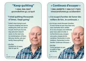
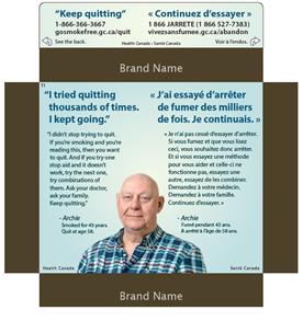
"Keep quitting"
1-866-366-3667
gosmokefree.gc.ca/quit
"I tried quitting thousands of times. I kept going."
"I didn't stop trying to quit. If you're smoking and you're reading this, then you want to quit. And if you try one stop aid and it doesn't work, try the next one, try combinations of them. Ask your doctor, ask your family. Keep quitting."
- Archie
Smoked for 43 years.
Quit at age 58.
The reaction of participants across the age groups ranged from negative to positive. While the testimonial approach in this HIM resonated with participants, the message itself elicited both positive and negative feedback. Those reacting positively described the teaser as attention-grabbing because it is positive and encouraging, and said it motivated them to read the main text. The teaser was also described as encouraging because it relates a personal success story and reminds them that there are smoking cessation options that can succeed.
Those who reacted negatively described the teaser as cliché. The main message, in their view, is discouraging or depressing. It serves to remind them of how difficult it is to quit while at the same time provides no new information on how to successfully quit smoking. Participants often commented that it would have been helpful to include information about how 'Archie' quit smoking. As well, the specification concerning the length of time 'Archie' smoked elicited mixed reactions. Some found it is encouraging because it makes them think that if he can do it so can they. Others found it depressing, noting how long it took him to quit. On one point there was widespread agreement: the line, 'I tried quitting thousands of times', lacks credibility.
Participants were virtually unanimous in their agreement that the quitline and website information are noticeable in both the FT and SS formats and that the picture complements the message. Many observed that the individual in the photo looks like an ordinary person, which makes it easy to relate to him and his story. While the text is clear, most participants felt that the main message in both languages is too long and that the background colours are drab. Some who reviewed the FT version also said that the font size of the testimonial is too small.
The effectiveness of this HIM in motivating people to think about quitting is limited by the fact that it appears to target smokers who are already actively trying to quit. Those participants who said they are not trying to quit smoking felt that the HIM was not at all relevant (because they are not currently thinking about quitting smoking).
The two suggestions offered with some frequency were to the shorten the main text (i.e. the testimonial) and to use more vibrant colours in the background of the HIM. Suggestions for improvements offered less frequently, sometimes by only one or two participants, include the following:


"I quit to save money"
"I quit to save money, but the majority of the positive effects were my health."
"Food tastes better, my sense of smell is back. I have a lot more energy and I'm a lot more
productive. I don't feel like a prisoner in my own life, I have control."
- Jennifer
Smoked for 20 years.
Quit at age 36.
1-866-366-3667
gosmokefree.gc.ca/quit
Participants' reaction to this HIM was generally positive primarily because it focuses on the financial benefits of quitting smoking. This was the reason the teaser was routinely described as attention-grabbing and as a motivator to read the rest of the HIM. While many participants noticed the additional benefits of quitting (e.g. food tasting better, sense of smell returning), these tended to be seen as less relevant. The testimonial approach also resonated with participants because it is relatable.
Critical feedback was directed mainly at the colour scheme, which was routinely described as poor, dull, or drab. In addition, participants tended to comment that the quitline and website information are not noticeable, especially in the SS version. While there was widespread agreement that the picture complements the message, it was sometimes observed that the woman's pose gives the impression that she is pregnant because it is the typical stance taken by pregnant women depicted on cigarette packages.
While the text is easy to read, the message was sometimes described as mixed because the teaser refers to monetary savings, but the main text emphasizes other benefits (i.e. health, sense perception, control, productivity). Some participants said this weakens the overall effectiveness of the HIM, explaining that they were drawn in by the teaser but lost interest when the focus shifted in the main message.
To the extent that this HIM motivated people to think about quitting, it is primarily by making them reflect on the potential monetary savings. That being said, it was also suggested that monetary savings is a benefit of quitting smoking, but typically not the reason people quit smoking.
The two suggestions offered with some frequency were to use more vibrant background colours and to move the quitline and website information to the teaser, especially in the SS version. Other suggestions for improvements include the following:
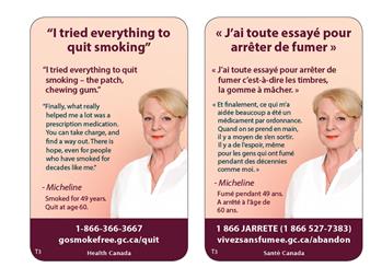
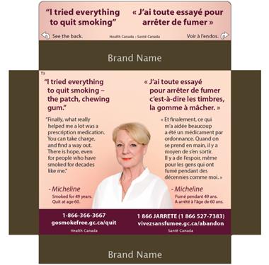
"I tried everything to quit smoking"
"I tried everything to quit smoking - the patch, chewing gum."
"Finally, what really helped me a lot was a prescription medication. You can take charge, and
find a way out. There is hope, even for people who have smoked for
decades like me."
- Micheline
Smoked for 49 years.
Quit at age 60.
1-866-366-3667
gosmokefree.gc.ca/quit
Reaction to this HIM tended to be critical primarily because of its focus on prescription medications as a way to quit smoking. Participants routinely reacted negatively to what they perceived as promotion or endorsement of prescription medications as the way to quit smoking, with many suggesting that this is simply replacing one form of dependence with another. Some described the focus on prescription medications as depressing, suggesting that the overall message in this HIM is defeatist because it amounts to saying, when all else fails you can turn to medication. Others described the focus on prescription medications as disappointing, explaining that the teaser stimulated their curiosity about various quit options, but that the main text focuses on one solution. Finally, the effectiveness of prescription medication was called into question by some participants who either have first-hand experience or know people who have tried medication.
The colour scheme in this HIM elicited widespread critical feedback, with participants describing it as washed out or dull. While the text was viewed as clear, some noted that a lot of words are used to say very little given its focus on prescription medications. It was also observed in Montreal that the French teaser and the message contains a grammatical error (i.e. 'J'ai tout essayé'). Reaction to the picture tended to be neutral, though there was widespread agreement that it is appropriate given that it is the picture of the person whose testimonial it is.
Positive reaction to this HIM was based mainly on the use of the testimonial approach, which resonated with participants. The approach is relatable because it is personalized.
Although of limited effect, the reference to prescription medication was the element in this HIM most likely to motivate people to think about quitting.
A number of suggested improvements were offered, including using more vibrant background colours, downplaying/removing the focus on prescription medications, and moving the quitline and website information to the teaser in the SS version. Other suggested improvements were offered infrequently and include:
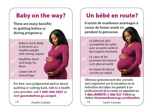
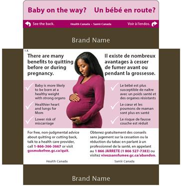
Baby on the way?
There are many benefits to quitting before or during pregnancy.
For free, non-judgmental advice about quitting or cutting back, talk to a health
are provider, call 1-866-366-3667 or visit gosmokefree.gc.ca/quit.
Reaction to this HIM was mixed, with design features eliciting positive feedback and content tending to elicit neutral feedback. Most participants said that this HIM does not apply to them because it targets pregnant women and women thinking of having a baby. As a result, they routinely observed that the messaging does not resonate with them. The exception was the reference to 'free non-judgemental advice from a health care provider' which many noticed and described as relevant to all smokers. Despite its perceived lack of relevance, participants reacted positively to various design-related features of this HIM:
As a result, participants, primarily young adults, said that this HIM would resonate with them if they were planning a family. Some, however, questioned the credibility of the statement about healthy birth weight based on their own experience or the experience of smokers they know. For instance, participants who smoke have had healthy birth weight babies or know smokers who have; conversely, participants also know or have heard about non-smokers who have had low birth weight babies. Others found the information in the message too general for the HIM's target audience.
The improvement that was consistently suggested was to move the quitline and website information to the teaser in the SS version. Other suggestions for improvement include the following:
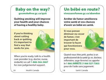
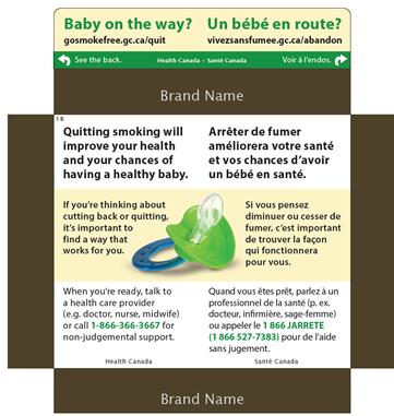
Baby on the way?
gosmokefree.gc.ca/quit
Quitting smoking will improve your health and your chances of having a healthy baby.
If you're thinking about cutting back or quitting, it's important to find a way that works for you.
When you're ready, talk to a health care provider (e.g. doctor, nurse, midwife) or call 1-866-366-3667 for non-judgemental support.
Participants' reaction to this HIM was generally mixed, ranging from negative to indifferent, to somewhat positive. Most participants said that this HIM does not resonate with them because it targets pregnant women and women thinking of having a baby. In addition, it was suggested that its relevance is limited by the vagueness and generality of the information provided. The exception was the reference to 'non-judgemental support', which was noted as being relevant to all smokers. That said, a few participants felt that 'non-judgemental' is redundant, that support by its very nature should be non-judgemental.
Despite its lack of relevance, some participants reacted positively to various features of this HIM:
Participants, particularly young adults, sometimes said this HIM would resonate with them if they were planning a family. At the same time, though, some also re-iterated that they found the information too general.
The main suggested improvement for this HIM was to move the quitline to the teaser in both the SS and FT versions. Other suggested improvements include the following:
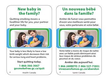
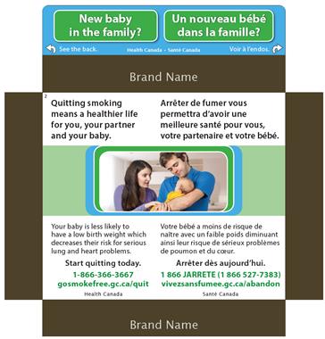
New baby in the family?
Quitting smoking means a healthier life for you, your partner and your baby.
Your baby is less likely to have a low birth weight which decreases their risk for serious lung and heart problems.
Start quitting today.
1-866-366-3667
gosmokefree.gc.ca/quit
Participants' reaction to this HIM ranging from neutral or indifferent to negative. Most participants said that this HIM does not resonate with them because it targets couples expecting or thinking of having a baby. In addition to its lack of relevance, the message did not resonate for the following reasons:
While the picture was not considered at odds with the message in the text, it was routinely criticized for being cliché or appearing too much like a 'stock' photo, in the genre of a pharmaceutical ad. It was also suggested that the mother and father do not look like 'ex-smokers' to the extent that they do not show any visible signs often associated with smoking, such as harm to skin and teeth.
The feature of this HIM most likely to generate positive feedback was the teaser in the SS version, which was routinely described as attention-grabbing because of the vibrant colour scheme (i.e. blue and green), the use of a road sign to indicate a baby on the way, and its formulation as a question followed by the words 'See the back'. Despite critical feedback on the content of the message, the text itself was described as clear and easy to understand.
This HIM was more likely to be effective in motivating youth and young adults to think about quitting smoking, but only if having a baby was something in their immediate or short-term plans.
The main suggested improvements for this HIM were to move the quitline and website information to the teaser in the SS version and to show the baby's face and the mother smiling in the picture. Other suggested improvements include the following:
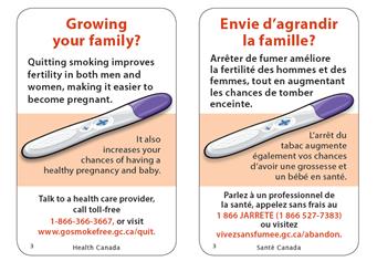
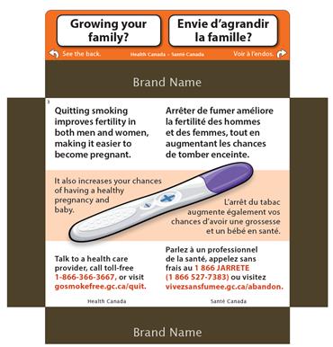
Growing your family?
Quitting smoking improves fertility in both men and women, making it easier to become pregnant.
It also increases your chances of having a healthy pregnancy and baby.
Talk to a health care provider, call toll-free 1-866-366-3667, or visit www.gosmokefree.gc.ca/quit.
Participants' reaction to this HIM ranged from mildly positive, to neutral to mildly critical. Most participants think this HIM does not apply to them because it targets couples thinking of having a baby. In particular, men did not recognize that smoking affects their fertility, as well as that of women. As a result, they routinely noted that the messaging does not resonate with them. Despite its lack of relevance, participants reacted positively to various features of this HIM:
Participants, particularly young adults, sometimes said that this HIM would make them think about quitting smoking if they were planning a family.
The one suggestion routinely offered was to move the quitline and website information to the teaser in the SS version. Other suggested improvements include the following:
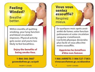
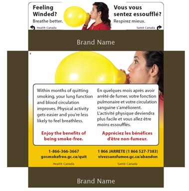
Feeling Winded?
Breathe better.
Within months of quitting smoking, your lung function and blood circulation improves. Physical activity gets easier and you're less likely to feel breathless.
Enjoy the benefits of being smoke-free.
1-866-366-3667
gosmokefree.gc.ca/quit
Participants' reaction to this HIM was consistently positive and generally based on the following:
While the information is not new to most of the participants, it was often observed that it is a reminder that the condition from which they may suffer can improve within a relatively short time period. As a result, it also motivates them to think about quitting smoking.
The main criticism of this HIM is that the quitline and website information are not visible enough in either package format (i.e. SS and FT). A few participants also felt the picture is too lighthearted.
As with many of the HIMs, participants often suggested that moving the quitline and website information in both the SS and FT versions to the teaser would improve the HIM. Some also added that this information should be placed in the balloon. Other suggested improvements include the following:
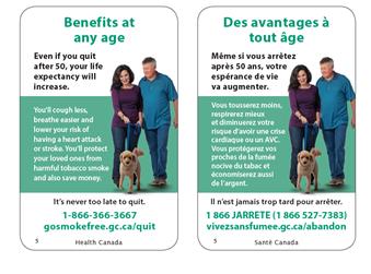
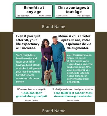
Benefits at any age
Even if you quit after 50, your life expectancy will increase.
You'll cough less, breathe easier and lower your risk of having a heart attack or stroke. You'll protect your loved ones from harmful tobacco smoke and also save money.
It's never too late to quit.
1-866-366-3667
Overall reaction to this HIM was mixed and tended to vary by age. There was widespread positive reaction to the teaser, with participants describing it as attention-grabbing and saying that it motivated them to read the rest of the message out of curiosity. In the SS version, the colour scheme in the teaser (i.e. black text on white against a green background) was also identified as attention-grabbing.
Opinions differed, however, regarding the main message. Participants often observed that the teaser refers to 'benefits at any age' while the main message focuses on benefits to those over 50. As a result, the message was more likely to resonate with older adults than with young adults who no longer felt targeted by the HIM. While there was a consensus that the text is clear and easy to read, participants at least 25 years of age were much more likely to feel engaged by the message. The exception was the reference to saving money, which resonated with participants of all ages.
Reaction to the picture tended to be neutral, with the general impression being that it complements the main text better than the teaser because it depicts an older looking couple. That being said, some observed that the woman does not look over 50 and a few participants questioned the inclusion of a dog. Those who reacted critically to the picture suggested that it is cliché in the genre of a pharmaceutical ad.
This HIM was more likely to be effective in motivating older smokers to think about quitting smoking because of its focus on the benefits of quitting after 50. By contrast, some young adults suggested that this message could give younger smokers the impression that they have time before they need to think about quitting. The reference to saving money was the only aspect that made both younger and older smokers think about quitting smoking.
The main suggestion to improve this HIM was to move the quitline and website information to the teaser in the SS version. Other improvements offered include the following:
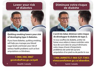

Lower your risk of diabetes
Quitting smoking lowers your risk of developing type 2 diabetes.
If you have diabetes, quitting smoking will help you manage your blood sugar levels and lower your risk of serious health problems such as foot amputations or blindness.
Participants' reaction to this HIM was mixed, with many reacting positively to the message but critically to the picture. Positive feedback on the message focused on the reference to diabetes. This reference to diabetes in the teaser was routinely identified as attention-grabbing and a motivator to read the message. The references in the message to possible amputation and blindness resulting from diabetes were often identified as noticeable and memorable, with several participants commenting that this has affected them or someone they know. In terms of the credibility of the information, most participants thought it was credible. A few participants noted that the focus on amputations, or what they referred to as 'worst case' or 'extreme' scenarios, affects the credibility of the HIM.
Reasons explaining why this HIM resonates included the novelty of the information and a connection to, or experience with, diabetes. This includes being diabetic, having susceptibility to it based on family history or lifestyle, or having friends with diabetes. It was also sometimes observed that the focus on diabetes is different from what one usually sees in terms of HIMs (e.g. a focus on cancer, strokes). In other words, the focus on diabetes is a novel approach. On the other hand, some participants said the message is not relevant to them because they do not have diabetes. The newness of the information and some personal experience related to diabetes were the reasons given to explain the effectiveness of this HIM in motivating one to reflect on quitting smoking.
The text in this HIM was generally described as clear, easy to read and short. A few suggested, however, that the intended audience is unclear: is it all smokers, smokers at risk of diabetes, smokers with diabetes, or all three?
Critical reaction to this HIM focused primarily on the picture, which was routinely described as weak. This included the impression that it looks like a stock photo that conveys nothing meaningful and the impression that the apparent smile on the man's face is inappropriate given the seriousness of the message. Some participants did not immediately notice the stethoscope around the physician's neck and were confused about what the image is trying to convey until they realized the second individual is a physician. While not critical of the background colour, some participants in Montreal said they associate it with a provincial alcohol distributor. In a few of the English groups, it was noted that the background colour could be associated with a national bank (both use a similar shade of red/burgundy).
The two suggestions offered with some frequency were to change the picture or adjust it so that the physician's face is seen and to move the quitline and website information to the teaser in the SS version. Other suggestions for improvements include the following:
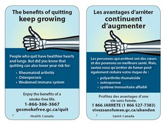
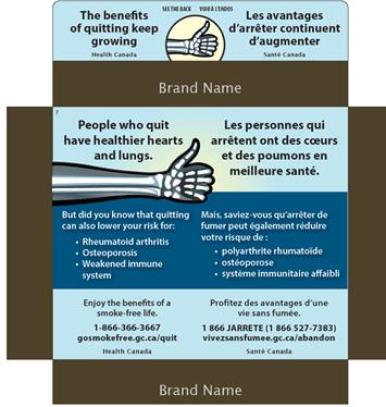
The benefits of quitting keep growing
People who quit have healthier hearts and lungs.
But did you know that quitting can also lower your risk for:
• Rheumatoid arthritis
• Osteoporosis
• Weakened immune system
Enjoy the benefits of a smoke-free life.
1-866-366-3667
gosmokefree.gc.ca/quit
Participants' reaction to this HIM ranged from neutral to critical but similar reasons underlie these reactions. One reason was confusion concerning the link between the teaser and the picture. To the extent that both were described as attention-grabbing, it was often because of curiosity about their connection. As a result, one of the motivations for reading the text had to do with understanding the message rather than interest in the topic. A few participants did not like the image at all, describing it as weak or confusing. Those confused wondered if the image is intended to symbolize death (i.e. smoking kills) and a few participants interpreted it as a 'thumbs-up' for smoking. It was not until the full message was read that these participants understood the relevance of the picture in the teaser.
The other reason informing both neutral and critical reactions was the limited relevance of the message. This was particularly (but not exclusively) the case among young adults. These participants often described the content as lacking relevance because the conditions identified in the bullets are unknown/unclear to them or strike them as conditions that affect people later in life. Young adults also tended to describe the colours as drab.
Positive reaction to this HIM was based mainly on the teaser, which was described as attention-grabbing because of curiosity regarding the benefits that keep growing, and the newness of the information regarding osteoporosis and rheumatoid arthritis. Some participants, especially younger ones, did not know that osteoporosis and rheumatoid arthritis are related to smoking in any way. While awareness of the connection between smoking and the immune system was slightly higherFootnote 7, this was new information to a number of participants. Others characterized the content itself as 'novel' in the sense that they could not recall having seen HIMs that emphasize the effect of smoking on the immune system.
This HIM was more likely to be effective in motivating older smokers to think about quitting than young adults, though its general effectiveness in this regard was described as limited.
To improve this HIM, participants often suggested replacing the image with something that relates more directly to the message and moving the quitline and website information to the teaser in the SS version. Other suggested improvements include the following:
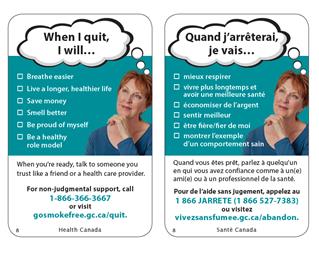

When I quit,
I will…
When you're ready, talk to someone you trust like a friend or a health care provider.
For non-judgmental support, call 1-866-366-3667 or visit gosmokefree.gc.ca/quit.
Participants' reaction to this HIM ranged from neutral to positive. Participants reacted positively to the teaser, describing it as attention-grabbing in terms of content and design. The content is attention-grabbing because it involves a thought-process that leaves the reader hanging, motivating them to read on. The style is attention-grabbing because use of a thought bubble is unconventional and draws one to read the text in it. Other features to which participants reacted positively include the use of check boxes, easy to read text, the emphasis on immediate/short-term effects of quitting smoking, and the availability of non-judgemental support. While the information is not new, it was sometimes described as a good reminder of things they know.
Neutral reactions were more evident among young adults. Reasons include the impression that the HIM targets an older audience because of the picture of a seemingly middle age woman, the focus on the future (suggesting to some young adults that they still have time before quitting), and specific references to breathing easier and being a role model, which were seen as more relevant to older people. That said, some older adults reacted critically to the last two bullets, describing them as judgemental and based on the assumption that smokers are poor role models and lack self-pride. The picture tended to elicit neutral reactions but was considered appropriate.
The reference to saving money was most likely to make participants think about quitting.
Suggested improvements include the following:
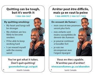
Quitting can be tough, but it's worth it
1-866-366-3667
By quitting smoking:
• My heart and lungs will be stronger
• My children are less likely to become smokers
• I'll be able to keep working hard
• I can reward myself with the money saved
You've got what it takes.
Don't quit quitting!
gosmokefree.gc.ca/quit
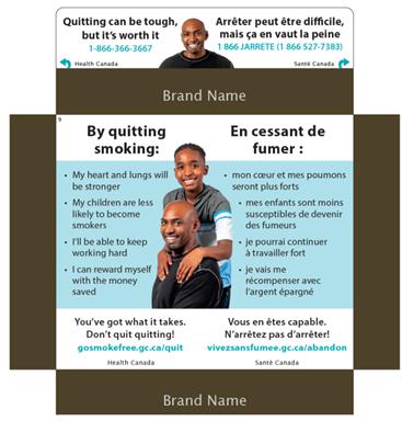
Reaction to this HIM was mixed, with design features eliciting positive feedback and content tending to elicit neutral feedback. The picture of the man on the SS front flap was seen to be effective in attracting attention and resulting in interest to read further. However, the teaser was not noted as particularly attention-grabbing, nor does it motivate people to read the rest of the message. Some participants said this is because the teaser is too cliché or slogan-like, while others said it is a depressing reminder of how difficult it is to quit smoking.
The effectiveness of the message in motivating people to think about quitting was described as limited for two reasons. One reason is the impression that it targets parents with young children and older smokers, making it irrelevant to anyone outside these audiences. This is based on the picture depicting a father and son and the specific reference to 'my children' in the bullet '…are less likely to become smokers'. The other reason is that the benefits of quitting do not tend to resonate. Indeed, the only benefit routinely identified as likely to motivate a smoker to think about quitting is the money that will be saved. While some said the reference to children being less likely to smoke if their parents don't smoke motivates them to think about quitting, others questioned the credibility of this statement either because their own parents do not smoke or because they know children who do not smoke despite the fact that their parents do smoke. The reference to being able to keep working hard tended to elicit criticism, with many suggesting that this is not a reason to quit smoking.
Despite its lack of relevance, participants reacted positively to various features of this HIM:
The two suggestions offered with some frequency were to move the website information to the teaser in both the SS ad FT versions and to remove the reference to being able to keep working hard. Other suggested improvements include the following:
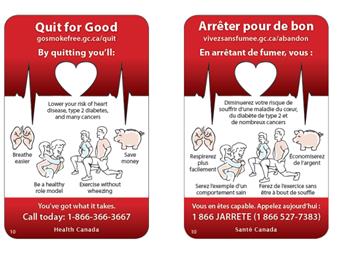
Quit for Good
gosmokefree.gc.ca/quit
By quitting you'll:
Lower your risk of heart disease, type 2 diabetes, and many cancers.
Breathe easier, be a healthy role model, exercise without wheezing, save money.
You've got what it takes.
Call today: 1-866-366-3667
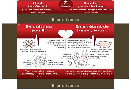
Reaction to this HIM was mixed. There was widespread agreement that it is unconventional in terms of design (which was considered a strength) but reaction to various design features varied. The background colour was described by some as vivid and attention-grabbing, but others found the strong red colour too aggressive. The pictures tended to elicit positive reaction because of their unconventional nature, but their display was often described as disorienting, making it hard to focus. This issue was more likely to be raised by participants reviewing the SS version who sometimes observed that the inclusion of both English and French text adds to the confusion. The depiction of a cardiogram and a heart routinely elicited positive reactions.
Reaction to the teaser varied as well. Some participants described it as attention-grabbing because of the colour contrast (i.e. white text on a red background). While others described the teaser as attention-grabbing because it is short and forceful, some participants said it is not captivating because it is too cliché. As a result, participants disagreed about the extent to which the teaser motivated them to read the rest of the text.
The text was routinely described as clear and credible, although some found the font too small. In terms of content, some liked the range of benefits covered, while others described them as things they know already. In addition, some liked the focus on the benefits of quitting, but others said they would prefer a focus on ways to quit smoking. Finally, a few participants did not like the text, "being a healthy role model", which suggested to them that smokers are not good role models. While there was a consensus that the content is a good reminder of the benefits of quitting, the only aspect likely to motivate people to think more about quitting is the reference to saving money.
Three suggestions were offered with some frequency:
The only other suggestion to improve the HIM was to create two versions: one that focuses on ways to quit and one that focuses on the benefits of quitting.
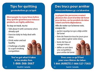
Tips for quitting
gosmokefree.gc.ca/quit
Most people try many times before they quit for good because tobacco products are highly addictive.
To stay on track, try to:
• Talk about it with someone who's already quit
• Exercise daily to help deal with stress
• Drink water and eat healthy
• Challenge a buddy to a quit smoking competition
You've got what it takes to be smoke-free.
1-866-366-3667
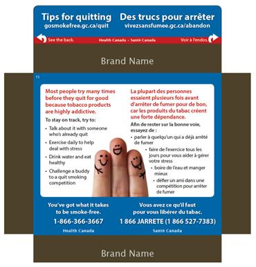
Participants' reaction to this HIM tended to be neutral or indifferent. While specific design-features were described as attention-grabbing (i.e. the colour scheme of the teaser in the SS version and the red text in both versions), this HIM did not tend to resonate with participants. Two reasons were often given to explain its limited resonance and relevance. First, because participants are not thinking about quitting, the teaser is not attention-grabbing and does not motivate them to read the text. Second, while the suggestions were identified as good in the sense that they focus on things that are easy to do, they are relevant primarily as a reminder of things they know already. That said, some identified the tips in the first and last bullet as new information.
While the text is clear, credible, and easy to read, some participants suggested that it is too long. Reaction to the picture tended to be neutral. While not seen as conveying a message at odds with the text, many were unclear about what the picture represents. A few participants characterized the picture as 'silly'.
Some indicated that this HIM would be relevant to them if they were thinking of quitting smoking. However, others said that this HIM would still not be relevant to them even if they were planning on quitting because they know what they have to do.
To improve this HIM, participants often suggested moving the quitline information to the teaser, including a better/more relevant picture (e.g. people engaged in an activity; a broken cigarette), and using more vivid or brighter background colours. Other suggested improvements include the following:
Have better sex
Quitting smoking lowers your risk of erectile dysfunction.
Don't be a limp dick, quit smoking.
1-866-366-3667
gosmokefree.gc.ca/quit
Augmenter votre performance au lit
Arrêter de fumer diminue votre risque de dysfonction érectile.
Évitez la panne, arrêtez de fumer.
1 866 JARRETE (1 866-527-7383)
vivezsansfumee.gc.ca/abandon
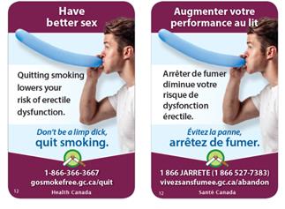
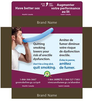
This HIM routinely elicited spontaneous reactions (typically laughter) and overall impressions were positive because of its unconventional nature and use of humour. The message in the teaser was consistently described as attention-grabbing because it is uncommon and unexpected on a cigarette package. As a result, it motivated participants to read the rest of the message. Features of the main message described as attention-grabbing and memorable include the picture and the phrase 'Don't be a limp dick'/'Évitez la panne', though the English version of this phrase was more likely to be described as memorable (a point also made by some bilingual Francophone participants). The picture was described by some as sexually suggestive, but it was not considered inappropriate and it was routinely described as complementing the text.
Despite its attention-grabbing nature, there was a widespread impression that this HIM lacks relevance, in particular, to women. Specifically, both male and female participants were of the opinion that it targets men, and some young adult males thought that it targets older men. Moreover, while male participants felt this HIM addresses them, erectile dysfunction (ED) is not an issue that concerns them because they say they do not experience it. Some also added that if ED becomes a problem there are medications to treat the condition. To the extent that it was considered effective in getting participants to think about quitting smoking it is because it focuses on a single issue or problem not usually associated with smoking.
Design features that generally elicited positive feedback included the short, easy to read text and the colour scheme. While not critical of the background colour, some participants in Montreal said they associate it with the provincial alcohol distributor (both use a similar shade of red/burgundy).
The main suggestion to improve this HIM was to move the quitline and website information to the teaser in the SS version. Other suggested improvements include the following:
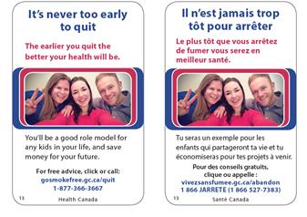
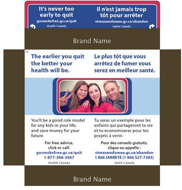
It's never too early to quit
The earlier you quit the better your health will be. You'll be a good role model for any kids in your life, and save money for your future.
For free advice, click or call:
gosmokefree.gc.ca/quit
1-877-366-3667
Il n'est jamais trop tôt pour arrêter
Le plus tôt que vous arrêtez de fumer vous serez en meilleur santé. Tu seras un exemple pour les enfants qui partageront ta vie et tu économiseras pour tes projets à venir.
Pour des conseils gratuits, clique ou appelle :
vivezsansfumee.gc.ca/abandon
1 866 JARRETE (1 866-527-7383)
Reaction to this HIM tended to be critical or neutral for the following reasons:
Features that elicited positive reactions included the placement of the website address in the SS version of the teaser, the connection between quitting early and better health, and the references to free advice, monetary savings, and being a role model. With the exception of the last two, all of these features were more likely to be identified by young adults than by older adults. The only feature typically identified as effective in motivating one to think about quitting smoking was the reference to monetary savings, although some participants also described the reference to 'being a role model' as motivational in this regard.
It should be noted that the reference to 'being a good role model' elicited both positive and negative reactions from participants. As mentioned above, the phrase was perceived a motivational by some participants. For many participants, however, the role model reference was viewed a judgemental and not a reflection of reality. These participants felt that smoking does not preclude them from being a leader in various areas of their lives and a role model for others.
The two suggestions offered with some frequency were to move the quitline text to the teaser in the SS version and to replace the photo with, for example, a family or people engaged in some activity. Other suggested improvements included the following:
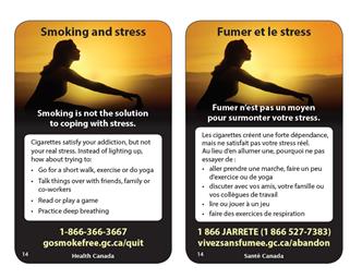
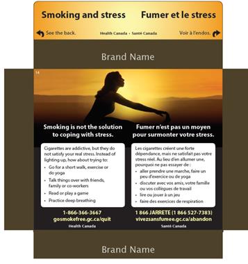
Smoking and stress
Smoking is not the solution to coping with stress.
Cigarettes satisfy your addiction, but not your real stress. Instead of lighting up, how about trying to:
• Go for a short walk, exercise or do yoga
• Talk things over with friends, family or co-workers
• Read or play a game
• Practice deep breathing
1-866-366-3667
gosmokefree.gc.ca/quit
Participants' reaction to this HIM ranged from neutral to positive. While the teaser, picture, and design features of this HIM elicited positive reactions, the content tended to elicit neutral reactions. Positive reaction to the teaser was based on its attention-grabbing design and content. In terms of design, participants routinely drew attention to the background colours, which they characterized as unconventional and unexpected for a cigarette package. The content was described as attention-grabbing because it focuses on a theme not usually addressed on cigarette packages but relevant to smokers. As a result, the teaser tended to motivate participants to read the rest of the message out of curiosity. Additional features eliciting positive feedback include the background colours, the picture (described as unconventional but as complementing the text), the clear, easy to understand text and use of bullets to lighten it, and the noticeable website and quitline number in the FT version.
Neutral reaction to the content was based mainly on the fact that it contains no new information. Proposed tips include things participants do already to cope with stress (e.g. deep breathing), things they have tried but which do not work, or things they do while smoking and which are therefore not viable alternatives to smoking. In addition, some participants noted that they do not experience stress so this HIM does not apply to them.
Despite participants' general ambivalence toward the content, positive and negative feedback was also offered by some participants. Positive reaction to the message was based mainly on the impression that it serves as a reminder of things they know. Critical reaction to the content was limited and based on the impression that the message should focus on fighting addiction not stress, and also that there should be a reference to understanding what triggers stress.
Suggested improvements included the following:
In addition, many participants felt the quitline information would be more effective if it was moved to the teaser in the SS version.
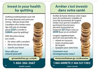
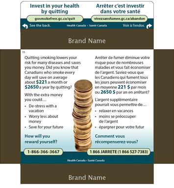
Quitting smoking lowers your risk for many diseases and saves you money. Did you know that
Canadians who smoke every day will save on average about $221 a month or $2650 a year by quitting?
With the extra money you could…
• De-stress with a vacation
• Worry less about money
• Save for your future
How will you reward yourself?
gosmokefree.gc.ca/quit
1-866-366-3667
Feedback on this HIM was consistently positive, primarily because of its focus on monetary savings. The following points were routinely made:
The only criticisms of this HIM were the following: the reference to health is superfluous given that the emphasis is on financial savings, and the reference to people who smoke 'every day' is too general (i.e. it could mean anything from one cigarette a day to one pack a day; the difference would obviously affect the amount of money saved by a someone who quits smoking cigarettes).
In addition to moving the quitline information to the teaser in the SS version, the main suggestion for improvement was to change the teaser to: 'How will you reward yourself? and 'Arrêtez c'est économiser'. Other suggestions included the following:
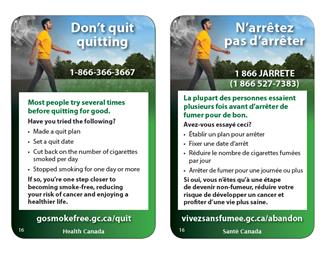
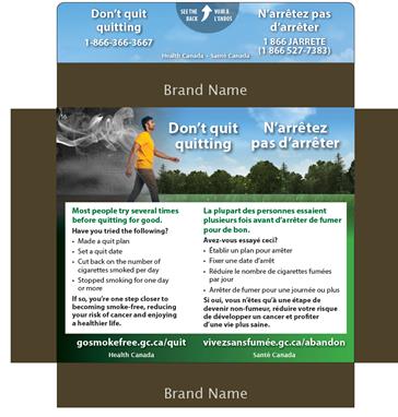
Don't quit quitting
1-866-366-3667
Most people try several times before quitting for good.
Have you tried the following?
• Made a quit plan
• Set a quit date
• Cut back on the number of cigarettes smoked per day
• Stopped smoking for one day or more
If so, you're one step closer to becoming smoke-free, reducing your risk of cancer and enjoying a healthier life.
gosmokefree.gc.ca/quit
Long description goes here
Participants' reaction to this HIM ranged from neutral or indifferent to positive. While participants reacted positively to various design features of this HIM, reaction to its content varied. Participants, particularly young adults, reacted positively to the following features of this HIM:
Reaction to the content varied from positive to indifferent/neutral. Positive reactions were based on the impression that the message is encouraging and helpful. This includes the impression that the teaser and the main text recognize effort and the difficulty of quitting and that the main text provides helpful advice in a non-moralizing way. Neutral/indifferent reactions were based on the impression that the teaser is cliché, that the main text provides no new/helpful information, and that the messaging is not relevant because it targets people who are already thinking about quitting. A few participants said that the HIM contains too much text.
Some indicated that this HIM would motivate them to think about quitting smoking if and when they were ready to do so. Others said it would not because when they decide to quit they expect to do so cold turkey (i.e. they need no advice).
The two suggestions offered with some frequency were to move the website information to the teaser in the SS version and to remove the reference to cancer in the last sentence. Other suggestions include the following:
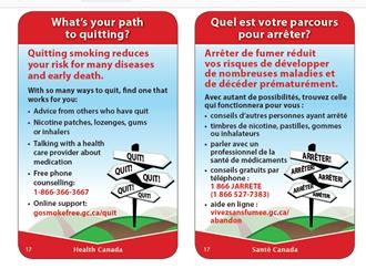
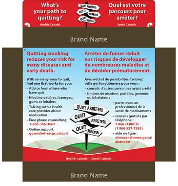
What's your path to quitting?
Quitting smoking reduces your risk for many diseases and early death.
With so many ways to quit, find one that works for you:
• Advice from others who have quit
• Nicotine patches, lozenges, gums or inhalers
• Talking with a health care provider about medication
• Free phone counselling: 1-866-366-3667
• Online support: gosmokefree.gc.ca/quit
Reaction to this HIM tended to be critical for the following reasons:
While the text was routinely described as clear, a few participants in Montreal were unclear about the meaning of 'inhalateurs' in the context of smoking, and it was suggested that it could be confused with an e-cigarette which is sometimes promoted as a way to quit smoking.
The effectiveness of this HIM in motivating people to think about quitting is limited by the fact that it targets smokers who are considering quitting or who have decided to quit.
To improve this HIM, participants often suggested moving the quitline and website information to the teaser in the SS version, removing the first sentence in bold red font, and changing the red text to something equally vibrant but more enticing, such as green. Other suggestions include the following:
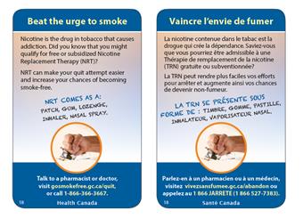
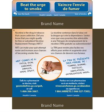
Beat the urge to smoke
Nicotine is the drug in tobacco that causes addiction. Did you know that you might qualify for free or subsidized Nicotine Replacement Therapy (NRT)?
NRT can make your quit attempt easier and increase your chances of becoming smoke-free.
NRT COMES AS A: PATCH, GUM, LOZENGE, INHALER, NASAL SPRAY.
Talk to a pharmacist or doctor, visit gosmokefree.gc.ca/quit, or call 1-866-366-3667.
Overall, participants' reaction to this HIM ranged from neutral to positive. The teaser in this HIM was the element most likely to elicit positive reactions. It was described as attention-grabbing because the yellow text on blue background makes it stand out and because it is a forceful statement suggesting that solutions will follow. The attention-grabbing nature of the teaser was enhanced in the SS version by framing and the words 'See the back', described by some as motivating them even more to read the rest of the message out of curiosity. A few participants said that the text of the teaser lacked relevance to the main message of the HIM, which they characterized as free or subsidized NRT.
Neutral reactions focused mainly on the design and content. Regarding the design, participants found it boring and conventional and described the background colours as drab. In addition, the picture of a hand crushing a package of cigarettes was unclear to some participants while others said it was too small. The use of a noticeably different font type for the text describing forms of NRT was puzzling to some participants and off-putting to others. With respect to the content, participants said the message is disappointing because it focuses on only one solution to quitting smoking-NRT. Some participants felt that the reference to nicotine as the addictive element in tobacco is superfluous.
While reaction to the message in general tended to be neutral, the focus on NRT elicited mixed feedback. Some reacted positively, describing this information on NRT as new and useful, particularly if NRT is free or subsidized. Negative or critical reactions were based on unsuccessful experiences using NRT (some participants had tried NRT, or knew someone who had) and the impression that it replaces one form of dependence with another.
The effectiveness of this HIM in getting participants to think about quitting also tended to be linked to NRT. Some said the possibility that it might help them makes them think about quitting, while others said their experience with NRT or that of others they know makes the HIM ineffective in this regard. Others said simply that the HIM is not effective in getting them to think about quitting because they are not interested in quitting smoking at this time.
The three suggestions routinely offered were moving the quitline and website information to the teaser in the SS version, making the quitline and website address more visible in the FT version by increasing the font size, and removing the first sentence in the message: 'Nicotine is the drug in tobacco that causes addiction'. Other suggestions include the following:
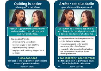

Quitting is easier when you're not alone
Positive support from family, friends and co-workers can help you quit and stay smoke-free.
You can ask others to:
• Avoid smoking around you
• Encourage you to stay positive, especially during 'slip-ups'
• Help you with smoking triggers such as stress
1-866-366-3667
Tobacco is the single most preventable cause of premature death.
This HIM elicited mixed reactions from participants. Feedback tended to be positive in relation to design features, neutral in relation to the picture of the two women, and indifferent or critical in relation to content. Positive feedback on the design focused on the teaser and layout of the HIM. The teaser in the SS versionFootnote 8 was described as attention-grabbing because of its colour scheme, with some noting that it contrasts well with the outside of the cigarette pack (recall that the HIMs were presented on SS packages that used plain packaging design).
Regarding the layout, participants said that the HIM is well balanced and that the message flows well from top to bottom. The text uses a good font size and is not too long. In addition, the use of bullets helps break up the text, which makes the content easy to read. A few participants thought that the text in the FT version would benefit from being made larger by reducing the size of the picture.
The picture tended to elicit indifferent or mildly critical reactions. It was routinely described as generic (e.g. it looks like a stock photo), and while some participants described it as conveying the same meaning as the text, others felt that it conveys no particular meaning at all. A few noted that the picture includes members of visible ethno-cultural groups, which was viewed favourably.
The message itself did not tend to resonate with participants for the following reasons:
As a result, this HIM does not tend to motivate participants to think about quitting.
A few participants said that the concept of the HIM is relatable. They liked the focus on not being alone and building a support system. This was viewed as appealing. Some added that the support system should include current and former smokers, not just non-smokers who do not understand the challenges associated with quitting smoking.
The two suggestions offered with some frequency related to the quitline and the photo. Participants suggested moving the quitline text to the teaser in the SS version and adding the website to both the SS and FT versions, as well as replacing the photo of the two women with one that includes a number of people. Other suggestions include the following:
This was not the case for the FT version of the HIM. The teaser text is not boxed-off with a separate background colour.
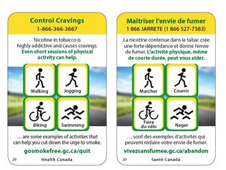
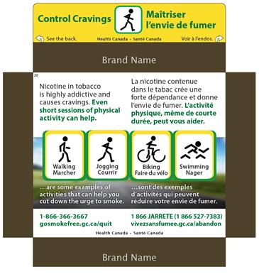
Control Cravings
1-866-366-3667
Nicotine in tobacco is highly addictive and causes cravings. Even short sessions of physical activity can help.
Walking, jogging, biking, swimming
… are some examples of activities that can help you cut down the urge to smoke.
gosmokefree.gc.ca/quit
This HIM elicited positive reaction to the teaser and design features, and mixed reactions to content. Positive reaction to the teaser was based on its being attention-grabbing in both design and content. In terms of design, participants tended to draw attention to the colour contrast (i.e. green text on a yellow background). The content was described as attention-grabbing because it is a short forceful message that focuses on a phenomenon commonly experienced by smokers. As a result, the teaser motivated participants to read the rest of the message out of curiosity. Additional features eliciting positive feedback include the background image in the FT version, the use of stick figures depicting activities (described as unconventional), short and easy to read text, and the noticeable quitline information in the FT version (the quitline number in the teaser and the website at the bottom of the HIM).
Regarding the stick figures, while this was viewed by many as a positive feature, a small number of participants likened them to signs found in parks on recreational trails and that the stick figures are reminiscent of park signs which did not resonate with these participants.
Reactions to the content ranged from neutral to positive. Positive reactions were based on the solution-oriented focus of the information and specific reference to the fact that even short sessions of physical activity are helpful. Neutral reactions were based on the perception that the content is general and not necessarily appropriate for a Canadian winter, contains no new information, and that these activities will not cut down the urge to smoke. Instead, these activities are linked to their smoking behaviour. Participants explained that walking or the other activities listed in the HIM are things they do while smoking and that they smoke immediately after other activities. As a result, these suggestions do not constitute practical or relevant solutions to dealing with cravings.
The effectiveness of this HIM in terms of getting participants to think about quitting was limited for the following reasons: it contains no new information, its focus is on controlling cravings not quitting smoking, and participants are not trying to quit smoking or do not believe they experience cravings.
Suggested improvements included the following:
In addition, many participants suggested moving the quitline number and website to the teaser in the SS version, and the website the teaser in the FT version.
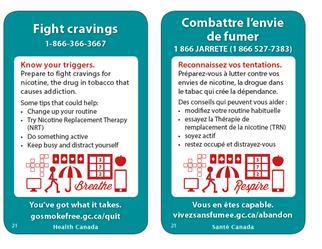
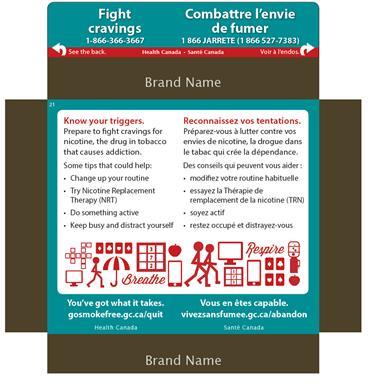
Artistic images of various activities, including a set of cards, a crossword puzzle, Sudoku, mobile phone, computer screen, stick figures jogging. There are also creative images of an apple, umbrella and water dispenser along with the words breathe and respire.
This HIM elicited positive reactions to the teaser and design features, and neutral to positive reactions to its content. Positive impressions of the teaser were based on its design and content. Participants routinely observed that the colour contrast (i.e. white text on green background) makes the teaser noticeable and that it is attention-grabbing because it is forceful and easy to relate to (i.e. smokers experience cravings). They also liked that the teaser emphasizes advance preparation in order to achieve results. For these reasons, the teaser tended to motivate participants to read the rest of the message.
Design elements typically eliciting positive feedback include the font size, the use of bullets to break up text and lighten it, and the use of symbols used to depict activities. The only criticism regarding the latter is that the meaning of a few of the symbols is not clear (e.g. the umbrella, the word 'breathe'). Some participants, however, described the design overall as too busy.
The first and last lines of the main message ('Know your triggers' and 'You've got what it takes') often prompted positive feedback. The former because it emphasizes the idea of preparing in advance, and the latter because it is encouraging. Participants offered mixed feedback on the tips to help deal with cravings. Positive impressions were based on the tone being suggestive rather than directive, and the tips being practical or actionable. On the other hand, some participants felt that the tips are too general and that the activities depicted as ways to fight cravings include things they do while smoking (e.g. playing cards, going for a walking, using their mobile phone, etc.).
As with HIM 20, Control Cravings, the effectiveness of this HIM in motivating thoughts about quitting is limited because it contains no new information and focuses on controlling cravings not quitting smoking. In addition, since participants are either not trying to quit or do not experience cravings, the HIM had limited relevance to them personally. While some said that the reference to NRT makes them think about quitting smoking, others questioned its effectiveness.
The only suggestion consistently offered was to move the website address to the teaser in both the SS and FT version. Other suggestions were mentioned infrequently and include the following:
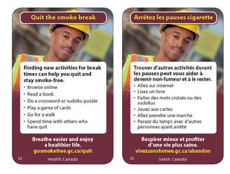

Quit the smoke break
Finding new activities for break times can help you quit and stay smoke-free.
• Browse online
• Read a book
• Do a crossword or sudoku puzzle
• Play a game of cards
• Go for a walk
• Spend time with others who have quit
Breathe easier and enjoy a healthier life.
gosmokefree.gc.ca/quit
Participants' reaction to this HIM ranged from neutral to critical. This HIM did not tend to resonate with participants for the following reasons:
Positive feedback on this HIM related mainly to design-related features. This includes the colour contrast in the teaser (yellow lettering against a dark red/burgundy background), the font size as well as the use of bullets, and the overall layout. In terms of content, some participants thought the suggestions were useful because they focus on day-to-day activities that are easy to do.
This HIM was limited in its effectiveness when it came to getting participants to think about quitting. The reasons for the HIM's limited effectiveness are that it contains no new information (i.e. nothing new to think about) and it focuses on activities that are typically done while smoking. Some also observed that the HIM is not relevant to them because they do not work, do not take breaks while at work, or do not smoke during their breaks at work.
A number of suggestions were offered to improve the HIM. The three mentioned most frequently were moving the website address to the teaser in the SS version, adding the quitline phone number in both the SS and FT versions, and replacing the photo with one that shows a person doing one of the suggested activities. Other suggested improvements include the following:
This section reports on findings related to the second type of health related message reviewed by participants: new toxic statements (TS) being considered by Health Canada. These statements appear on the side of cigarette packages and are designed to inform about the health effects and hazards of specific toxic chemicals found in tobacco and tobacco smoke. Participants were asked to comment on the content (i.e. text) as well as design elements being considered for TS.
A total of 24 potential TS were reviewed as part of the research. In order to limit the response burden placed on participants, statements were divided into four sets of six (i.e. sets A, B, C, and D). This resulted in participants in each group reviewing six TS and each set being reviewed in nine groups.
A handout containing the six TS in question was distributed to participants. They were asked to read each statement, underline any words that were not clear, answer two questions for each statement, and then circle the statement they consider most effective in terms of informing and educating about the toxic substances found in tobacco or tobacco smoke and the health effects arising from exposure to them. As part of the group discussion that followed, participants were asked specifically about the following concerning each statement: its clarity and ease of understanding, its length, its credibility, and any changes that would make it more effective.
1. Review of TS Text
Presented below are the findings, organized by set. The presentation of findings for each set begins by identifying how the statements ranked in terms of perceived effectiveness, followed by feedback on each specific statement.
Text: Set A
Table 6: Set A TS
| Set A English | Set A French |
| There is no safe level of exposure to cigarette smoke | Aucun degré d'exposition à la fumée de tabac n'est sans risques |
| Toxic chemicals in tobacco smoke enter your blood and cause damage all over your body | Les substances chimiques dans le tabac pénètrent dans votre sang et endommagent tout votre corps |
| Filters do not prevent you from inhaling toxic smoke into your body | Les filtres ne vous empêchent pas d'inhaler de la fumée toxique dans votre corps |
| Cadmium in tobacco smoke builds up in your body damaging your bones | Le cadmium dans la fumée de tabac s'accumule dans votre corps et endommage vos os |
| Tobacco smoke can damage the blood vessels in your eyes, causing blindness | La fumée de tabac peut endommager les vaisseaux sanguins de vos yeux et vous rendre aveugle |
| Hydrogen cyanide in tobacco smoke damages the cleaning system of your lungs, allowing toxins to build up | Le cyanure d'hydrogène dans la fumée de tabac empêche les poumons de se nettoyer, ce qui cause l'accumulation de toxines |
The statement 'There is no safe level of exposure to cigarette smoke' was most often rated most effective in English in terms of informing and educating about the toxic substances found in tobacco and the health effects arising from them, followed by 'Tobacco smoke can damage the blood vessels in your eyes, causing blindness'. Three other statements were almost equally likely to be rated as most effective: 'Filters do not prevent you from inhaling toxic smoke into your body', 'Hydrogen cyanide in tobacco smoke damages the cleaning system of your lungs, allowing toxins to build up', and 'Toxic chemicals in tobacco smoke enter your blood and cause damage all over your body'. The statement least likely to be rated most effective was 'Cadmium in tobacco smoke builds up in your body damaging your bones'.
There was a noticeable regional difference regarding the perceived effectiveness of 'There is no safe level of exposure to cigarette smoke'. Only a few participants in Montreal rated the French version of this statement as the most effective (i.e. 'Aucun degré d'exposition à la fumée de tabac n'est sans risques'). Participants in Montreal routinely commented that the use of double negatives makes it necessary to read the statement more than once to understand its meaning. In Montreal, the statement most likely to rank first in terms of effectiveness was 'La fumée de tabac peut endommager les vaisseaux sanguins de vos yeux et vous rendre aveugle'.'Tobacco smoke can damage the blood vessels in your eyes, causing blindness'.
There is no safe level of exposure to cigarette smoke/Aucun degré d'exposition à la fumée de tabac n'est sans risques
Routinely identified reasons for the perceived effectiveness of this statement include the following:
The only suggestion for improving this statement relates to the French version, i.e. 'Aucun degré d'exposition à la fumée de tabac n'est sans risques'. Participants in Montreal routinely commented that the use of double negatives in the statement makes it necessary to read it more than once in order to understand its meaning. It was routinely suggested that it be reformulated (e.g. N'importe quel degré d'exposition à la fumée de tabac comporte des risques).
Tobacco smoke can damage the blood vessels in your eyes, causing blindness/La fumée de tabac peut endommager les vaisseaux sanguins de vos yeux et vous rendre aveugle
The main reason for the perceived effectiveness of this statement is its reference to blindness. It was often observed that the statement is easy to relate to because people are sensitive to what affects their eyesight, particularly the possibility of blindness. Some added that it is easy to relate to because when they smoke they feel the effect on their eyes (i.e. irritation, burning sensation). Others specified that this statement resonates with them because they have problems with their eyes (i.e. difficulty reading, difficulty seeing). Finally, some described it as effective because it is new information or something they rarely think about. A couple of participants were not convinced of the credibility of this statement because they have seen no evidence of this among smokers they know. The only suggested improvement to this statement in both languages was to strengthen it by saying that tobacco smoke 'damages' rather than 'can damage'.
Toxic chemicals in tobacco smoke enter your blood and cause damage all over your body/Les substances chimiques dans le tabac pénètrent dans votre sang et endommagent tout votre corps.
Participants who rated this statement as most effective did so because of its reference to the extent of damage caused by smoking (i.e. all over your body). Some, however, found the reference too general or vague, while some others described the statement as too long. Suggestions to improve it included providing examples of parts of the body damaged by chemicals and shortening the statement to Toxic chemicals in tobacco smoke cause damage all over your body/Les substances chimiques dans le tabac endommagent tout votre corps.
Filters do not prevent you from inhaling toxic smoke into your body/Les filtres ne vous empêchent pas d'inhaler de la fumée toxique dans votre corps.
Participants who rated this statement as most effective focused on its brevity and clarity as well as its emphasis on dispelling a myth (i.e. that filters reduce the danger of smoking). Suggestions to improve it focused on the English version and included reformulating it as 'No filter of any kind prevents you from inhaling toxic smoke into your body', and replacing the word 'body' with 'lungs'. A suggested improvement to both English and French versions was to remove the phrase 'into your body'/'dans votre corps'.
Hydrogen cyanide in tobacco smoke damages the cleaning system of your lungs, allowing toxins to build up/Le cyanure d'hydrogène dans la fumée de tabac empêche les poumons de se nettoyer, ce qui cause l'accumulation de toxines.
The perceived effectiveness of this statement was based mainly on its reference to lung damage, some adding that it resonates with them because they experience lung-related problems such as shortness of breath and chronic coughing. A few also described it as effective because the information is new to them, specifically how smoking causes lung damage. Some, however, described the statement as vague and unclear, specifically lack of clarity regarding the lungs' 'cleaning system' (i.e. what is it and how does hydrogen cyanide interfere with it by allowing toxins to build up). Participants routinely observed that they do not know what hydrogen cyanide is (though it is clear that it is a chemical). Suggested improvements to the English version included clarifying the meaning of 'cleaning system' in easy to relate to language and identifying some specific toxins that build up. Suggested improvements to both language versions included identifying what hydrogen cyanide is to make the statement easier to relate to, and shortening it.
Cadmium in tobacco smoke builds up in your body damaging your bones/ Le cadmium dans la fumée de tabac s'accumule dans votre corps et endommage vos os.
The reason for considering this statement most effective was its relevance to a family medical condition (i.e. a history of arthritis in the family). Feedback on this statement typically involved participants observing that they do not know what cadmium is (though it is clear that it is a chemical). Some also described it as too general and were curious to know how cadmium builds up in one's body. Suggested improvements to both language versions included identifying what cadmium is to make the statement easier to relate to and specifying the type of damage it can cause to bones.
Text: Set B
Table 7: Set B TS
| Set B English | Set B French |
| The toxic chemicals in cigarette smoke cause suffering and death | Les substances chimiques dans la fumée de tabac causent la souffrance et la mort |
| Toxic chemicals in tobacco smoke attack your immune system | Les substances chimiques dans la fumée de tabac attaquent votre système immunitaire |
| 10 drags per smoke x 10 smokes per day means toxins entering your body 36,500 times per year | Au rythme de 10 bouffées par cigarette x 10 cigarettes par jour, des toxines pénètrent dans votre corps 36 500 fois par année |
| 1,3-butadiene, a chemical in tobacco smoke, causes leukemia and other cancers | Le 1,3-butadiène, une substance chimique dans la fumée de tabac, cause la leucémie et autres cancers |
| Toxic chemicals in tobacco smoke infiltrate your blood and can damage your kidneys | Les substances chimiques dans la fumée de tabac s'infiltrent dans votre sang et peut endommager vos reins |
| Cadmium is found in tobacco smoke and battery acid. It causes lung cancer | Le cadmium est présent dans la fumée de tabac et l'acide de batterie. Il cause le cancer du poumon |
Two statements in this set (in both languages) were most often and almost equally likely to be rated most effective in terms of informing and educating about the toxic substances found in tobacco and tobacco smoke and the health effects arising from exposure to them:
These statements were followed by The toxic chemicals in cigarette smoke cause suffering and death/Les substances chimiques dans la fumée de tabac causent la souffrance et la mort. The other three statements were least (and almost equally likely) to be identified as most effective.
Cadmium is found in tobacco smoke and battery acid. It causes lung cancer/Le cadmium est présent dans la fumée de tabac et l'acide de batterie. Il cause le cancer du poumon
Routinely identified reasons for the perceived effectiveness of this statement include the following:
While participants routinely indicated that they do not know what cadmium is (though it is clear it is a chemical), it was observed that this did not detract from the effectiveness of the statement because knowing that cadmium is in battery acid provides a vivid enough image of what it is. On the other hand, some participants observed that the effectiveness of the statement is based partly on the fact that they do know what cadmium is; a heavy metal that should not be ingested. The only suggested improvement was to the English version and involved referring to cancer in general as opposed to lung cancer specifically.
10 drags per smoke x 10 smokes per day means toxins entering your body 36,500 times per year/ Au rythme de 10 bouffées par cigarette x 10 cigarettes par jour, des toxines pénètrent dans votre corps 36 500 fois par année
The perceived effectiveness of this statement was based mainly on its use of a calculation, which makes clear in a concrete, quantifiable, easy-to-relate-to manner what one is doing to his/her body when smoking. This approach was routinely described as thought-provoking, though some noted that they had to read the statement a few times to understand it and a few questioned the credibility of the statement. Another reason for its perceived effectiveness was that it constitutes a novel/unconventional approach. Suggested improvements included identifying specific toxins that enter the body and shortening the statement. It was suggested that the English version be shortened by using the equation symbol (=) instead of the word 'means', and that the French version be shortened to 'Au rythme de 10 cigarettes par jour, des toxines pénètrent dans votre corps 36 500 fois par année'.
The toxic chemicals in cigarette smoke cause suffering and death/Les substances chimiques dans la fumée de tabac causent la souffrance et la mort
Participants who rated this statement as most effective focused on its clarity and conciseness, its reference to 'suffering' and 'death', and the causal link made between smoking and suffering and death. Others, however, found the statement to be too general and vague to be effective. The only suggestion for improving the statement in both languages was to make it more specific. An additional suggestion for improving the English version was to add some reference to the number of substances in tobacco smoke (e.g. 'The hundreds of toxic chemicals in …'. Suggestions for improving the French version included finding a better expression than 'souffrance' and changing the term 'chimiques' to 'toxiques'.
1,3-butadiene, a chemical in tobacco smoke, causes leukemia and other cancers/ Le 1,3-butadiène, une substance chimique dans la fumée de tabac, cause la leucémie et autres cancers
Participants who rated this statement as most effective focused on its reference to cancer, the causal link between smoking and cancer, the fact that it provides information about a chemical they did not know about, and something they can look up/follow-up on. While participants routinely indicated that they do not know what 1,3 butadiene is (though it is clear it is a chemical), some observed that this does not detract from the effectiveness of the statement because its effectiveness is based on what the chemical does (i.e. it causes leukemia). The reference to 'other cancers'/'autres cancers' was described by some as too general, with a few suggesting that to be this general is to be misleading which affects the credibility of the statement. Suggested improvements to the English version included changing the structure to ''The chemical 1,3 butadiene …', and specifying that 1,3 butadiene is 'one of many chemicals in tobacco smoke'. Suggested improvements to both languages included identifying other cancers caused by smoking.
Toxic chemicals in tobacco smoke attack your immune system/Les substances chimiques dans la fumée de tabac attaquent votre système immunitaire
Participants who rated this statement as most effective focused on its clarity, conciseness, and scope (i.e. the wide-ranging impact of smoking). Regarding the latter, it was observed that the immune system is crucial to health in general so that when it is affected we are open to a wide-range of health-related problems. Others felt that the statement is too general and that this limits its effectiveness. No suggestions were made to improve this statement.
Toxic chemicals in tobacco smoke infiltrate your blood and can damage your kidneys/Les substances chimiques dans la fumée de tabac s'infiltrent dans votre sang et peut endommager vos reins
The perceived effectiveness of this statement was based on the newness of the information to some (i.e. the effect of smoking on kidneys) and a connection to family medical history for others (i.e. a history of kidney failure in the family). A suggested improvement to both language versions was to make it more forceful by removing the word 'can', while a suggested improvement to the English version was to shorten the statement by removing the words 'infiltrate your blood'. It was also observed that there is a spelling mistake in the French version (i.e. it should be 'peuvent' not 'peut').
Text: Set C
Table 8: Set C TS
| Set C English | Set C French |
| Lead, a heavy metal in tobacco smoke, can damage a child's brain development | Le plomb, un métal lourd dans la fumée de tabac, peut nuire au développement du cerveau de l'enfant |
| Toxic chemicals in cigarette smoke damage your blood vessels and organs | Les substances chimiques dans la fumée de tabac endommagent vos vaisseaux sanguins et votre corps |
| Puff after puff, you are inhaling more than 70 chemicals that can cause cancer | Bouffée après bouffée, vous inhalez plus de 70 substances chimiques qui peuvent causer le cancer |
| Tobacco smoke may contain polonium-210, a radioactive chemical that causes lung cancer | La fumée de tabac peut contenir du polonium 210, une substance chimique radioactive qui cause le cancer du poumon |
| Particles inhaled from tobacco smoke cause chronic bronchitis | Les particules inhalées de la fumée de tabac provoquent une bronchite chronique |
| Tobacco smoke contains arsenic, a poison that causes bladder cancer | La fumée de tabac contient de l'arsenic, un poison qui cause le cancer de la vessie |
Within this set, the statement Puff after puff, you are inhaling more than 70 chemicals that can cause cancer/Bouffée après bouffée, vous inhalez plus de 70 substances chimiques qui peuvent causer le cancer was most frequently identified as most effective in terms of informing and educating about the toxic substances found in tobacco and the health effects arising from them. The statement least likely to be considered most effective was Tobacco smoke contains arsenic, a poison that causes bladder cancer/La fumée de tabac contient de l'arsenic, un poison qui cause le cancer de la vessie. The four other statements (in both languages) were similarly likely to be identified as most effective.
Puff after puff, you are inhaling more than 70 chemicals that can cause cancer/Bouffée après bouffée, vous inhalez plus de 70 substances chimiques qui peuvent causer le cancer
Routinely identified reasons for the perceived effectiveness of this statement include the following:
A few Anglophone participants suggested that the phrase Puff after puff be replaced with the phrase With each puff. Some participants in Montreal suggested finding an expression to replace Bouffée après bouffée. Although they could not think of one, some felt that the expression is awkward. It was also suggested that it could lead to some confusion because 'bouffer' is also the French expression for eating.
This statement was more likely considered effective among young adults than older adults.
Lead, a heavy metal in tobacco smoke, can damage a child's brain development/Le plomb, un métal lourd dans la fumée de tabac, peut nuire au développement du cerveau de l'enfant
The perceived effectiveness of this statement was based mainly on the reference to harm caused to children, with some adding that it resonates with them because they have children or younger siblings or look after children. Some also identified the specific reference to lead as contributing to its effectiveness because it is a metal that is banned in certain products (e.g. paints), making it easy to relate to the dangers it poses.
On the other hand, a few participants wondered about the effectiveness of the warning because of the use of the word 'can' (i.e. 'can damage' rather than 'will damage'). A few others were unclear about the nature of a 'heavy metal', wondering if this means it is more dangerous. Suggestions for improvement included making the statement in both languages stronger if possible by saying that lead 'will' damage a child's brain development, and specifying whether the damage to the child's brain is before or after birth (or both). Another suggested change to the English version was to shorten it to Tobacco smoke contains lead which can damage a child's brain development.
Particles inhaled from tobacco smoke cause chronic bronchitis/Les particules inhalées de la fumée de tabac provoquent une bronchite chronique
Participants who rated this statement as most effective focused on its reference to bronchitis, either because they suffer from it or know someone who does. It was observed that this makes the statement particularly relevant to them. Both Anglophone and Francophone participants suggested that the statement be shortened (i.e. Tobacco smoke causes chronic bronchitis/La fumée de tabac provoque une bronchite chronique.
Toxic chemicals in cigarette smoke damage your blood vessels and organs/Les substances chimiques dans la fumée de tabac endommagent vos vaisseaux sanguins et votre corps
The perceived effectiveness of this statement was based mainly on the simplicity and general nature of the message. This included the reference to toxic chemicals in general, the impression that the reference to cigarette smoke includes the effect of smoking on others (i.e. non-smokers), and the reference to organs in general. Others, however, described these features as limiting its effectiveness, asking for specifics such as how toxic chemicals damage organs and which ones (or in the case of participants in Montreal how toxic chemicals affect the body). Some also rated it as effective because it seems new to them (i.e. not focused on cancer). Suggestions for improving this statement in both languages focused on making it more precise. This included providing details about the type of damage caused to specific organs (English version), the body (French version), and blood vessels (both languages).
Tobacco smoke may contain polonium-210, a radioactive chemical that causes lung cancer/La fumée de tabac peut contenir du polonium 210, une substance chimique radioactive qui cause le cancer du poumon
Participants who rated this statement as most effective focused on its reference to the radioactivity of polonium-210 and the causal link between it and lung cancer. While participants routinely indicated that they do not know what polonium-210 is (though it is clear to them it is a chemical), some observed that this does not detract from the effectiveness of the statement because its effectiveness is based on the fact that it is radioactive. On the other hand, some questioned its effectiveness because of the use of the word 'may'/'peut'. The use of the word 'may'/'peut' also confused some participants who wondered why there is uncertainty about this (i.e. what determines whether or not tobacco smoke does or does not contain polonium-210?). This lack of certainty in turn led a few participants to question the credibility of the statement, suggesting that Health Canada focus on statements it can make with certainty. A suggested improvement to both languages was to remove the word 'may'. An additional suggestion to improve the English version was to remove the specific reference to polonium-210 (i.e. Tobacco smoke may contain radioactive chemicals that causes lung cancer).
Tobacco smoke contains arsenic, a poison that causes bladder cancer/La fumée de tabac contient de l'arsenic, un poison qui cause le cancer de la vessie
Participants who rated this statement as most effective focused on the direct causal link between arsenic and bladder cancer as well as the fact that this connection is new information to them. No suggestions were offered to improve this statement.
Text: Set D
Table 9: Set D TS
| Set D English | Set D French |
| Cigarette smoke is toxic and can cause death and disease in children and non-smokers/ | La fumée de tabac est toxique et peut causer la mort ou des maladies chez les enfants et les non-fumeurs. |
| Toxic chemicals in tobacco smoke harm almost every organ in your body/ | Les substances chimiques dans la fumée de tabac ont des effets nocifs sur presque tous les organes de votre corps |
| Within hours of quitting, the level of carbon monoxide in your blood drops significantly/ | Quelques heures après avoir cessé de fumer, la concentration de monoxyde de carbone dans votre sang chute de façon importante |
| Benzene causes leukemia. It is found in tobacco smoke/ | Le benzène cause la leucémie. On le trouve dans la fumée de tabac |
| Toxic chemicals in tobacco smoke can trigger sudden blood clots and strokes/ | Les substances chimiques dans la fumée de tabac peuvent provoquer la formation de caillots sanguins et des AVC soudains |
| Ammonia is found in tobacco smoke which can damage your lungs/ | L'ammoniac est présent dans la fumée de tabac pouvant endommager vos poumons. |
Two statements in this set were most often and almost equally considered most effective in terms of informing and educating about the toxic substances found in tobacco and the health effects arising from them:
While both these statements were almost equally likely to be rated most effective, 'Toxic chemicals in tobacco smoke can trigger sudden blood clots and strokes/ Les substances chimiques dans la fumée de tabac peuvent provoquer a formation de caillots sanguins et des AVC soudains'' was more likely to be described as such among adult smokers.
They were followed by Cigarette smoke is toxic and can cause death and disease in children and non-smokers/La fumée de tabac est toxique et peut causer la mort ou des maladies chez les enfants et les non-fumeurs which was more likely to be rated most effective among Francophone participants. Few participants rated any of the other three statements as most effective.
Toxic chemicals in tobacco smoke harm almost every organ in your body/Les substances chimiques dans la fumée de tabac ont des effets nocifs sur presque tous les organes de votre corps
Participants who rated this statement as most effective did so mainly because of its comprehensive nature (i.e. the reference to damage caused by smoking to almost every organ in your body). Some, however, found it too general or vague to be effective. Other reasons for it perceived effectiveness included the newness of the information and the reference to tobacco smoke which makes it clear that anyone exposed to cigarette smoke is adversely affected (i.e. non-smokers as well as smokers). Suggestions for improving both languages included identifying the number or percentage of organs affected by smoking. An additional suggested change to the French version was to replace the expression 'chimiques' with 'toxiques'.
Toxic chemicals in tobacco smoke can trigger sudden blood clots and strokes/ Les substances chimiques dans la fumée de tabac peuvent provoquer la formation de caillots sanguins et des AVC soudains
Routinely identified reasons for the perceived effectiveness of this statement include the following:
The only suggested change to this statement was to the French version and it involved replacing the expression 'chimiques' with 'toxiques'.
This statement was most likely to be considered effective among adults.
Cigarette smoke is toxic and can cause death and disease in children and non-smokers/La fumée de tabac est toxique et peut causer la mort ou des maladies chez les enfants et les non-fumeurs.
Participants who rated this statement as most effective did so because of its focus on damage caused by smoking to others, and its appeal to feelings of altruism and guilt. The specific references to 'death' and 'children' were also singled out by some as particularly effective. A few added that this statement resonates with them because they have children. Other, however, said that the statement is not relevant to them because they do not smoke around children and non-smokers. Some also said it does not resonate with them because they do not like to appeal to feelings of guilt.
The only suggested improvement to this statement was to the English version and involved changing the phrase 'Cigarette smoke' to 'Second-hand smoke' so as to drive home the main message which is the effect of smoking on others.
This statement was more likely to be rated as most effective among Francophone participants.
Within hours of quitting, the level of carbon monoxide in your blood drops significantly/Quelques heures après avoir cessé de fumer, la concentration de monoxyde de carbone dans votre sang chute de façon importante.
Participants who rated this statement as most effective did so because of its focus on the positive effects of quitting smoking. This included the impression that it represents a novel approach to such statements (i.e. focusing on the positive rather than the negative), the focus on the immediate/short term effects of quitting (i.e. within hours of quitting …), and the more general message that damage caused by smoking can be fixed, which is encouraging. Criticism of this statement was based primarily on its lack of relevance (e.g. why is this important to know, what are the results of this decline). Suggested improvements to both languages included specifying by how much the level of carbon monoxide might decline after a few hours of having quit smoking and identifying why this is good or important.
Benzene causes leukemia. It is found in tobacco smoke/Le benzène cause la leucémie. On le trouve dans la fumée de tabac.
Participants who rated this statement as most effective focused on the fact that it is short and straightforward, focuses on the effects of a specific chemical, and establishes a causal link between the chemical in question and a specific cancer (i.e. leukemia). While participants routinely indicated that they do not know what benzene is (though it is clear it is a chemical), some observed that this does not detract from the effectiveness of the statement because its effectiveness is based on what the chemical does (i.e. it causes leukemia). Suggestions for improving both languages included reformulating it as one sentence (e.g. Benzene is found in tobacco smoke and causes leukemia/Le benzène se trouve dans la fumée de tabac et cause la leucémie.), and explaining what benzene is.
Ammonia is found in tobacco smoke which can damage your lungs/L'ammoniac est présent dans la fumée de tabac pouvant endommager vos poumons.
The reasons given for considering this statement most effective include its reference to lung damage and the fact that this information is new. On the other hand, it was suggested that the reference to lung damage is vague and general and limits the statement's effectiveness. It was also suggested that use of the expressions 'can'/'pouvant' weaken the effectiveness of this statement. The only suggestion to improve this statement in both languages was to make it more forceful by using more categorical language and identifying concrete/definite kinds of damage.
2. Review of TS Design Elements
Following their review of content, participants reviewed different design elements being considered for the TS. The design elements in question included text layout, background colour, and format/colour combinations. Participants were shown five options in each of these three areas. The options were displayed respectively on three handouts distributed to participants (i.e. one for text layout, one for background colour, and one for format/colour combinations). Participants were asked to focus on two things in each case: the option most likely to be noticed or to grab their attention, and their ability to read the text in each option. In order to facilitate comparability, each of the 15 design options shown to participants included the identical statement in the same font size.
Text Layout
The following options were shared with participants:
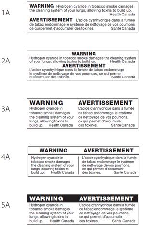
Five images of a bilingual toxic emissions statement. The images are labelled 1A to 5A.
Widespread agreement on option 5a as easiest to read and most noticeable
There was widespread agreement across audiences and regions that option 5a makes the TS easiest to read and that it is the most noticeable layout. The design feature singled out repeatedly as making it the most noticeable option was the WARNING section. The colour contrast (i.e. white text on black background), font size, and black rectangle distinguishing 'WARNING' from the statement were routinely identified as attention-grabbing features of this option.
These same features, either independently or in combination, were identified as elements making the statement in this option easiest to read. For example, participants often observed that the attention-grabbing 'WARNING' also draws attention to the text, making the latter easier to read. The fact that 'WARNING' is clearly separated from the text was also identified as rendering the text clear and distinct which in turns makes it easier to read. It was also frequently observed that the combination of design features in this option makes the text look bigger than in other options even if it is in reality the same font size. Finally, it was observed that displaying the languages side-by-side (with the French statement displayed on the left side and English on the right side for Montreal) in box-like format, clearly separated from each other, combined with the clear separation between 'WARNING' and text, provides an overall balance in spacing that makes the text easy to read.
Regarding the bilingual format, many participants commented that the line used in option 4a does a good job of clearly separating the English and French statements. While option 5a was preferred overall, participants often suggested that the black line found in option 4a would improve the readability of the statements if it was added as a design element to option 5a.
By comparison, the layout in option 2a was most often identified as making it difficult or more difficult to read the text due to the absence of spacing and separation. Specifically, it was frequently observed that the lack of separation between 'WARNING' and the text in each language, in addition to the absence of space between the two languages, gives the text a cramped look which makes it more difficult to read.
Near unanimous preference that WARNING to appear by itself
Nearly all participants were of the opinion that 'WARNING' should be by itself on top of the TS rather than integrated into the statement. Reasons for this preference include the impression that it makes 'WARNING' more visible/attention-grabbing, that it makes the text easier to read by clearly setting it off, and that it is more aesthetically pleasing to the eye. It was also observed by some that the text looks shorter when 'WARNING' appears by itself than when it is integrated.
Strong preference for languages to appear side by side
Most participants, a majority in almost every group, said they prefer when the English and French texts in the TS are displayed side by side rather than one language on top of the other. Reasons for this preference include the following:
It was also suggested that displaying the two languages side-by-side recognizes their equality.
Background colour
The following options were shared with participants:
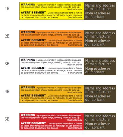
WARNING
Hydrogen cyanide in tobacco smoke damages the cleaning system of your lungs, allowing toxins to build up. Health Canada
1b leads the way as most eye-catching colour, followed by 5b
Option 1b (yellow) was most often chosen as the background colour most likely to catch participants' eyes. In explaining why, participants regularly identified one or more of the following three factors: the brightness or vividness of the colour (with participants in Montreal routinely using the expression ça flash), the habitual association of the colour yellow with 'warning' or 'danger', and the contrast between the yellow background and the black text, described by many as attention-grabbing.
A number of participants, though considerably fewer, chose option 5b (red) as the background colour most likely to catch their eye. In explaining why, participants identified the same factors identified by those who identified option 1b as most eye catching. This includes the brightness or vividness of the colour, the habitual association of the colour red with 'warning' or 'danger', and the contrast between the red background and the white text. Regarding the contrast between the background and the text, some of those who preferred option 1b did so because they found the white text against the red background in this option more difficult to read, especially at a distance.
Relatively few participants identified options 2b, 3b, or 4b as most attention-grabbing. Those who chose options 2b or 4b typically explained that these colours stand out because they are uncommon or unconventional. Option 3b was identified as attention-grabbing mainly based on the assumption that the white background would be visible with any colour cigarette package. It was also chosen as most attention-grabbing by a couple of participants with daltonism (i.e. colour blindness).
2b and 4b identified most often as colours to be avoided
Options 2b and 4b led the way in terms of colours most likely to be identified as background colours to be avoided. The main reasons given were the same in both cases: the colours are drab/dull and they are not colours typically associated with warning messages. As a result, participants said they are less likely to be effective in drawing attention to the TS. It was also observed by some participants that the contrast between text and background colour is poor in both cases, making it more difficult to read the statement.
After options 2b and 4b, option 5b was most likely to be identified as a colour to be avoided. In particular, a number of participants observed that its capacity to be eye-catching would depend on the colour of the cigarette package. A number of participants also commented on the contrast between the text and background colour in this option, observing that the red colour overpowers the white text making it look smaller than the text in other options and more difficult to read.
Participants who suggested avoiding option 3b as a background colour explained that it is neither attention-grabbing nor a colour typically associated with warning messages. Finally, a few participants suggested avoiding option 1b because, although it is attention-grabbing, it is too overpowering and makes it difficult to read the text.
Format/colour combinations
The following options were shared with participants:
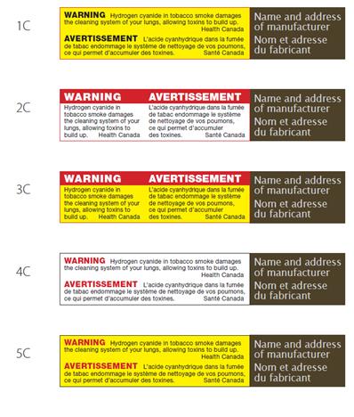
WARNING
Hydrogen cyanide in tobacco smoke damages the cleaning system of your lungs, allowing toxins to build up. Health Canada
Name and address of manufacturer
Widespread agreement on option 3c as most attention-grabbing design
Option 3c was most often chosen as the most attention-grabbing design in this set. In explaining why, participants regularly identified the following factors, usually in combination:
This was followed at a distance by option 2c, the only other option identified with any frequency as most attention-grabbing. While chosen much less often than option 3c, the reasons for choosing it were similar, namely:
Extent to which options adversely affect ability to read text varies
Option 4c was most often identified as adversely affecting participants' ability to read the text, followed by options 1c and 5c. Very few participants identified options 2c and 3c as adversely affecting their ability to read the text. Reasons identified as making it difficult to read the text in each of these options include the following:
Those who identified option 3c as adversely affecting their ability to read the text pointed to the combination of colours to explain why. Specifically, the red and yellow colours combine to overpower the black text making it more difficult to read it. Those who identified option 2c as adversely affecting their ability to read the text pointed to the dullness of the white background colour which has the effect of not drawing attention to the text.
With one exception, there was no single theme or type of HIM that resonated positively with all participants. Some participants, for example, preferred HIMs that focus on the benefits of quitting smoking and others preferred HIMs that focus on ways to quit smoking. This lack of consensus, not surprisingly, was particularly evident in the case of HIMs perceived as targeting only a specific audience, such as pregnant women, younger smokers, or older smokers. These HIMs elicited mixed assessments from participants in terms of their perceived effectiveness-that is, they were judged to be relatively effective in relation to members or potential members of the target audience, but less effective, or even ineffective, among non-members.
The exception to this finding was references to monetary savings resulting from quitting smoking. This theme resonated with participants both when monetary savings are explicitly referenced in the teaser (i.e. HIM T2 and 15) and when they are identified as one benefit of quitting among others (i.e. HIM 5, 8, 9, 10, and 13). Saving money was something that all participants could readily relate to as well as see the potential benefits of. Conversely, there was also one theme or topic that stood out by eliciting negative or critical reaction from participants to whom it was presented. This was the reference to the use of prescription medication as a way to quit smoking in HIM T1. Participants routinely reacted negatively to what they perceived as promotion or endorsement of prescription medications as the way to quit smoking.
Despite differences of opinion, participants identified a variety of factors contributing to the effectiveness of HIMs both in terms of what makes a teaser attention-grabbing and motivates smokers to read the message, and in terms of what makes a message meaningful or relevant.
The factors that make a teaser attention-grabbing and motivate one to read the message include the following:
The factors that make a message meaningful include the following:
By contrast, the following things were routinely identified as adversely affecting the effectiveness of HIMs:
It is also worth noting that some research participants, especially older smokers, reacted negatively or critically to messaging they perceived as casting smokers in a negative light or as judging smokers. This includes the implication that smokers are poor role models, that they endanger the health of others, and that they cannot quit smoking without the help of others or prescription medication.
Turning to the TS, participants generally expressed a preference for shorter, direct statements presented in side-by-side bilingual format with 'WARNING' across the top in white text with a red background. When it came to colours, the yellow background was most often preferred because it is bright, habitually associated with 'warning' or 'danger', and contrasts well with the black text.
Screener
INTRO: Hello/Bonjour, my name is [RECRUITER]. I'm calling from CRC/Research House, a Canadian research company. We're organizing a series of discussion groups on behalf of the Government of Canada with smokers in your area.
Would you prefer that I continue in English or French? / Préférez-vous continuer en français ou anglais?
RECRUITER NOTE: FOR ENGLISH GROUPS, IF PARTICIPANT WOULD PREFER TO CONTINUE IN FRENCH, PLEASE RESPOND WITH, "Malheureusement, nous recherchons des gens qui parlent anglais pour participer à ces groupes de discussion. Nous vous remercions de votre intérêt."
Is there anyone in your household 18 years of age or older who smokes cigarettes? If so, may I speak with this individual?
No THANK/DISCONTINUE
Yes:
Same person CONTINUE
Someone else 1. ASK TO SPEAK TO SMOKER
2. REPEAT INTRO
3. CONFIRM THIS PERSON SMOKES CIGARETTES
4. GO TO DESCRIPTION
Not available SCHEDULE CALL-BACK
DESCRIPTION: We are conducting a research study for Health Canada, a department of the Government of Canada, to help them develop health-related information for cigarette packaging. I'd like to tell you about the study to see if you might be interested in taking part in a discussion group. The groups will last up to two hours and will be conducted in the evening [ADJUST FOR WEEKEND GROUPS]. People who take part will receive a cash gift to thank them for their time and light refreshments will be served. The format is a "round table" discussion led by a research professional with up to 11 participants. All opinions will remain anonymous and participation is voluntary. The information collected will be used for research purposes only and handled according the Privacy Act of Canada.* The full names of participants will not be provided to the government or any other third party. More information about the handling and use of your personal information will be provided by email in advance of the research. Would you be interested in taking part in this study?
Yes CONTINUE
No THANK/DISCONTINUE
*IF ASKED: The personal information you provide to Health Canada is governed in accordance with the Privacy Act and is being collected under the authority of section 4 of the Department of Health Act. The information you provide will not be linked with your name on any document including the consent form or the discussion form. In addition to protecting your personal information, the Privacy Act gives you the right to request access to and correction of your personal information. For more information about these rights, or about our privacy practices, please contact Health Canada's Privacy Coordinator at 613-948-1219 or privacy-vie.privee@hc-sc.gc.ca. You also have the right to file a complaint with the Privacy Commissioner of Canada if you think your personal information has been handled improperly. The final report written by Phoenix will be available to the public from Library and Archives Canada (http://www.bac-lac.gc.ca/).]
Before we invite you to attend, I need to ask you a few questions to make sure we are getting a good mix of people for each discussion groups. This will take 5 minutes. May I continue?
Yes CONTINUE
No THANK/DISCONTINUE
Female
Male
| Target Audience | Recruitment Specifications |
| Young adult smoker | Minimum of 2 per group for each age segment 20-21 22-23 24 |
| Adult smoker | 25-34 Minimum of 2 per group for each age segment 45-54 55-64 65-74 75+ THANK/TERMINATE |
RECRUITER NOTE: WHEN TERMINATING AN INTERVIEW, SAY: "Thank you very much for your cooperation. We are unable to invite you to participate because we have enough participants who have a similar profile to yours."
…a marketing research, public relations, or advertising firm?
…the media (radio, television, newspapers, magazines, etc.)?
…the federal or provincial government?
…a tobacco or e-cigarette company?
…a smoking cessation company?
…a legal or law firm?
Yes THANK/TERMINATE IF YES TO ANY
No CONTINUE
Every day GO TO Q6
Occasionally CONTINUE
VOLUNTEERED:
Not at all THANK/TERMINATE
Yes [OCCASIONAL SMOKER] MAXIMUM OF 4 PER GROUP
No THANK/TERMINATE
Less than 2 years
2-5 years
6-10 years
11-20 years
Over 20 years
Some high school
Completed high school
Some college/technical school/CEGEP
Graduated college/technical school/CEGEP
Some university
Graduated university
Graduate studies
Yes
No
Yes
No GO TO Q13
Within the last 6 months THANK/TERMINATE
6 months to under 2 years CONTINUE
2 or more years GO TO Q11
RECORD: _______________
THANK/TERMINATE IF RELATED TO TOBACCO
Fewer than 5
Five or more THANK/TERMINATE
Yes CONTINUE
No THANK/TERMINATE
Yes CONTINUE
No THANK/TERMINATE
Yes CONTINUE
No THANK/TERMINATE
Invitation to Participate
Thank you. We would like to invite you to attend one of the discussion groups, which will be lead by a researcher from the national public opinion research firm, Phoenix SPI. The group will take place on [DAY OF WEEK], [DATE], at [TIME] and it will last two hours. Following your participation, you will receive $100 to thank you for your time.
Yes CONTINUE
No THANK/TERMINATE
Yes: ENTER EMAIL ADDRESS: ____________________
No: That's fine. Do you have a pen handy so that I can give you the address where the group will be held? It will be held at [INSERT FACILITY ADDRESS] at [TIME] on [DATE].
At the facility, you will be asked to produce photo identification, so please remember to bring something with you (for example, a driver's license). In order to participate, you will also be asked to provide the signed consent form we will send by email in advance.
If you use glasses to read, please bring them with you.
As we are only inviting a small number of people to attend, your participation is very important to us. If for some reason you are unable to attend, please call us so that we can get someone to replace you. You can reach us at [INSERT NUMBER] at our office. Please ask for [INSERT NAME].
Someone from our company will call you the day before to remind you about the session. To do that, we need to have your contact information.
Someone from our company will call you the day before to remind you about the session. To do that, we need to have your contact information.
PARTICIPANT
First name: |
| Last Name: |
| Daytime phone number: |
| Evening phone number: |
| Email: |
Thank you!
Introduction (5 minutes)
Introduction to review of materials (5 minutes)
As I mentioned, tonight/today we'll be talking about labelling on cigarette packages. Cigarette packages include three types of health-related information: the health warning, the health information message, and the toxic emission statement. The focus of our discussion will be the health information message and toxic emission statement not the health warnings. USE MOCK-UP PACKAGE [BOTH SS AND FT] TO SHOW WHICH LABELS WILL BE DISCUSSED. NOTE PROPOSED PLAIN PACKAGE DESIGN AND THE FACT THIS IS NOT PART OF THE DISCUSSION.
Health information messages provide information about the health benefits of quitting tobacco use and are displayed on the inside of cigarette packages. MODERATOR: NOTE DIFFERENT INTENTION/PURPOSE OF HW AND HIM. They have two parts:
Toxic Emission Statements (TS) are short statements found on the side of cigarette packages. [POINT TO WHERE THIS IS FOUND ON THE PACKAGES]. These aim to inform tobacco users about the health effects and hazards of specific toxic chemicals found in tobacco smoke and in the product.
Tonight/today, we'll be asking you to review versions of health information messages and toxic emission statements that could appear on cigarette packaging.
Before we do… Do any of you look at or read any of the health information messages on the cigarette packages that you purchase? For those who look at or read messages, what type of information draws your attention and why?
NOTE TO MODERATOR: This is specific to the HIM. If the participants discuss the HW re-direct to the HIM.
ASK FT USERS ONLY:
What do you do with the flip top HIM after you have opened the package? Do you think there is a way to better integrate the HIM in this package format?
Review of Health Information Messages (75 minutes)
We'll start with the health information messages. The draft health information messages [SHOW AGAIN ON THE PACKAGES - SLIDE AND SHELL AND FLIP TOP] that you're going to look at use the proposed plain package colours for the brand area (the area of the tobacco package that does not contain any health-related information mandated by Health Canada). Again, we are only asking for your feedback on the health information messages; not the plain package colours or design. Is this clear to everyone? In total, we'll be looking at six health information messages. [ADJUST IN MONTREAL]
I'd now like you to turn to the materials in front of you-there is a set of SIX / SEVEN health information messages and an exercise sheet [HAND-OUT 1]. We're going to look at each health information message one at a time, so please pull out [INSERT HIM] and take a minute to look at it on your own, in silence. When you're done, please turn to the exercise sheet and answer the two questions in row one. Before you do so, insert the following code in that row [MODERATOR CALL OUT HIM CODE]. When everyone is finished, we'll talk about it as a group.
Please do not write on any of the health information messages-we will need to use them again.
ALLOW UP TO 2 MINUTES FOR PARTICIPANTS TO REVIEW THE HIM AND COMPLETE THE EXERCISE SHEET.
Ok, it looks like everyone is finished. ALLOW UP TO 10 MINUTES PER HIM.
Probe if not raised by participants:
Probe if not raised by participants:
Probe if not raised by participants:
Now let's focus specifically on the information,
Probe if not raised by participants:
Now thinking about the health information message in its entirety,
Let's move to the next health information message, [INSERT]:
REPEAT QUESTIONS FOR EACH HIM.
12. Is the HIM more noticeable/effective on one pack type over another? Which pack type? Why?
Review of toxic emission statements (25 minutes)
Now let's turn to the toxic emission statements that appear on the sides of cigarette packages. Health Canada is considering a series of new statements that could provide similar information in different ways. [SHOW AGAIN ON THE PACKAGES - SLIDE AND SHELL AND FLIP TOP]
A: Text
Please review [HAND-OUT 2] I just passed out. There are six toxic emission statements. I'd like you to read each one, on your own, and then we'll discuss them. When reading the statements, underline any words that are not clear, answer the two questions for each of the six statements and then circle the statement that you feel is most effective in terms of informing and educating people about the toxic substances found in tobacco and the health effects arising from them.
GIVE PARTICIPANTS UP TO 5 MINUTES TO REVIEW STATEMENTS.
Now we're going to go through each of these statements one at a time. Let's start with the first one. moderator reads STATEMENT AND THEN BEGINS.
REPEAT FOR EACH STATEMENT.
ONCE ALL SIX HAVE BEEN REVIEWED, ASK Q15.
B: Design Elements [HAND-OUT 3]
I'd now like to get your feedback on different design elements that are being considered for the toxic emission statements. For this part of the discussion, I'd like you to focus on the format, not the content, of the statements. PROVIDE HANDOUT 3 TO PARTICIPANTS.
Please do not write on any statements-we will need to use them again.
Layout (Materials 1a-5a - ON HANDOUT - SET A)
The page contains different layout options. MAKE SURE PARTICIPANTS ARE ON THE SAME PAGE, THEN ASK: [IF NEEDED, SHOW AGAIN ON BOTH PACKAGES TYPES]
PROBE: font, spacing, length of message, bilingual design
Background (Materials 1b-5b ON HANDOUT - SET B)
Now let's look at the second set. On your handout, this is set B. Health Canada is considering five different background colours for the toxic emission statements. MAKE SURE PARTICIPANTS ARE ON THE SAME PAGE, THEN ASK:
Colour Combinations (Materials 1c-5c ON HANDOUT - SET C)
Now let's look at the third set. On your handout, this is set C. Health Canada is considering different formats for the toxic emission statements.
Conclusion (5 minutes)
We've covered a lot today/tonight and I really appreciate you taking the time to come and share your opinions. I'm going to leave the room now to check with the observers to see if there are any last questions for you. When I come back, I'm going to ask whether any of you has last thoughts that you want to give the Government of Canada about discussion topic.
MODERATOR WILL LEAVE THE ROOM AND CHECK WITH OBSERVERS TO SEE IF THERE ARE LAST QUESTIONS.
Thank you very much for your time. This concludes the discussion group. 1ST GROUP ONLY, ADD: When you leave the room, please don't discuss the topic. Participants for the second group will
Handout 1 - HIM
| How effective are each of these health information messages in terms of informing and educating about the health effects and health hazards of smoking? | ||||||||||
| Not at all Very effective effective |
||||||||||
| HIM SET X - HIM # | 1 | 2 | 3 | 4 | 5 | 6 | 7 | 8 | 9 | 10 |
| HIM SET X - HIM # | 1 | 2 | 3 | 4 | 5 | 6 | 7 | 8 | 9 | 10 |
| HIM SET X - HIM # | 1 | 2 | 3 | 4 | 5 | 6 | 7 | 8 | 9 | 10 |
| HIM SET X - HIM # | 1 | 2 | 3 | 4 | 5 | 6 | 7 | 8 | 9 | 10 |
| HIM SET X - HIM # | 1 | 2 | 3 | 4 | 5 | 6 | 7 | 8 | 9 | 10 |
| HIM SET X - HIM # | 1 | 2 | 3 | 4 | 5 | 6 | 7 | 8 | 9 | 10 |
| How effective are each of these health information messages in terms of making you think about quitting smoking? | ||||||||||
| Not at all Very effective effective |
||||||||||
| HIM SET X - HIM # | 1 | 2 | 3 | 4 | 5 | 6 | 7 | 8 | 9 | 10 |
| HIM SET X - HIM # | 1 | 2 | 3 | 4 | 5 | 6 | 7 | 8 | 9 | 10 |
| HIM SET X - HIM # | 1 | 2 | 3 | 4 | 5 | 6 | 7 | 8 | 9 | 10 |
| HIM SET X - HIM # | 1 | 2 | 3 | 4 | 5 | 6 | 7 | 8 | 9 | 10 |
| HIM SET X - HIM # | 1 | 2 | 3 | 4 | 5 | 6 | 7 | 8 | 9 | 10 |
| HIM SET X - HIM # | 1 | 2 | 3 | 4 | 5 | 6 | 7 | 8 | 9 | 10 |
Handout 2 - TS
| Not at all Very clear clear |
||||||||||
| TS SET X - Statement 1 | 1 | 2 | 3 | 4 | 5 | 6 | 7 | 8 | 9 | 10 |
| TS SET X - Statement 2 | 1 | 2 | 3 | 4 | 5 | 6 | 7 | 8 | 9 | 10 |
| TS SET X - Statement 3 | 1 | 2 | 3 | 4 | 5 | 6 | 7 | 8 | 9 | 10 |
| TS SET X - Statement 4 | 1 | 2 | 3 | 4 | 5 | 6 | 7 | 8 | 9 | 10 |
| TS SET X - Statement 5 | 1 | 2 | 3 | 4 | 5 | 6 | 7 | 8 | 9 | 10 |
| TS SET X - Statement 6 | 1 | 2 | 3 | 4 | 5 | 6 | 7 | 8 | 9 | 10 |
| Not at all Very relevant relevant to you |
||||||||||
| TS SET X - Statement 1 | 1 | 2 | 3 | 4 | 5 | 6 | 7 | 8 | 9 | 10 |
| TS SET X - Statement 2 | 1 | 2 | 3 | 4 | 5 | 6 | 7 | 8 | 9 | 10 |
| TS SET X - Statement 3 | 1 | 2 | 3 | 4 | 5 | 6 | 7 | 8 | 9 | 10 |
| TS SET X - Statement 4 | 1 | 2 | 3 | 4 | 5 | 6 | 7 | 8 | 9 | 10 |
| TS SET X - Statement 5 | 1 | 2 | 3 | 4 | 5 | 6 | 7 | 8 | 9 | 10 |
| TS SET X - Statement 6 | 1 | 2 | 3 | 4 | 5 | 6 | 7 | 8 | 9 | 10 |
When referring to a single Health Information Message in the report, "HIM" is used. When referring to multiple Health Information Messages, "HIMs" is used.
Plain and standardized appearance for tobacco product packaging is currently being proposed by the Government of Canada. The proposed measures include standardizing the overall appearance of all tobacco packaging (e.g., font type, colour and size).
SS refers to slide and shell.
INS refers to the insert found in flip top cigarette packages.
It should be noted that all people portrayed in the testimonial HIM are the persons who gave the quotes and who suffer from smoking-related illnesses.
There were no consistent regional differences in how participants reacted to the HIM and assessed them in terms of credibility, clarity and relevance or memorability. Language-based differences were evident in reactions to certain HIM, but they involved phraseology or turns of phrases rather than themes and images. Specifically, it was sometimes noted by bilingual participants in Montreal that a certain phrase works better in English than French because it is more 'pithy', 'catchy', or succinct. An example is HIM 12: "Have better sex" / « Augmenter votre performance au lit ».
A few participants aware of this connection volunteered that this is something their physician told them or that they know this from their personal experience (i.e. they are more susceptible to colds).
This was not the case for the FT version of the HIM. The teaser text is not boxed-off with a separate background colour.
On slide and shell packages this information is printed on the back of the sliding portion of the package, and on flip top packages the information is printed on a leaflet inserted in the package.