For more information on this report, please contact Health Canada at: hc.cpab.por-rop.dgcap.sc@canada.ca
Ce rapport est aussi disponible en français.
This public opinion research report presents the results of a series of focus groups conducted by Phoenix SPI on behalf of Health Canada. The research was conducted with young adult smokers July 24 through 26, 2018.
This publication may be reproduced for non-commercial purposes only. Prior written permission must be obtained from Health Canada. For more information on this report, please contact Health Canada at:
Phoenix Strategic Perspectives (Phoenix SPI) was commissioned by Health Canada to conduct qualitative research to test creative concepts for the Break It Off / Je te laisse campaign. Footnote 1 A set of six in-person focus groups was conducted with young adult smokers in three locations: St. John's (July 24th, 2018), Montreal (July 25th), and Saskatoon (July 26th). The groups in St. John's and Saskatoon were conducted in English and the groups in Montreal were conducted in French. The target audience was smokers, aged 20 to 24. One group in each city was conducted with "occasional" smokers Footnote 2 and the other with "daily" smokers. More details about the methodology can be found in the Methodology section in the Introduction.
This research was qualitative in nature, not quantitative. As such, the results provide an indication of participants' views about the issues explored, but they cannot be generalized to the full population of members of the targeted audience segments.
1.1 Key Findings
Font treatments and taglines
Overall impressions of both concepts (Be Done with Smoking / Fumer, c'est f-ini and Ditch Smoking / Adieu la cigarette) tended to elicit lukewarm reactions ranging from neutral to mildly positive.
The message in Be Done with Smoking was routinely described as simple, straightforward, sober, and when compared with Ditch smoking, some characterized it as more age-appropriate. At the same time, the message was also sometimes described as cliché or slogan-like, with nothing new, provocative or particularly meaningful conveyed. Reaction to the design elements was more mixed. Some reacted positively to such features as the burgundy colour, the use of a crushed cigarette to depict the letter 'I', the font for the expression 'Be done with smoking' (most preferring Font B Footnote 3, which some referred to as the more unconventional font), and the circle which reminded some of a stop sign, sticker, or a seal of approval. By contrast, many reacted neutrally or critically, describing the design in general as boring or bland, with nothing eye-catching or attractive in it. Some participants in Montreal said the burgundy colour and/or the burgundy dot reminded them of the logo and taste tags of the provincial liquor distributor. The most frequent suggestion for improving this concept was to use more vibrant colours.
The design features of Ditch Smoking were routinely described as attention-grabbing. These included what was referred to as the red graffiti or spray paint motif and the two different font types and colours. Many also liked the use of a crushed cigarette to depict the letter 'I'. Conversely, some described the design approach as 'juvenile' and felt it was targeted to a younger audience. Reaction to the message was more mixed. Some liked it, characterizing it as clear, definitive, dramatic, and categorical. Others, however, were more neutral or critical. Neutral reactions were based on the impression that the message is too slogan-like and contains nothing catchy or memorable and that it makes quitting sound easy. Critical reactions were based on the impression that the expression 'Ditch smoking' targets a younger audience. This critical reaction to the message in 'Ditch smoking' applied only to the English version.
Social media
Generally-speaking, social media graphics incorporating the Ditch Smoking concept elicited more positive feedback than those incorporating the Be Done with Smoking concept. This included use of what was described as 'vibrant', 'bold', 'captivating' colours, more age-appropriate text, and better models. While the social media focus used in the Be Done with Smoking concept was described as relevant and easy to relate to, there was a widespread sense that the message targets a younger audience. And while the models were routinely described as age-appropriate, they were often characterized as looking sad or depressed. Examples of social media graphics elicited a range of reactions, but the one most likely to elicit positive reactions was I Need Space to Breathe and the one most likely to elicit critical feedback was I creeped tobacco on Facebook and what I found didn't look good.
Overall reaction to the relationship theme as embodied in the social media graphics was also mixed. While most understood the relationship theme, many did not. Moreover, even when it was understood, its effectiveness in motivating people to think about quitting smoking was usually described as limited. By way of explanation, participants suggested that use of the relationship theme establishes no meaningful connection to themselves and their lives/lifestyles. In order to have an impact, campaign messaging must make them reflect on how their life will be impacted by quitting smoking. It was suggested that none of the social media graphic treatments focuses on the life changing consequences of quitting (e.g. feeling better/healthier, saving money). The most commonly made suggestion to improve the treatments in both concepts was to establish a more personal link to the message by suggesting why someone should quit smoking and how their life will change positively when they stop smoking.
Backdrop banners
The banner incorporating the Ditch Smoking concept was more likely to be described as attention-grabbing than the one incorporating the Be Done with Smoking concept. This was mainly because of its vibrant colours and font treatments. Despite the attention-grabbing features in either treatment, neither was viewed as likely to motivate participants to stop at the booth. The main reason given was that the banners are too generic and neither one contains a meaningful message that would draw them in or make them reflect. This was especially the case for the banner incorporating the Be Done with Smoking concept. It was described by some as having a limited connection to smoking (i.e. the most prominent feature, the photo, was felt to lack meaning and the tagline which does connect with smoking was considered too small).
Alternative font treatment and taglines
Reaction to the alternative font treatment (i.e. 'Split up with smoking') was mixed, but like the other two treatments, tended to be divided between neutral and positive impressions. The element in this treatment most likely to elicit positive reaction was the depiction of a broken cigarette as part of the letter 'K' in the expression 'Break It Off'. Indeed, many participants in St. John's and Saskatoon felt that this design feature should replace the depiction of a crushed cigarette used in the earlier versions. It was suggested that a broken cigarette works better than a crushed cigarette because it suggests that the cigarette was destroyed rather than smoked. On the other hand, a few felt that it looked like a broken pencil. The French version of this tagline elicited similar enthusiasm for the depiction of a broken cigarette as part of the letter 'L' in the expression 'Je te Laisse'.
Additional taglines most likely to be preferred by English-speaking participants were those emphasizing freedom from cigarettes (i.e. 'Free Yourself From Smoking') being better off smoke-free (i.e. 'You're Better Off Smoke Free') and self-worth (i.e. 'You're Better Than Smoking'). The tagline most likely to be preferred by French-speaking participants was the one emphasizing self-worth (i.e. 'Je vaux plus qu'une cigarette').
Promotional items
Participants were shown examples of three promotional items that could be distributed at campaign-related events and asked about their usefulness and appropriateness. They included a stress ball, breath mints, and a card holder that fastens to the back of a mobile phone or device. Participants in all groups routinely described these items as both appropriate and useful, primarily as reminders of their efforts to quit smoking and ways to spread awareness of the campaign. The stress ball and mints were also described as helpful supports/distractions when trying to quit smoking - the ball by helping with stress relief and the mints by being a substitute for cigarettes. Participants suggested a host of additional promotional items, including fidget toys/devices, apps to help track their smoking cessation progress, wrist bands, pins, water bottles, stickers, key chains, and pens.
New website design
Most participants reacted positively to the proposed redesign of the landing page of the Break It Off campaign website, regardless of which of two alternative approaches they were shown first (i.e. 'Be Done with Smoking' or 'Ditch Smoking'). The few who were not positive were more likely to be neutral than negative. The landing page was often described as appearing to be welcoming, user-friendly/well organized, comprehensive, and appealing in terms of overall look, spacing, and colour schemes. The menus were described as clear and participants had no difficulty identifying sections they thought would contain useful information for them personally. Examples included 'Tell us why you're here', 'Share your quitting experience', 'Join us at an event', 'Call a quit coach', 'After you quit', 'Cost calculator', 'Some reasons for quitting', 'Start saving your money', 'Make a quit plan', and 'I want to help someone quit'.
Participants were divided when asked which version they preferred, with slightly more identifying the 'Ditch Smoking' version. Those who preferred this version described it as more attractive than the other version. In explaining why, they described it as 'more motivational', 'more fun-looking', 'more modern-looking' (i.e. like Instagram, Buzzfeed, or Snapchat), and 'more adapted to their age group', with some suggesting that it looks like it was designed by young people. By contrast, those who preferred the 'Be Done with Smoking' version described it as more sober, less distracting, and easier on the eyes/calmer, with some suggesting that the colour scheme is more appropriate to a smoking cessation website. Some also specified that they did not like the red 'swatches' used in the 'Ditch Smoking' version because it looks like dripping blood.
1.2 Conclusions and Implications
No clear winner emerged among the two concepts participants reviewed, and reactions to each tended to be similar, ranging from neutral to mildly positive. While positive impressions of Be Done with Smoking were based more on the message than design elements, positive impressions of Ditch Smoking were based more on design elements than on the message. Overall reaction to the relationship theme used into both approaches was mixed. While most understood the play on the relationship theme, at least a few participants in every group did not. Moreover, even when it was understood, its effectiveness in motivating people to think about quitting smoking was usually described as limited.
Despite differences of opinion and overall lukewarm reactions to materials, participant feedback provides direction in terms of helping ensure that the Break It Off campaign continues to resonate with members of the target audience. While it is clear that there is no 'one size fits all' approach that will resonate with members of the target audience, feedback suggests that a new creative concept could be developed using preferred elements from the Be done with smoking and Ditch smoking concepts. Specifically, the following points should guide the development of creative concepts for the Break It Off campaign:
Vibrant visuals clearly resonate with young adults and are crucial to ensuring the appeal of campaign-related materials. At the same time, young adults have a sense of sobriety and want to be taken seriously. As a result, a balance should be struck to ensure that design elements are appealing without detracting from the seriousness of the message or missing the mark by appealing to a younger audience.
Messaging embodying the relationship theme should facilitate an immediate personal connection to the message that is consequential in order to be relevant (e.g. how my life will change positively when I quit smoking). Messaging that focuses exclusively on the relationship theme for the sake of the theme itself runs the risk of being perceived as clever or interesting rather than motivational.
Use of age-appropriate models is important but not sufficient to ensuring effective messaging. While it is important that members of the target audience perceive models used in campaign materials as age-appropriate, other features are also important to effective messaging (i.e. non-stereotypical poses and facial expressions, meaningful backgrounds in banners and social media graphics, clear connections to smoking, and credible/believable text).
Approaches that are light hearted or even humorous resonate with participants and are considered appropriate, but not if they detract from the seriousness of the topic. As a result, it is important that messaging not be perceived as silly, laughable, or lacking in credibility.
Changes to the landing page of the Break It Off campaign website should focus on adjustments designed to achieve a balance between attractiveness/appeal and sobriety/seriousness. Specifically, the focus should be on making the site attractive and appealing without detracting from its seriousness as a smoking cessation resource or its appropriateness for the age group in question. In this sense, feedback on the website echoed feedback on other campaign-related materials: while visual elements (e.g. colour schemes, images) clearly resonate with young adults, they also want to be taken seriously.
Contract Value: $59,923.90 (including HST)
Statement of Political Neutrality: I hereby certify as a Senior Officer of Phoenix Strategic Perspectives that the deliverables fully comply with the Government of Canada political neutrality requirements outlined in the Communications Policy of the Government of Canada and Procedures for Planning and Contracting Public Opinion Research. Specifically, the deliverables do not contain any reference to electoral voting intentions, political party preferences, standings with the electorate, or ratings of the performance of a political party or its leader.
Alethea Woods
President
Phoenix Strategic Perspectives Inc.
2 Introduction
Phoenix Strategic Perspectives (Phoenix SPI) was commissioned by Health Canada to conduct qualitative research to test creative concepts for the Break It Off / Je te laisse tobacco cessation campaign.
2.1 Background and Objectives
Tobacco use is the leading preventable cause of disease and premature death in Canada. It is a contributing factor to serious chronic diseases, such as cancer, respiratory ailments and heart disease. The vast majority of smokers begin this habit by adolescence or young adulthood. In Canada, 82% of current daily smokers had their first cigarette by the age of 18, with smoking prevalence being highest among young adults aged 20 to 24.
The Break It Off campaign was first launched in January 2012 by the Canadian Cancer Society (CCS), with support from Health Canada through a contribution agreement. In 2014, Health Canada launched the Break It Off campaign, in collaboration with the CCS, as part of the 2012-2017 Federal Tobacco Control Strategy. Health Canada is continuing to lead a marketing campaign on tobacco cessation that aims to increase awareness, knowledge and uptake of quit smoking tools and resources among young adult smokers, as part of on-going activity under Canada's Tobacco Strategy.
The campaign uses a relationship theme to help young adult smokers as they move through the various stages of "breaking it off" with smoking. Additionally, the campaign uses this platform to promote useful tools and resources that could further encourage tobacco cessation activities among these Canadians.
The overall campaign approach resonates well with audiences and has consistently been well-received; however, a refreshed look and feel and the development of select assets is required to ensure the campaign remains modern, relevant and interesting. To ensure the campaign continues to resonate with the target audience and helps meet the Government of Canada's goals for cessation, Health Canada required qualitative research to gather insight from the target audience about potential Break It Off campaign messages and resources.
Objectives of the research included the following:
To evaluate two new creative concepts for the Break It Off campaign to determine if the content is:
clearly understood by the audience,
credible, relevant and of value to the audience,
appealing and appropriate to the audience,
memorable and appropriate in tone,
able to motivate the audience to take personal action(s), and
valuable or user friendly (i.e., website architecture).
To assess the appropriateness and usefulness of promotional items that could be distributed at campaign-related events.
To assess the proposed redesign of the home page of the campaign's website in terms of overall appeal, user-friendliness, and relevance.
To obtain suggestions for potential changes to ensure the messages and resources resonate with the target audience.
To identify preferred sources and methods of receiving cessation information from the Government of Canada.
Findings from this research will: 1) assist in testing the effectiveness of two unique creative concepts developed for the Break It Off campaign; 2) enable Health Canada to develop content that resonates with the target audiences and motivates them to quit smoking and stay smoke-free; 3) ensure the marketing campaign is supported by robust and sustainable creative look and feel; and 4) ensure that funding allocated towards public awareness and outreach is spent responsibly and effectively.
2.2 Methodology
To meet the research objectives, a set of six in-person focus groups was conducted in three locations: St. John's (English), Montreal (French), and Saskatoon (English). The target audience was young adult smokers, aged 20-24. One group in each city was conducted with "occasional" smokers Footnote 4 and the other with "daily" smokers. Participants were recruited by telephone using an opt-in database. The focus groups were held between July 24th and 26th, 2018.
Each group included a mix of participants by gender, age, education, and visible ethno-cultural status. In addition, efforts were taken to include young adult smokers who work in the trades, self-identify as LGBTQ+ Footnote 5, and belong to "hip hop" or "alternative" social groups or crowds. Footnote 6 In each group, a total of eleven individuals were recruited. Between five and eight participants took part in each group (four groups included eight participants, one group included seven participants, and one group included five participants). A total of 44 young adult smokers took part in the research.
Focus groups lasted two hours and participants received an incentive of $125 in appreciation of their time. At the groups, all participants were asked for identification to verify their identity and that consent forms were completed.
In each focus group, the following were tested:
Two unique concepts for the Break It Off campaign, each featuring:
one font treatment and tagline,
three social media graphics with different models and colours, and
one backdrop banner and T-shirt.
An alternative font treatment and tagline;
A selection of generic promotional items; and
A solution for an existing website, including mock-ups for the website architecture, and graphics for the main landing page.
The materials were presented to participants in a storyboard format, printed on letter-size paper. Larger versions of website mock-ups were also mounted on a flip chart at the front of the room.
All steps of the project complied with the Marketing Research Intelligence Association (MRIA) industry standards as well as The Standards for the Conduct of Government of Canada Public Opinion Research.
The investigator for this study was Philippe Azzie who moderated all groups and wrote the final report.
This research was qualitative in nature, not quantitative. As such, the results provide an indication of participants' views about the issues explored, but they cannot be generalized to the full population of members of the targeted audience segments.
3 Detailed Findings
3.1 Contextual Information
This section provides contextual information about participants.
Length of time smoking varies
The length of time participants said they have been smoking ranged from approximately two years to 10 years among daily smokers and one year to 12 years among occasional smokers. Regional differences included the following:
Most daily smokers in St. John's and Saskatoon said they have been smoking for over five years while daily smokers in Montreal said they have been smoking for 5 years or less.
Most occasional smokers in Saskatoon and Montreal said they have been smoking for at least five years while most in St. John's said they have been smoking for less than 5 years.
Number of cigarettes consumed by daily smokers varies, as does frequency of smoking among occasional smokers
Daily smokers quantified approximately how many cigarettes they smoke per day either as an absolute number or as a proportion of a pack (i.e. a full pack, half a pack). The number of cigarettes smoked daily ranged from as few as three to four, to as much as a pack a day, with most participants indicating that they smoke at least 10 cigarettes a day. Some daily smokers said they tend to smoke more on weekends than during the week while others indicated that their consumption does not vary much throughout the week. Daily smokers in St. John's were most likely to be 'heavier' smokers, with most saying they smoke a pack a day and the rest in the group saying they smoke approximately 10 cigarettes a day.
The frequency of smoking among occasional smokers varied widely, ranging from approximately every other day, to a few times a week, to weekends only, to a few times a month or every few weeks. It was also noted that the frequency of smoking depends on 'stimuli' or what is going on in their lives.
Daily and occasional smoking tend to occur under similar circumstances
Whether they smoke daily or occasionally, young adult smokers tend to smoke under similar circumstances. The following circumstances were routinely identified:
With friends/in a social setting/at parties.
At work/on work breaks.
In the car/while driving.
When drinking/with alcohol.
Outdoors (e.g. walking, waiting for a bus).
Circumstances identified less frequently included at night time, after dinner, at home, when stressed, and on weekends. Occasional smokers were more likely than daily smokers to specify that they smoke on weekends.
Most have attempted to quit smoking using similar measures/techniques
With one exception, most participants in every group said they have tried to quit smoking (the exception being daily smokers in Saskatoon where only a few said they had tried to quit). Measures participants have taken to try to quit smoking most often included trying to quit cold turkey, using medications, and using substitutes, such as vaping devices, gums, or patches. Measures identified less frequently or by individual participants included drinking a lot of water, cutting back gradually on the number of cigarettes smoked, engaging in exercise/sport, sucking/chewing on straws, trying to change habits/routine, and spending time with a non-smoking parent.
Unsuccessful quit attempts linked mainly to lifestyle
Participants who tried to quit smoking typically provided two reasons to explain why they think their quit attempts failed; both are related to lifestyle in general.
Living/interacting with other smokers: Participants explained that people in their lives with whom they interact on a regular basis (i.e. partners, family members, friends/acquaintances) are smokers. As a result, they are routinely in the company of other smokers and subject to the peer pressures/influences that smoking as a social activity entails.
Habits/routines: Participants also explained that their lifestyles include routines and patterns habitually associated with smoking (e.g. going out with friends, drinking alcohol, taking a work break). As a result, their quit attempts are complicated by the fact that they are trying to stop smoking while maintaining the habits and routines of which smoking was a part. Because their lifestyle has not changed, smoking triggers are ever present (e.g. being offered cigarettes by friends).
Reasons identified less frequently to explain failed quit attempts included the pleasure derived from smoking, not being in the proper mindset when trying to quit (i.e. lack of will power or motivation), and stress.
Most say they are serious about trying to quit smoking
Most participants said they are seriously considering trying to quit smoking within the next six months, but very few of these individuals are considering doing so within the next 30 days. The only group in which most participants said they are seriously considering trying to quit smoking within the next 30 days was occasional smokers in Montreal. Among daily smokers, the only group in which most participants said they are seriously thinking about quitting within six months was in Saskatoon.
Main perceived barriers to quitting smoking and remaining smoke-free
When asked to identify the main barriers or challenges to quitting smoking and remaining smoke-free, participants tended to re-iterate the challenges they faced in their own quit attempts. Those identified most often included the challenge of breaking habits/routines and being around friends/acquaintances who smoke. Barriers identified less often included the satisfaction/soothing sensation provided by smoking, smoking's ability to relieve stress, and a lack of motivation or will power. Reasons identified by individual participants included fear of weight gain and mental health issues which are coped with in part through smoking.
Participants aware of a variety of quit smoking aids/resources
Collectively, participants identified a range of aids or resources they believe are available to someone who wants to quit smoking. Those identified routinely included vaping, counselling or support groups (e.g. hotlines), prescription medications, and nicotine replacement therapy (e.g. patches). Those identified infrequently, or by individual participants, included laser treatment on the ear, sucking on a straw, a liquid drink (unspecified) and a spray (unspecified).
Limited recall of smoking cessation campaigns
Recall of smoking cessation campaigns was very limited. Recollection was highest among daily smokers in Montreal and lowest among daily and occasional smokers in Saskatoon where no one could recall anything. Recollections were often general and based on where participants had seen something rather than what they had seen. Examples included posters in schools or physicians' offices, publicity on metros/subways, and messages on television. Specific recollections of content included the following, each of which was identified by individual participants:
An image or logo of a broken cigarette.
Barb Tarbox, the anti-smoking activist.
A YouTube video showing a young person preferring to lick a fish than smoke a cigarette.
A television ad about second-hand smoke showing a father smoking while driving with kids in the car.
Anti-smoking competition with the title 'J'arrête, j'y gagne'.
The slogan 'Cig-arrêt'.
A phone number followed by the word 'j'arrête'.
The individual who recalled the YouTube video said it was memorable because of its emphasis on how non-smokers perceive smoking and smokers. The depiction of someone preferring to lick a fish than smoke a cigarette made this person think about how disgusting a habit smoking is perceived to be by non-smokers, and by implication, what they must think of smokers. The individual who recalled a phone number followed by the word 'j'arrête' described it as memorable because it is everywhere. That said, it did not encourage thoughts about quitting smoking.
No one recalled seeing or hearing any campaigns with the slogan Break It Off / Je te laisse.
3.2 Review of Concepts
As noted in the introduction, participants were asked to review two creative concepts developed for the Break It Off / Je te laisse campaign. Each approach included different font treatments for the words 'Break It Off', a tagline with two font treatments Footnote 7, as well as a series of materials to help participants better understand how the concept could be used in a marketing campaign. Each concept was designated by its tagline: 'Be done with smoking / Fumer, c'est fini' and 'Ditch smoking / Adieu la cigarette'. The order of presentation was rotated across groups; one group began with Be done with smoking or Ditch smoking and the order was reversed in the next group.
Feedback was first sought on each of the concepts (i.e. font treatments and taglines), followed by the campaign-related materials incorporating each concept. The campaign-related materials included the following:
Examples of how the concept could be used in graphics for social media.
Examples of campaign-related materials that could be used at events on school campuses, trade shows, malls, etc. This included images of a backdrop banner and a T-shirt that could be worn by people operating booths at such events.
Participants were asked to review each example on their own and invited to write down any thoughts or impressions on a piece of paper in advance of the group discussion.
Presented below is feedback related to each of the concepts and the campaign-related materials associated with them.
3.2.1 Concept 1: Be done with smoking / Fumer, c'est fini
3.2.1.1 Font treatment and tagline
***DRAFT***
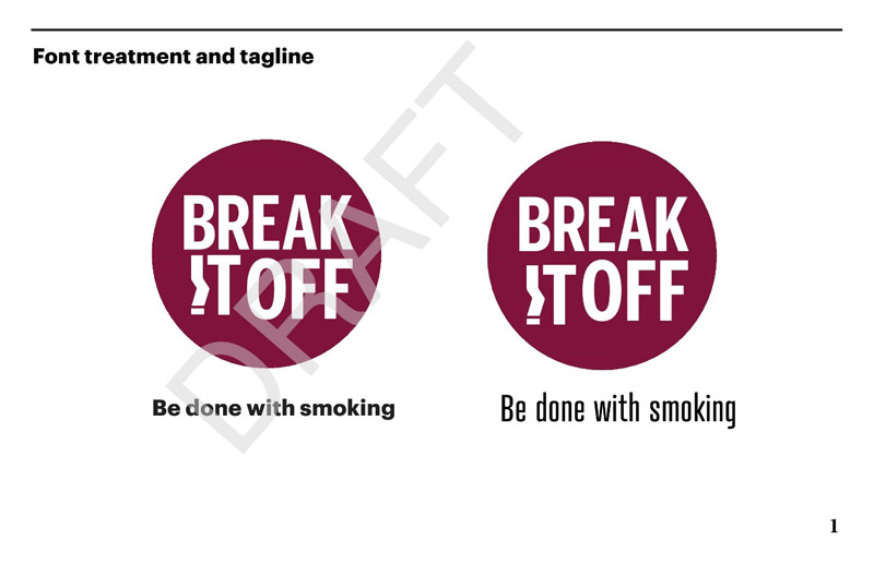
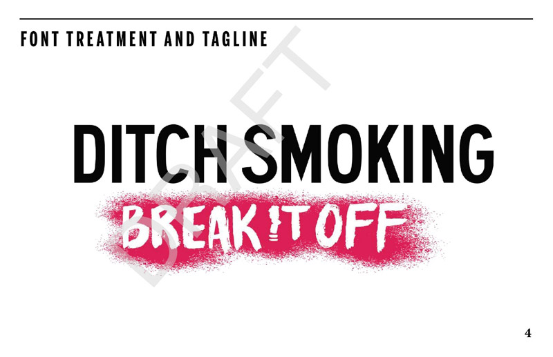
Figure 1: Font treatment and tagline (Be done with smoking / Fumer, c'est fini) Figure 1 - Text Description
Two images of a proposed font treatment for the Break It Off tobacco cessation campaign. The font treatment is a burgundy circle with white text that reads: "Break It Off". The "I" in "It" is designed to represent a broken cigarette. Underneath the circle is a tagline, which reads: "Be done with smoking". The difference between the two images is the font style used for the tagline in each.
Font treatment and tagline elicit lukewarm response
Overall impressions of the Be Done with Smoking / Fumer, c'est fini font treatment and tagline ranged from neutral to mildly positive, although they were more likely to be neutral. Neutral reactions were linked both to the message and the design in general. This included the following impressions:
The message is cliché or slogan-like, with nothing new, provocative or particularly meaningful conveyed.
The design is boring, bland, or outdated, with nothing eye-catching or attention-grabbing.
The elements of the concept are not well integrated (i.e. the tagline seems disconnected from the font treatment).
Some participants in Montreal said the burgundy colour and/or the burgundy dot reminds them of the logo and taste tags of the provincial liquor distributor.
Positive impressions of the concept were based mainly on the message, described by those who liked it as simple, straightforward, and serious. Positive impressions were also, though less often, based on design elements and included the following:
The colour scheme (i.e. white text on a burgundy background), which as described as simple and sober or serious.
The use of a crushed cigarette to depict the letter 'I' in the word 'It' (English version) and the word 'laisse' (French version).
The circle/dot which reminded some either of a stop sign, a sticker, or a seal of approval, each of which was associated with the idea of quitting smoking.
The font type in the expression 'Be done with smoking', with most preferring Font B, which is presented in the version on the right Footnote 8. Reasons given for preferring Font B were that it is unconventional, more attention-grabbing, and larger than Font A in the version on the right.
One participant who reacted positively to the message likened it to a message bomb, while another liked the use of the relationship theme.
Differences between groups or audiences included the following:
In St. John's, daily smokers were more likely to react neutrally to the concept while occasional smokers were more likely to react positively. It should be noted that occasional smokers reviewed the concept after the 'Ditch' concept and positive impressions were sometimes presented in comparative terms. For example, it was suggested that the message in 'Be done with smoking' is more serious and more age-appropriate than the message 'Ditch smoking'.
When it came to the font type in the expression 'Be done with smoking', daily smokers were more likely to prefer Font B while occasional smokers were more likely to prefer Font A (i.e. bold font).
Message more likely to be interpreted as breaking a habit than ending a relationship
Most participants' initial response when asked what message this concept is trying to communicate was to say, 'quit smoking'. When prompted for other messages, participants tended to focus on the theme of breaking the habit of smoking, ending a pattern or cycle that is bad, leaving smoking behind, and going forward in life without smoking. Relatively few focused directly on the relationship theme as part of the messaging. Asked explicitly if the allusion to the relationship theme is clear many said it is not, often adding that they understand the point of the message to be breaking a 'habit' rather than breaking or ending a 'relationship'.
Participants in Montreal were most likely to understand or identify the relationship theme as part of the message, perhaps because the French version is more explicit in this regard, translating 'Break It Off' as 'Je te laisse' (literally 'I'm leaving you').
Attention-catching features
Features of this concept identified as attention-grabbing tended to be the same ones identified earlier when participants were asked about their overall impression of the concept. The feature identified most often was the use of a crushed cigarette to depict the letter 'I' in the word 'It' (English version) and the word 'laisse' (French version). Other routinely identified features included the dot/circle, the burgundy colour, the expression 'Break It Off', and the two different font treatments for the tagline. The French version of the tagline, 'Fumer, c'est fini', was more likely to be identified as attention-grabbing than the English version.
Suggestions for improvement
Suggestions to improve this concept were relatively limited. The only suggestion offered with some frequency was to use more vibrant colours (e.g. red, yellow, blue). Other suggestions offered by fewer participants included the following:
Changing the circle/dot to a heart or a stop sign.
Highlighting the ashes in red in the crushed cigarette used to depict the letter 'I' in the word 'It' (English version) and the word 'laisse' (French version).
Showing smoke emanating from the crushed cigarette used to depict the letter 'I' in the word 'It.
Framing the entire concept in order to pull it together into a more coherent whole.
Moving the tagline closer to the font treatment or placing it in the circle/dot.
Reversing the order in the text (i.e. 'Be done with smoking. Break It Off').
Changing the message to 'Break up with smoking; end the toxic relationship'.
3.2.1.2 Social media graphics
***DRAFT***
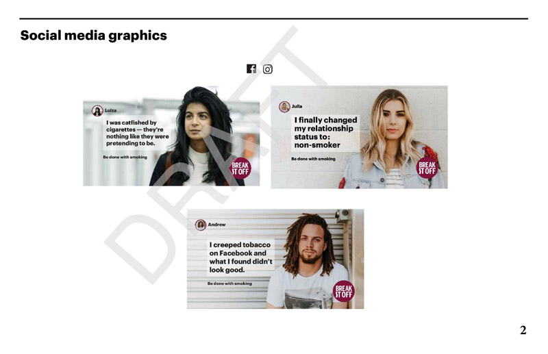
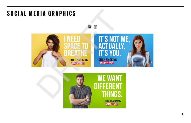
Figure 2: Social media graphics (Be done with smoking / Fumer, c'est fini) Figure 2 - Text Description
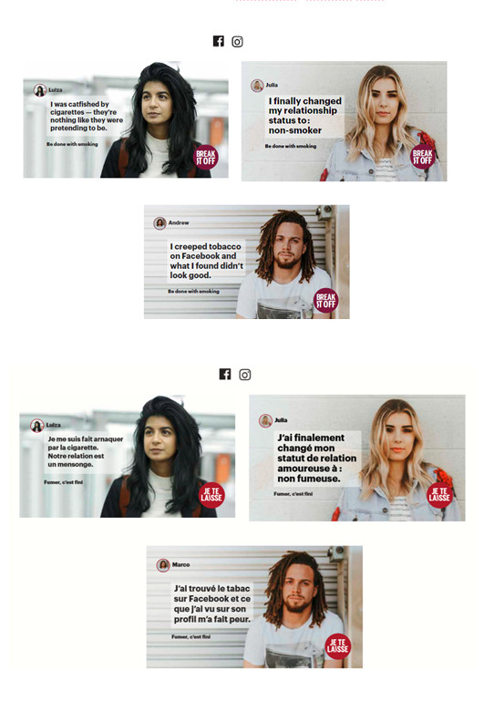
Three images of potential social media graphics for the Break It Off tobacco cessation campaign that use the tagline "Be done with smoking". Each graphic presents a young adult and their social media profile followed by the tagline "Be done with smoking" and the "Break It Off" burgundy font treatment. The text for Luiza reads: "I was catfished by cigarettes-they're nothing like they were pretending to be". The text for Julia reads: "I finally changed my relationship status to: non-smoker". The text for Marco reads: "I creeped tobacco on Facebook and what I found didn't look good".
Social media graphics elicit mixed reactions
Overall impressions of the social media graphics incorporating the Be Done with Smoking concept were mixed, ranging from positive to neutral to critical. Participants in both Saskatoon groups were most likely to react positively to the social media graphics, while occasional smokers in St. John's were most likely to react critically and daily smokers in Montreal were most likely to be neutral.
Positive impressions of the social media graphics were based on the following:
The social media theme is contemporary, relevant, and easy to relate to, with a few participants adding that the pictures look like ones that would be posted on social media.
The messaging is different/uncommon.
The idea of sharing thoughts about smoking or how people come to terms with smoking is appealing.
The models seem realistic, like people their own age or people they know (though occasional smokers in Saskatoon thought they looked a little older).
In Montreal, a few participants liked the fact that the models reflect cultural diversity.
The text is clear, simple, and attention-grabbing.
The font treatment (i.e. 'Break It Off') is well integrated into the presentations.
Neutral and critical impressions tended to focus on similar aspects including the following:
There is nothing captivating or attention-grabbing about the messaging and nothing that makes one think about quitting smoking.
The messaging targets a younger audience (i.e. under 20; identified by some as the 'Instagram generation'). Related to this, it was suggested that the text does not reflect the way young adults in their age group speak.
The relationship theme is not very effective (i.e. trying to personify a cigarette or treat smoking like a relationship).
The models look sad or depressed.
Occasional smokers in St. John's felt that the models look too stereotypical (i.e. like models in a clothing ad) as opposed to people they know or would spend time with.
The models do not look like smokers/ex-smokers, with the possible exception of Luiza.
The tagline (i.e. 'Be done with smoking') is too small.
The colours/colour scheme is bland and the backgrounds in the pictures are meaningless.
Mixed reactions to specific treatments
As noted above, reaction to individual examples of social media graphics also tended to elicit mixed reactions. Presented below is feedback related to each one ordered according to preference (i.e. from the one most positively received to the one least positively received)
Julia:
Reaction to this example ranged from neutral to positive, and of the three treatments, it was the one most likely to elicit positive reactions. Reasons included the following:
The relationship theme is clear and works well in this example because it alludes to a lifestyle change based on a relationship gone bad, something people in their age group can relate to.
The messaging flows well (i.e. the text, tagline and font treatment work well together).
Neutral reactions were based on the impression that the message is bland and does not tend to elicit reflection about quitting smoking. It was noted that, while the relationship theme is clear, the message is inconsequential (i.e. while it points to a lifestyle change it is not clear why this change took place or how it changed her life).
Luiza:
Reaction to this example tended to be mixed. Positive reactions or aspects participants liked included the following:
The model looks like a smoker.
It looks like she is looking to the future (i.e. beyond cigarettes).
The message is consequential (i.e. it shows someone learning something and coming to terms with it).
Neutral and critical reactions were based on the impression that the relationship theme is not very effective in this example (i.e. it is not effective in making one think about quitting smoking).
Andrew:
Reaction to this example tended to range from neutral to critical, but with some positive reactions as well. That said, this treatment was the least likely of the three to elicit positive reactions. Neutral and critical reactions were based primarily on a perceived lack of credibility. Participants routinely suggested that everyone knows cigarettes are bad, so the idea of a young adult learning about this through 'creeping' on Facebook is not believable. Positive reactions were based on the ability to relate to this message because everyone 'creeps' and because, like Luiza, the message shows someone learning something and coming to terms with it.
Message in graphics is clear but not motivational
Participants in every group described the messages in all three examples as clear. They also frequently observed that the relationship theme is understood and comes through clearly or more clearly in these examples than in the font treatments and taglines on their own.
That being said, there was a widespread impression that the social media graphics in general are limited in terms of motivating them to think about quitting smoking. The most frequently given explanation was that there is little or nothing in the examples that touches participants personally or connects with their lives in such a way as to get them to reflect about quitting smoking. Some added that the examples contain nothing new and therefore give them nothing new to think about or no reason to quit.
Some participants suggested that the examples might have some effect on them at a subconscious level, as reminders that smoking is bad. Others suggested that the examples might be effective if they were already thinking about quitting smoking, but not otherwise.
Suggested improvements to social media graphics
The most frequently heard suggestion to make the social media graphics more appealing to people of their age was to establish some meaningful connection to their own lives by providing reasons to quit smoking. Suggestions along these lines included the following:
Focus on the positive impact/consequences of quitting (e.g. money saved, feeling better).
Provide statistics or data showing the impact or consequences of quitting over the short-term (e.g. 'within X days of smoking, your lung capacity will increase X%').
Include meaningful backgrounds in the graphics by showing models engaged in some activity that depicts a lifestyle change (e.g. hiking, playing sports).
Two additional suggestions offered with some frequency were to use more vibrant/vivid colours or colour schemes and to change the models in the sense of making their stance look less contrived and their look less sad or depressed. Other suggestions included increasing the font size of the tagline and including a picture of the model that is not identical to the profile picture in the upper left-hand corner.
3.2.1.3 Banner and T-shirt
***DRAFT***
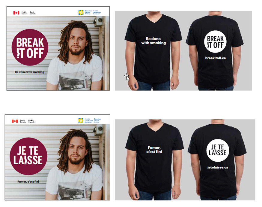
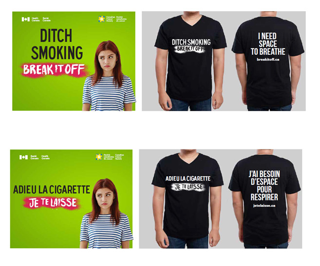
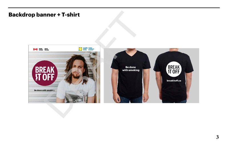
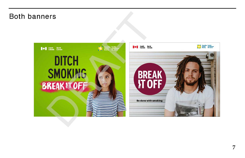
Figure 3: Banner and T-shirt (Be done with smoking / Fumer, c'est fini) Figure 3 - Text Description
The image on the left is a potential backdrop banner for promoting the Break It Off tobacco cessation campaign that could be used at events on school campuses, trade shows, or malls, for example. The banner features a young man and incorporates the "Break It Off" burgundy font treatment as well as the "Be done with smoking" tagline. Across the top are the Health Canada and Canadian Cancer Society logos.
The image on the right is an individual wearing a black t-shirt branded with the Break It Off tobacco cessation campaign font treatment and the "Be done with smoking" tagline. The tagline is on the front of the shirt and the logo on the back of it. Underneath the font treatment is the website address for the campaign.
Banner has limited appeal
Reaction to the example of a campaign banner participants might see at an event was typically neutral. In short, the banner elicited no strong reaction, either positive or negative. Participants routinely suggested that this banner would be unlikely to attract their attention or entice them to stop at a booth where it was displayed. The reason consistently provided for its limited appeal was that there is little or nothing that is captivating or attention-grabbing in it in terms of design or messaging.
The design was generally described as dull, with participants drawing attention to the lack of vibrant colours, the absence of pertinent context or meaningful background, and the perceived sad/bored/depressed looking model. For its part, the message tended to be described as too generic or vague to be meaningful. It was suggested that the one element in the banner that establishes a clear connection to smoking, the tagline, is the least visible element in the design.
Features identified by some as attention-grabbing, and which might entice them to stop at the booth, included the font treatment for 'Break It Off' as well as the picture of the model (these participants described the model as nice looking or attractive). Occasional smokers in Saskatoon were most likely to say they would notice this banner and stop at the booth, though some added they would be more likely to do so if they had already taken the decision to stop smoking. One feature of the banner about which there was widespread agreement was that the logos of Health Canada and the Canadian Cancer Society add credibility to the campaign.
Participants react positively to T-shirt design
Participants routinely described the T-shirt as attention-grabbing primarily because of the black and white colour scheme/design. While some also described the tagline as appealing because it is discrete, others felt they would not notice it because it is too small and because its meaning is unclear on its own on the front of the T-shirt. The font treatment was more likely to be described as attention-grabbing with some suggesting that it should be placed on the front of the T-shirt to make it more visible. By contrast, some participants in Montreal were of the opinion that the font treatment on its own is unclear and therefore would be unlikely to catch their attention.
3.2.2 Concept 2: Ditch smoking / Adieu la cigarette
3.2.2.1 Font treatment and tagline
***DRAFT***
Figure 4: Font treatment and tagline (Ditch smoking / Adieu la cigarette) Figure 4 - Text Description
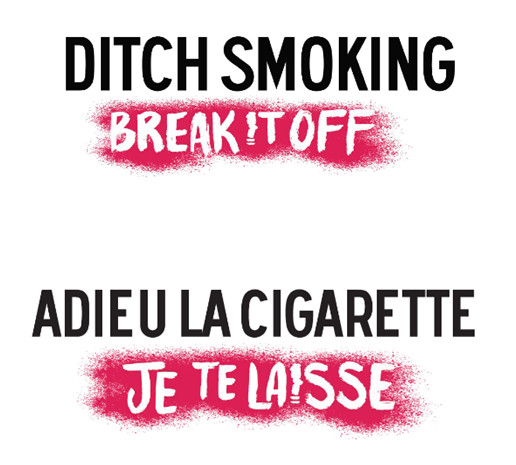
An image of a second potential font treatment for the Break It Off tobacco cessation campaign. The font treatment consists of the tagline "Ditch Smoking" in upper-case black lettering, and white text that reads: "Break It Off" over a red spray paint background. The "I" in "It" is designed to represent a crushed cigarette.
Impressions of font treatment and tagline range from neutral to positive
Overall impressions of the Ditch Smoking / Adieu la cigarette font treatment and tagline ranged from neutral to positive but were more likely to be positive. Few participants expressed negative impressions of the concept overall. Positive impressions were based mainly on the design features. The feature most likely to elicit positive reactions was the graffiti-like red swatch or spray paint motif, which was routinely described as eye-catching or attention-grabbing. Other features that elicited positive reactions included the font size, the use of two different font types, the colour scheme (i.e. combination of black, red, and white), and the use of a crushed cigarette to depict the letter 'I' in the word 'It' (English version) and the word 'laisse' (French version). Positive impressions were also, though less frequently, based on the message, which was described as clear, categorical, assertive, and dramatic. Finally, some said they liked the concept as a whole (i.e. message and design features) because it is unconventional (i.e. the approach struck them as new or different).
Neutral and negative reactions were based mainly on the impression that the design approach and the message (specifically the use of the expression 'Ditch') target a younger audience. As a result, some suggested that there is nothing attention-grabbing, meaningful, or memorable in the concept. Neutral reactions to the message were also based on the impression that the message sounds like an order, that it is slogan-like, and that it makes quitting sound easy. The latter was viewed as making the message less credible or less serious.
Differences between groups or audiences included the following:
Overall positive reactions were more likely among daily smokers than occasional smokers in all locations.
Positive reaction to the message was most evident in Montreal, with some participants there noting that the font treatment and tagline ('Je te laisse') work very well together which makes the message flow well.
Impressions that the message targets a younger audience were most likely among occasional smokers in St. John's.
Concept communicates ideas of breaking habits, taking initiative, and freeing oneself from cigarettes
Asked what message this concept is trying to communicate, participants most often identified variations on themes such as breaking a bad habit, breaking with the past, taking the initiative, and freeing oneself from cigarettes. Some participants focused directly on the relationship theme as part of the messaging. However, as was the case with the previous concept, the response was mixed when participants were asked explicitly if the allusion to the relationship theme is clear.
Attention-catching features
As was the case with the first concept, features of this concept identified as attention-grabbing tended to be the same ones identified when participants were asked about their overall impression of the concept. The features identified most often were the graffiti-like red swatch or spray paint motif, the two different font types, and the use of a crushed cigarette to depict the letter 'I' in the word 'It' (English version) and the word 'laisse' (French version). Some occasional smokers in St. John's said they noticed the expression 'Ditch' because it is not commonly used by people they know in their age group.
Suggestions for improvement
Suggestions to improve this concept included the following:
Combine the tagline 'Be done with smoking' with the design elements of 'Ditch Smoking'.
Change the expression 'Ditch smoking' as well as the graphics to something more age appropriate for a young adult audience.
Use a uniform font type in the concept in order to tie the elements together more coherently.
Reverse the order in the message (i.e. begin with 'Break It Off').
Include an exclamation mark after the tagline.
Include quotation marks around the text.
Remove the word 'la' from the French version and include a comma after 'cigarette' in order enhance/accentuate the relationship theme (i.e. 'Adieu, cigarette').
Only capitalize the word Adieu in the expression 'Adieu la cigarette'.
Include more space between the words in 'Adieu la cigarette'.
Use a deeper/more intense colour of red in the graffiti-like swatch/spray paint motif.
3.2.2.2 Social media graphics
***DRAFT***
Figure 5: Social media graphics (Ditch smoking / Adieu la cigarette) Figure 5 - Text Description
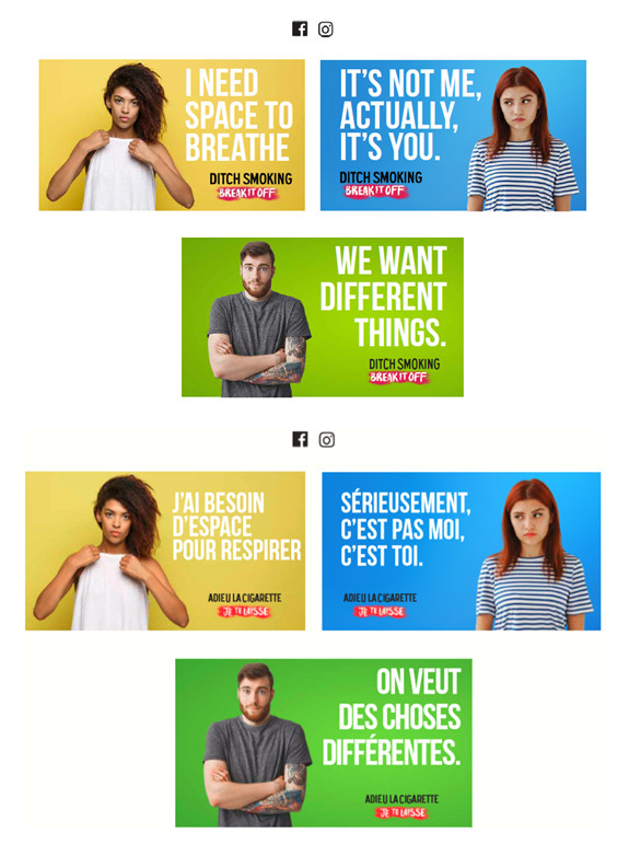
Three images of potential social media graphics for the Break It Off tobacco cessation campaign that use the tagline "Ditch smoking". Each graphic presents an empowered young adult followed by the tagline: "Ditch smoking" and the "Break It Off" font treatment. The text for the graphic with the yellow background reads: "I need space to breathe". The text for the graphic with the blue background reads: "It's not me, actually, it's you". The text for the graphic with the green background reads: "We want different things".
Social media graphics tend to elicit positive reactions
Overall impressions of the social media graphics incorporating Ditch Smoking tended to be positive, and those who were not positive were more likely to be neutral than critical of the graphics. Positive impressions were most often linked to design-related features but also to the message itself. As was the case with the previous concept, the specific examples elicited mixed reactions (i.e. some considered better/more appealing than others).
Positive impressions of the social media graphics were based on the following:
The colours are bold, vivid, vibrant and attention-grabbing.
The models seem realistic and look like people of their age or people they know (some suggesting that the facial expressions on these models are better than those in the 'Be done with smoking' concept).
The font treatment and tagline are visible and well integrated into the design.
The combination of font types and sizes are appealing, and the text is easy to read.
The spacing/display of design elements and text is good.
The statements are straightforward, decisive, and humorous or light-hearted without being silly or laughable.
The message is serious without being directive or preachy.
The statements are appropriate to their age group and easy to relate to.
The relationship theme is clear and easy to understand (some adding that the theme emerges more clearly than in the 'Be done with smoking concept').
Neutral and critical impressions were based on the following:
The approach in general (i.e. colours, message) is familiar. There is nothing captivating or attention-grabbing about the messaging and nothing to make one think about quitting smoking.
The approach in general is a little too light-hearted or playful.
The relationship theme, while clear, is not very effective because smoking is not really a relationship, with a few specifying that it is a habit or a bad habit).
The messaging lacks impact because there is no link to a smoker's life (i.e. no reason to quit smoking).
The messages are too judgmental/negative.
The models' poses look contrived.
The font treatment and tagline are not visible enough. It was observed that their visibility is important because they are the only features that clearly link the graphics to smoking.
The backgrounds while bold and bright in terms of colours are meaningless.
Reactions to specific treatments
As noted above, reaction to individual examples of social media graphics also tended to elicit mixed reactions. Presented below is specific feedback related to each one ordered according to preference (i.e. from the one most positively received to the one least positively received).
I Need Space To Breathe / J'ai besoin d'espace pour respirer
Of the three treatments, this example was the one most likely to elicit positive reactions from participants. Reasons for positive impressions included the following:
The message is simple, clear, positive, pertinent, and memorable.
The relationship theme works well.
The message includes a health theme in addition to the relationship theme (i.e. smoking affects one's capacity to breathe/lung capacity) and the themes work well together.
The model looks confident.
We Want Different Things. / On veut des choses différentes.
Reaction to this example tended to be mixed. Reaction to the model was generally positive, with some suggesting that he seems to be somber. Some also reacted positively to the message, describing it as decisive without being negative. Finally, some drew attention specifically to the green background colour as something they like. Others, however, reacted neutrally or critically to the message, suggesting that the relationship theme does not work well in this treatment because it is not clear what a cigarette could want. It was suggested that this results in an unclear or confusing message.
It's Not Me, Actually, It's You. / Sérieusement, c'est pas moi, c'est toi.
Reaction to this example ranged from neutral to critical, and of the three treatments, it was the one most likely to elicit critical reactions. Reasons informing neutral and critical reactions included the following:
The overall message is unclear (i.e. what is the connection to smoking).
The relationship theme does not work very well in this example. As a result, the message does not tend to elicit reflection about quitting smoking.
The messaging is negative in the sense that it assigns blame.
The model looks a little young and seems sad, depressed, angry, or frustrated.
On the other hand, some participants felt that the look on this model's face was appropriate and something they could relate to because coming to terms with smoking does, at times, generate feelings of depression and frustration. In this sense, some also liked the message because it taps into a feeling of frustration about smoking that they can relate to.
Message and relationship theme clear to most but graphics lack motivational power
As was the case with the previous concept, participants routinely described the messages in all three examples as clear (though this was less likely to be the case for the second example). They also observed that the relationship theme is clear, sometimes adding that it is clearer in this approach than in Be done with smoking. The relationship theme was least likely to be understood by daily smokers in Saskatoon, where some interpreted the messages as being delivered by non-smokers to smokers.
Despite participants' positive reaction to the design elements and perception that the message is clear, there was widespread agreement that the examples are limited in terms of motivating them to think about quitting smoking. The reason most frequently given was similar to the one given to explain the limited motivational power of the first concept. That is, there is little or nothing that touches participants personally or connects with their lives in such a way as to get them to reflect about quitting smoking. Some added that they need something more 'jaw dropping', serious, or consequential to make them think about quitting. Several others added that the relationship theme is not very effective because smoking is not a relationship.
On the other hand, some said that these examples would make them think about quitting, or that they were more effective in this regard than the examples incorporating the first concept. Reasons for their greater effectiveness in this regard included the eye-catching or attention-grabbing nature of the treatments, models that are easier to relate to, and a more effective incorporation of the relationship theme in this approach. Regarding the latter, one participant observed that the relationship theme in these examples made one think of a non-smoking partner and reflect more about quitting. Daily smokers in St. John's were most likely to describe these examples as effective in making them reflect on quitting smoking.
Suggested improvements to social media graphics
Once again, the most frequently offered suggestion to make the social media graphics more appealing to people of their age was to establish some meaningful connection to their own lives by providing reasons to quit smoking (e.g. money saved, lifestyle difference). Other suggestions included establishing a clearer link to smoking by making cigarettes more visible (e.g. include the picture of a broken cigarette), reversing the order between font treatment and tagline (i.e. begin with 'Break It Off'), and having the model in example 2 smile or at least look less depressed.
3.2.2.3 Banner and T-shirt
***DRAFT***
Figure 6: Banner and T-shirt (Ditch smoking / Adieu la cigarette) Figure 6 - Text Description
The image on the left is a potential backdrop banner for promoting the Break It Off tobacco cessation campaign that could be used at events on school campuses, trade shows, or malls, for example. The banner features a young woman and incorporates the "Break It Off" logo and "Ditch smoking" tagline. Across the top are the Health Canada and Canadian Cancer Society logos.
The image on the right is an individual wearing a black t-shirt branded with the Break It Off tobacco cessation campaign font treatment and "Ditch smoking" tagline. The font treatment is on the front of the shirt and the text "I need space to breath" is on the back. Underneath the text is the website address for the campaign.
Banner more likely to attract attention than motivate people to stop
Participants suggested that this banner would be likely to attract their attention if they happened to be at an event displaying it, with some adding that it is more attention grabbing or captivating than the version incorporating Be done with smoking. Reasons provided to explain why included its vibrant colours and the font treatment and tagline which are prominent, bold in terms of messaging, and make a connection to smoking (i.e. 'Ditch smoking'). The model was much less likely to be identified as an attention-grabbing feature of the banner, though some described her as noticeable because she looks angry or frustrated. It was also said that her T-shirt attracts attention.
The banner was less effective in terms of motivating participants to stop at a booth where it would be displayed. Indeed, most said they would be unlikely to stop for the following reasons:
The approach in terms of messaging is cliché or slogan-like, with nothing new or enticing to offer participants.
There is nothing in the message to relate to on a personal level, with some suggesting that there is no real message at all, just an angry-looking individual.
It is not clear why the individual in the banner wants to quit smoking or even that she wants to quit.
Some on the other hand said they would be motivated to stop or more likely to stop at a booth displaying this banner than a booth displaying the banner incorporating the 'Be done with smoking' concept. Reasons included the following:
The message is clear and simple.
The model is age-appropriate and looks like someone easy to relate to.
The approach in general is uncommon (e.g. less formal, more gritty/provocative).
The banner is attractive/inviting or more attractive/inviting than the version incorporating Be done with smoking.
Participants react positively to T-shirt design
Participants routinely described the T-shirt as attention-grabbing. As with the version incorporating the Be done with smoking concept, one of the most attractive features was the black and while colour scheme/design. The font treatment and tagline on the front were also described as eye-catching because of their size/proportions, the message is considered slightly amusing and provocative, and the use of different font types. Some suggested that the tagline would be more captivating if the red colour were used. Many also described the message on the back as visually appealing because of its size and because the message and the website address would generate curiosity.
3.2.3 Comparison of concepts
No clear winner emerged when participants were asked which of the two concepts they preferred. Slightly more participants preferred the Ditch smoking concept but among these were some who suggested combining the graphics of the latter with the text/message of Be Done with Smoking. Indeed, while the design features for the Ditch smoking concept routinely elicited more positive feedback than those used in the Be Done with Smoking, many participants preferred the message in the latter. Reasons for participants' overall preference are summarized in the table below.
Be done with smoking / Fumer, c'est fini
Ditch smoking / Adieu la cigarette
The message is simple, straightforward, and more likely to generate reflection.
The message is categorical, definitive and dramatic and more provocative.
The message is more age appropriate. By contrast, the expression 'ditch' is more appropriate to a younger age group (e.g. under 20).
The design features are more appealing/attractive and attention-grabbing.
The approach in general is more sober/less 'in your face' and in particular the circle/dot in the font treatment is appealing as a symbol.
The general approach is more modern and unconventional (i.e. more gritty/provocative).
The message is better in tone because it does not sound like an order and it is more realistic/credible/serious. By contrast Ditch smoking sounds like an order and makes quitting smoking sound easy.
The font treatment and tagline in the French version are more coherent and flow better.
Some participants in Montreal prefer use of the word 'cigarette' in the message (i.e. 'Adieu la cigarette').
Some participants in Montreal prefer use of the word 'fumer' in the message (i.e. 'Fumer, c'est fini').
The only noticeable difference by audience type was that most daily smokers in each location expressed an overall preference for Ditch smoking while most occasional smokers in each location expressed an overall preference for Be done with smoking. That being said, most daily smokers in St. John's qualified their overall preference by saying that they prefer a hybrid approach using the text/message from Be done with smoking combined with the graphics from Ditch smoking.
3.2.4 Alternative font treatment and taglines
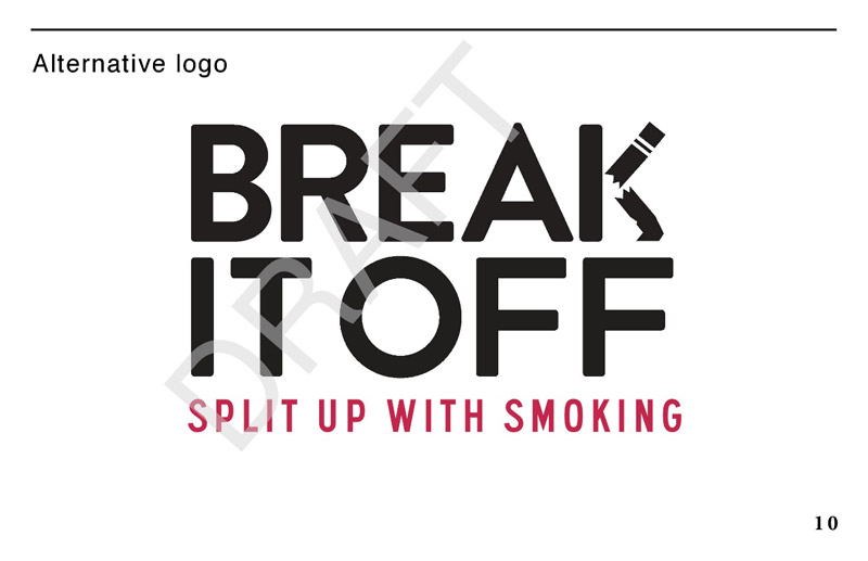
3.2.4.1 Font treatment
After reviewing and comparing the two conceptual approaches, participants were asked for their feedback on an alternative approach. The alternative approach, designated as Split up with smoking, included the following font treatment and tagline:
***DRAFT***
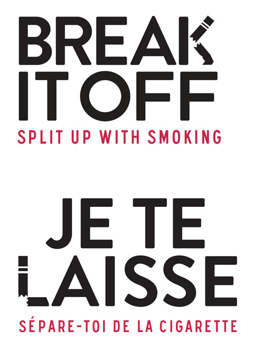
Figure 7: Alternative logo Figure 7 - Text Description
An image of another potential font treatment for the Break It Off tobacco cessation campaign. The font treatment consists of the campaign name, "Break It Off", in upper-case black lettering, followed by the tagline, "Split up with smoking", in upper-case red lettering. The "K" in "Break" is designed to represent a broken cigarette.
Reaction to the alternative font treatment was mixed, ranging from positive to neutral to critical. The element most likely to elicit positive reaction was the depiction of a broken cigarette as part of the letter 'K' in the expression 'Break It Off'. The French version of this tagline elicited similar enthusiasm for the depiction of a broken cigarette as part of the letter 'L' in the expression 'Je te laisse'. Other features that tended to elicit positive reactions were the red font in ttagline, the combination of black and red font, and the font style.
The tagline 'Split up with smoking' elicited mixed reactions. Some liked it because the relationship theme is explicit and clear, while others disliked it for the same reason, suggesting that the emphasis on the relationship theme is too strained and obvious. Some participants in Montreal suggested that the two parts of the French version (i.e. 'Je te laisse' and 'Sépare-toi de la cigarette') are contradictory because the first part is spoken in the first-person and suggests someone taking charge while the second part gives the impression of a third-person issuing an order.
With one exception, no one preferred this approach to the one they had identified previously as their favourite. However, many participants in St. John's and Saskatoon felt that the depiction of a broken cigarette as part of the letter 'K' in 'Break It Off' should replace the crushed cigarette used in Be done with smoking and Ditch smoking to depict the letter 'I' in the word 'It'. It was suggested that a broken cigarette works better than a crushed cigarette because it suggests that the cigarette was destroyed rather than smoked. On the other hand, a few participants felt that the broken cigarette looked more like a broken pencil. The French version of this tagline elicited similar enthusiasm for the depiction of a broken cigarette as part of the letter 'L' in the expression 'Je te laisse'. While a number of participants in Montreal reacted positively to this design feature, no one suggested incorporating it into their preferred conceptual approach.
3.2.4.2 Taglines
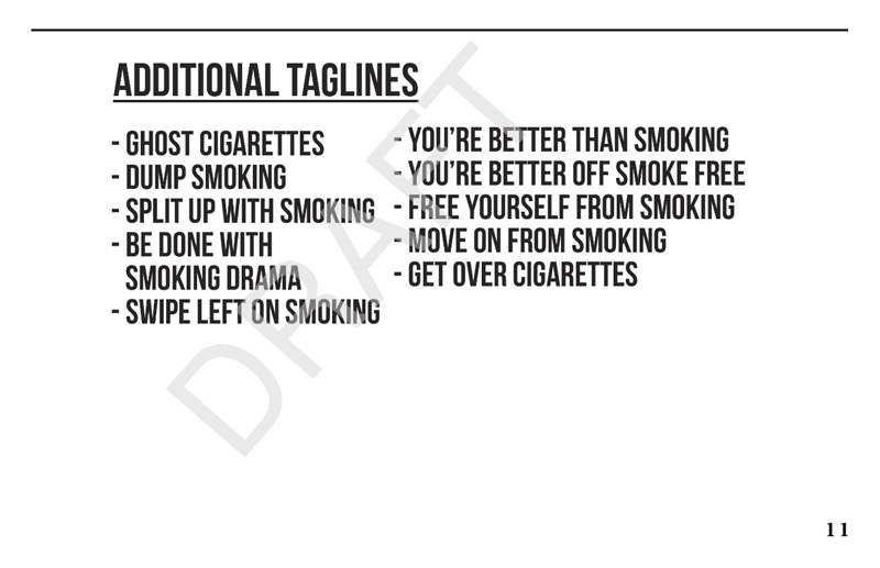
Following the review of the logo and tagline, participants were given a sheet containing a list of other possible taglines. They were asked to identify the one they considered most effective. The list included the following options:
English Taglines
GHOST CIGARETTES
DUMP SMOKING
SPLIT UP WITH SMOKING
BE DONE WITH SMOKING DRAMA
SWIPE LEFT ON SMOKING
YOU'RE BETTER THAN SMOKING
YOU'RE BETTER OFF SMOKE FREE
FREE YOURSELF FROM SMOKING
MOVE ON FROM SMOKING
GET OVER CIGARETTES
French Taglines
OUBLIE LA CIGARETTE
JETTE LA CIGARETTE
SÉPARE-TOI DE LA CIGARETTE
CASSE AVEC LA CIGARETTE
QUITTE LA CIGARETTE
ÉCRASE LA CIGARETTE
FAIS DISPARAÎTRE LA CIGARETTE
GLISSE À GAUCHE FACE À LA CIGARETTE
C'EST FINI AVEC LA CIGARETTE
JE VAUX PLUS QU'UNE CIGARETTE
LIBÈRE-TOI DE LA CIGARETTE
FINI LES DRAMES
The taglines most likely to be preferred by English-speaking participants were those emphasizing freedom from cigarettes (i.e. 'Free Yourself From Smoking'), being better off smoke-free (i.e. 'You're Better Off Smoke Free'), and self-worth (i.e. 'You're Better Than Smoking'). The tagline most likely to be preferred by French-speaking participants was the one emphasizing self-worth (i.e. 'Je vaux plus qu'une cigarette').
No other tagline was preferred by more than a few participants. 'Free Yourself From Smoking' was preferred because of the emphasis on freedom in general and freeing oneself from toxins in particular. 'You're Better Off Smoke Free' was preferred because it is true, to the point, and works well with the expression 'Break It Off'. Finally, 'You're better than smoking/Je vaux plus qu'une cigarette' was preferred because it emphasizes self-worth, reminds one that smoking is a bad habit or an addiction, and brings to mind the idea of taking back control of one's life.
3.3 Promotional Items
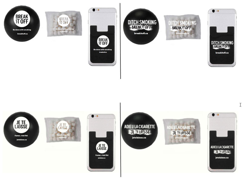
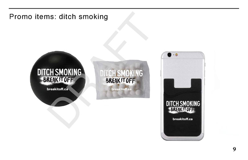
Participants were shown examples of three promotional items that could be distributed at events and asked about their usefulness and appropriateness in the context of a smoking cessation campaign. The items included a stress ball, breath mints, and a cardholder that fastens to the back of a mobile phone.
***DRAFT***
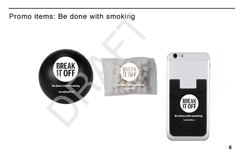
Figure 8: Promotional items Figure 8 - Text Description
Images of three potential promotional items that could be handed out at events as part of the Break It Off campaign: a stress ball, a package of mints, and a card holder that fastens to the back of a mobile phone. Each item contains the "Break It Off" font treatment, tagline, and website address.
Agreement on purpose of promotional items
Prior to being asked to comment on the promotional items, participants were asked what they think should be the purpose of promotional items that are part of a quit smoking campaign like Break It Off. In response, three purposes were routinely identified. These included serving as reminders/keeping the issue of quitting top-of-mind, helping increase awareness of the campaign, and playing a supportive/motivator/role in helping one quit smoking.
Consensus on appropriateness of items and widespread agreement regarding their usefulness
There was a consensus among participants that the promotional items were appropriate, and widespread agreement that they are useful, primarily as reminders and ways to spread awareness of the campaign. The stress ball and mints were also viewed as helpful in a supportive capacity for someone when trying to quit smoking - the ball by helping with stress relief and the mints by being a substitute for cigarettes. Some who described the mints as a useful substitute for cigarettes suggested that they might be less useful as a reminder or a way to spread awareness because once they are consumed the packet is thrown away.
Comparatively speaking, the usefulness of the cardholder was most likely to be considered problematic. It was suggested, for example, that relatively few people use cardholders and that those who do might not want a smoking cessation campaign version. Its usefulness as a reminder and a way to spread awareness was also questioned on the assumption that people rarely look at the back of their phone and that people do not look at other people's phones. In response, it was suggested that people have their phones with them 24/7 so the cardholder is likely to have some effect as a reminder, especially when people pull out their credit or debit card to purchase cigarettes.
Additional promotional items identified as useful
Participants collectively identified a host of additional promotional items they thought might be useful. The list included fidget toys/devices, apps to help track their smoking cessation progress, as well as wrist bands, pins, fridge magnets, chewing gum, water bottles, T-shirts, pens, stickers, slime, key chains, and lighters.
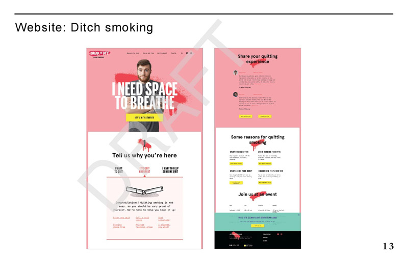
3.4 Review of Website Design
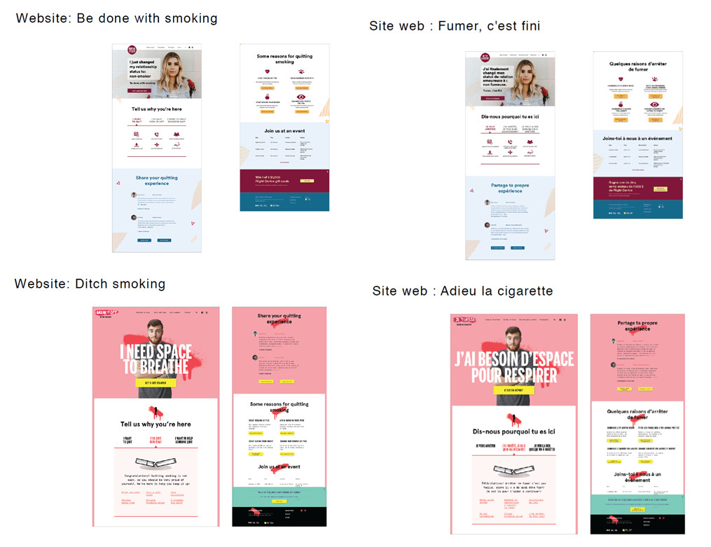
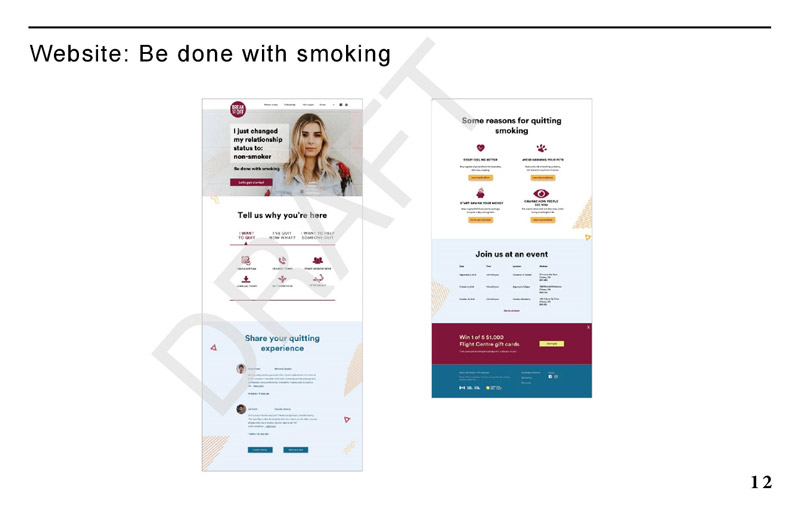
This section reports on participants' reactions to a proposed redesign of the Break It Off website. Participants were shown a screenshot of the landing page for the site and asked to review it. Two versions of the landing page were tested, differing only in terms of style (i.e. the content in terms of menus and text was the same in both versions). One version incorporated the Be done with smoking concept and the other incorporated the Ditch smoking concept. The presentation of versions was rotated so that each version was presented first in half the focus groups.
***DRAFT***
Figure 9: Website landing pages Figure 9 - Text Description
Images of two potential website landing page designs for the Break It Off tobacco cessation campaign. One uses the "Be done with smoking" font treatment and tagline, and the other uses the "Ditch smoking" font treatment and tagline.
Nature of website apparent to most by looking at home page
Nearly all participants said that it is clear when looking at the home page of either version that this is a quit smoking website. The few participants who indicated that this was not clear to them were occasional smokers in St. John's who were reviewing the Ditch smoking version.
Widespread positive reaction to website home page
There was widespread positive reaction to the proposed redesign of the landing page of the Break It Off campaign website, regardless of which of the two approaches participants were shown first (i.e. Be done with smoking or Ditch smoking). With one exception, all or most participants in every group reacted positively and those who were not positive were neutral rather than negative.
Reasons for positive overall impressions focused on the design/presentation, content, and organization of the website and included the following:
The home page is welcoming (e.g. 'Tell us why you're here').
It looks user-friendly and well organized.
The content looks useful/interesting and the site seems comprehensive (i.e. it appears to have lots of information and resources).
The overall design is attractive, and the site is appealing in terms of look, spacing, and colour schemes. The design was described as 'modern' and 'competent', with some saying that it does not look like a typical Government of Canada site.
Neutral reactions tended to be based on the impression that the overall look is boring and that there is little or nothing that is eye catching in terms of design. The Ditch smoking version was more likely to elicit positive feedback on design-related features while the Be done with smoking version elicited neutral reactions in this regard.
Various features of home page described as attractive/appealing
Most participants described the presentation of the home page as attractive and appealing in a way that makes them want to use the site. Features or aspects of the site identified as appealing or attractive in the sense of making participants want to use it included the following:
The site is welcoming and encourages involvement/participation (e.g. 'Tell us why you're here', 'Share your quitting experience', 'Join us at an event').
The site flows well and orients visitors, in particular the tripartite division in reasons for visiting the site (i.e. 'I want to quit', 'I've quit now what?', and 'I want to help someone quit').
The site is clearly designed for young adults (each version prominently displaying a young adult).
The overall look/design of the site is cheerful (e.g. bright, light, and airy), not heavy and sombre.
The site looks comprehensive in terms of content (i.e. it seems to contain a lot of information and numerous resources).
Some participants, however, identified features of the site that do not motivate them to want to use it. These include the following:
The young female adult featured in Be done with smoking was described as having a vacant look that is unappealing.
The colour scheme in both versions was criticized by some participants. The pink in Ditch smoking was described by occasional smokers in Montreal as poorly coordinated with other colours and as detracting from the seriousness of the site. A few other participants said that they associate the colour pink with breast cancer. On the other hand, some criticized Be done with smoking as being dull looking in terms of colour scheme.
The amount of information available on the site gave a few participants the impression that there would be a lot to wade through when exploring the site, an impression that does not induce them to want to use it.
The red 'swatches' used in Ditch smoking were described by some as unappealing because they look like dripping blood.
Menus and labels described as clear and containing useful information
Participants were unanimous in describing the menus on the home page as clear and easy to understand. Indeed, no one identified any label considered confusing or lacking in clarity.
Participants had no difficulty identifying sections on the home page they thought would contain useful information for them personally. These included the following:
'Tell us why you're here' / 'Dis-nous pourquoi tu es ici'
'I want to quit' / 'Je veux arrêter'
'Share your quitting experience' / 'Partage ta propre expérience'
'Join us at an event' / 'Joins-toi à nous à un événement'
'Call a quit coach'/ 'Appeler un spécialiste d'abandon du tabac'
'After you quit' / 'Après avoir arrêté'
'I slipped, now what?'/ 'J'ai dérapé. Je fais quoi'
'Cost calculator'/ 'Calculateur de coût'
'Some reasons for quitting'/ 'Raisons d'arrêter'
'Start saving your money'/ 'Commence à sauver ton argent'
'Make a quit plan'/ 'Faire un plan pour arrêter'
'I want to help someone quit'/ 'Je veux aider quelqu'un à arrêter'
'Win 1 of 5 $1,000 Flight Centre gift cards'/ 'Gagne une des cinq cartes-cadeaux de 1,000 $ de Flight Centre'
Suggestions for improving the website
Participants offered relatively few suggestions to improve the design of the website in order to make it more relevant or appealing. The only frequently made suggestion was to include better or more meaningful pictures of the young adults featured on the home page. Other suggestions applying to both sites included making the competition/contest more visible by moving it up, placing 'Some reasons for quitting smoking' before 'Share your quitting experience', including videos in the 'Share your quitting experience' section, and making the Health Canada logo more prominent/visible.
A few suggestions related specifically to the colours/colour schemes used in each version of the home page. In relation to Ditch smoking, some suggested replacing the colour pink to give the site a more sober/serious look and removing the red 'swatches' because they look like dripping blood. In relation to Be done with smoking, some suggested replacing the burgundy colour and adding more colour/using more vibrant colours.
Participants divided over preferred version of website
Participants were divided when asked which version of the website they preferred, though slightly more identified Ditch smoking. Those who preferred this version typically described it as more attractive than the other version. In explaining why, they described it as 'more motivational', 'more fun-looking', 'more modern-looking' (i.e. like Instagram, Buzzfeed, or Snapchat), and 'more adapted to their age group', with some suggesting that it looks like it was designed by young people. Some participants also preferred it for organizational reasons, suggesting that it appears easier to guide/orient themselves in this version and that they have a clearer sense of links and content in this version. Additional reasons for preferring this version included the impression that the spacing is better and a preference for the tagline, 'I need space to breathe'.
Those who preferred Be done with smoking usually described it as more sober/serious, more professional looking, less distracting (compared to the pink background of Ditch Smoking), and easier on their eyes/calmer, with some suggesting that the colour scheme is more appropriate for a smoking cessation website. Some also felt that the overall use of space was better in this version, giving the home page a lighter, more aerated look. A few expressed a preference for the 'Be done with smoking' font treatment.
Regional differences were evident when it came to preferences regarding versions of the website. Most participants in both groups in St. John's preferred Ditch smoking, while most in both Montreal groups preferred Be done with smoking. By contrast, participants in both Saskatoon groups were split down the middle in terms of preferences.
Social media best way to reach young adult smokers with campaign materials
Participants were unanimous that the best way for Health Canada to reach young adult smokers with Break It Off campaign materials is through social media channels (e.g. Youtube, Instagram, Facebook, Twitter). Other routinely suggested media included the following:
T-shirts and other promotional items (e.g. distributing them at public events).
Television and radio.
Booths/kiosks at university welcome weeks.
Publicity on buses and in metros.
Street squads.
4 Appendix
4.1 Screener
INTRO: Hello/Bonjour, my name is [RECRUITER]. I'm calling from Decision Points Research, a Canadian research company. We're organizing a series of discussion groups on behalf of the Government of Canada with smokers in your area.
Would you prefer that I continue in English or French? / Préférez-vous continuer en français ou anglais?
RECRUITER NOTE: FOR ENGLISH GROUPS, IF PARTICIPANT WOULD PREFER TO CONTINUE IN FRENCH, PLEASE RESPOND WITH, "Malheureusement, nous recherchons des gens qui parlent anglais pour participer à ces groupes de discussion. Nous vous remercions de votre intérêt."
Is there anyone in your household aged 20 to 24 who smokes cigarettes? If so, may I speak with this individual?
No
THANK/DISCONTINUE
Yes:
Same person CONTINUE
Someone else
ASK TO SPEAK TO SMOKER
REPEAT INTRO
CONFIRM THIS PERSON SMOKES CIGARETTES
GO TO DESCRIPTION
Not available SCHEDULE CALL-BACK
DESCRIPTION: We are conducting a research study for Health Canada, a department of the Government of Canada, to help them develop health-related information for cigarette smokers. I'd like to tell you about the study to see if you might be interested in taking part in a discussion group. The groups will last up to two hours and will be conducted in the evening. People who take part will receive a cash gift to thank them for their time and light refreshments will be served. The format is a "round table" discussion led by a research professional with up to 11 participants. All opinions will remain anonymous and participation is voluntary. The information collected will be used for research purposes only and handled according the Privacy Act of Canada.* The full names of participants will not be provided to the government or any other third party. More information about the handling and use of your personal information will be provided by email in advance of the research. Would you be interested in taking part in this study?
Yes CONTINUE
No THANK/DISCONTINUE
*IF ASKED: The personal information you provide to Health Canada is governed in accordance with the Privacy Act and is being collected under the authority of section 4 of the Department of Health Act. The information you provide will not be linked with your name on any document including the consent form or the discussion form. In addition to protecting your personal information, the Privacy Act gives you the right to request access to and correction of your personal information. For more information about these rights, or about our privacy practices, please contact Health Canada's Privacy Coordinator at 613-948-1219 or privacy-vie.privee@hc-sc.gc.ca. You also have the right to file a complaint with the Privacy Commissioner of Canada if you think your personal information has been handled improperly. The final report written by Phoenix SPI will be available to the public from Library and Archives Canada (http://www.bac-lac.gc.ca/).]
Before we invite you to attend, I need to ask you a few questions to make sure we are getting a good mix of people for each discussion groups. This will take 5 minutes. May I continue?
Yes CONTINUE
No THANK/DISCONTINUE
1. Record gender by observation. [50/50 SPLIT]
Female
Male
2. We've been asked to speak to participants of all different ages. May I have your age please? [GET MIX]
Under 20 THANK/TERMINATE
20
21
22
23
24
25+ THANK/TERMINATE
RECRUITER NOTE: WHEN TERMINATING AN INTERVIEW, SAY: "Thank you very much for your cooperation. We are unable to invite you to participate because we have enough participants who have a similar profile to yours."
3. Do you, or any member of your immediate family, work for…? [READ LIST]
…a marketing research, public relations, or advertising firm?
…the media (radio, television, newspapers, magazines, etc.)?
…the federal or provincial government?
…a tobacco or e-cigarette company?
Yes
THANK/TERMINATE IF YES TO ANY
No
CONTINUE
4. At the present time, do you smoke cigarettes every day or occasionally?
Every day [DAILY SMOKER] GO TO Q6
Occasionally CONTINUE
VOLUNTEERED:
Not at all THANK/TERMINATE
5. In the past 30 days, did you smoke any cigarettes?
Yes [OCCASIONAL SMOKER]
No THANK/TERMINATE
6. Have you ever tried to quit smoking?
Yes GO TO Q8
No CONTINUE
7. Are you seriously thinking about quitting smoking in the next 6 months? [GET MIX]
Yes
No
8. Could you please tell me what is the last level of education that you have completed?
Some high school
Completed high school
Some college/technical school/CEGEP
Graduated college/technical school/CEGEP
Some university
Graduated university
Graduate studies
9. Which of the following best describes your employment situation? Are you… [READ]
Working full or part time?
A student attending school full-time?
Unemployed, but looking for work?
Not in the workforce?
ASK Q10 IF EMPLOYED; IF NOT, GO TO Q11.
10. What is your current occupation? [GET MIX]
[RECORD JOB AND CODE AS 1) TRADE* or 2) NON-TRADE]
Trade*
Non-trade
*NOTE: This is someone who specializes in a particular occupation that requires work experience, on-the-job training, and/or vocation education. Examples of occupations: carpenter, construction worker, mining, oil and gas extraction workers, mechanic, HVAC technician, plumber, electrician, machine operator, welder, painter, mason, cooks/chefs, hairstylist, etc.
11. Do you identify as…
a) a member of a visible ethno-cultural group? [GET MIX]
12. Which, if any, of the following types of music do you listen to ? [READ LIST; GET MIX]
Hip/Hop and rap
Indie music
Rock/alternative music
Pop and dance music
Country music
VOLUNTEERED: None of the above.
ASK: What genre of music do you listen to? [RECORD]
13. Have you ever attended a discussion group or taken part in interview on any topic that was arranged in advance and for which you received money for participating?
Yes CONTINUE
No GO TO Q17
14. When did you last attend one of these discussion groups or interviews? [DO NOT READ UNLESS HELPFUL]
Within the last 6 months THANK/TERMINATE
6 months to under 2 years CONTINUE
2 or more years GO TO Q16
15. Thinking about the groups or interviews that you have taken part in, what were the main topics discussed?
RECORD: _______________
THANK/TERMINATE IF RELATED TO TOBACCO
16. How many discussion groups or interviews have you attended in the past 5 years?
Fewer than 5
Five or more THANK/TERMINATE
17. Participants will be asked to look at some items and voice their opinions in front of others. Do you feel comfortable doing this?
Yes CONTINUE
No THANK/TERMINATE
18. The discussion group will be video-recorded. These recordings are used to help with analyzing the findings and writing the report. The results from the discussions will be grouped together in the research report, which means that individuals will not be identified in anyway. Neither your name nor your specific comments will appear in the research report. Is this acceptable?
Yes CONTINUE
No THANK/TERMINATE
19. There may be some people from Health Canada and other organizations* who have been involved in this project observing the session in-person or remotely via a webcam set-up. They will not take part in the discussion and they will not know your name. Is this acceptable?
Yes CONTINUE
No THANK/TERMINATE
*IF ASKED: This includes the Canadian Cancer Society and the creative agency.
Thank you. We would like to invite you to attend one of the discussion groups, which will be lead by a researcher from the national public opinion research firm, Phoenix SPI. The group will take place on [DAY OF WEEK], [DATE], at [TIME] and it will last two hours. Following your participation, you will receive $125 to thank you for your time.
20. Are you willing to attend?
Yes CONTINUE
No THANK/TERMINATE
21. May I have your email address so that we can also send you an email message with the address where the group will be held, as well as a consent form to read and bring with you to the focus group?
Yes: ENTER EMAIL ADDRESS
No: That's fine.Do you have a pen handy so that I can give you the address where the group will be held? It will be held at [INSERT FACILITY ADDRESS] at [TIME] on [DATE].
At the facility, you will be asked to produce photo identification, so please remember to bring something with you (for example, a driver's license). In order to participate, you will also be asked to provide the signed consent form we will send by email in advance.
If you use glasses to read, please bring them with you.
As we are only inviting a small number of people to attend, your participation is very important to us. If for some reason you are unable to attend, please call us so that we can get someone to replace you. You can reach us at [INSERT NUMBER] at our office. Please ask for [INSERT NAME].
Someone from our company will call you the day before to remind you about the session. To do that, we need to have your contact information.
First name:
Last Name:
Daytime phone number:
Evening phone number:
Email:
Thank you!
4.2 Moderator's Guide
Introduction (5 minutes)
Introduce moderator/firm and welcome participants to the focus group.
Thanks for attending/value your being here.
Tonight/today, we're conducting research on behalf of Health Canada.
We will be seeking your opinion on potential messages and resources related to a campaign that helps young adults quit smoking and stay smoke-free.
The discussion will last approximately 2 hours.
If you have a cell phone or other electronic device, please turn it off.
Describe focus group.
A discussion group is a "round table" discussion.
My job is to facilitate the discussion, keeping us on topic and on time.
Your job is to offer your opinions on the materials we're going to look at tonight.
There are no right or wrong answers. This is not a knowledge test.
Everyone's opinion is important and should be respected.
We encourage you to speak up even if you feel your opinion might be different from others around the table. Your opinion may reflect that of other Canadians who are not here tonight.
Explanations.
Comments treated in confidence.
Please note that anything you say during these groups will be held in confidence. We do not attribute comments to specific people. Our report will summarize the findings from the groups, but it does not mention anyone by name.
We encourage you to not provide any identifiable information about yourself.
The final report can be accessed through the Library of Parliament or Archives Canada.
Your responses will in no way affect your dealings with the Government of Canada.
The session is being audio-video recorded. The recordings remain in our possession and will not be released to anyone, even to the Government of Canada, without your written consent.
Recording is for report writing purposes / verify feedback.
Observers.
There are people from Health Canada and the partner organizations involved in this project who will be observing tonight's session in person from behind the one-way mirror, or online.
Purpose: oversee the research process and see your reactions first-hand.
Any questions?
Roundtable introduction: Please tell us your first name and a hobby or interest of yours, for example the type of music you listen to or what you like to do in your spare time.
Context (15 minutes)
What you all have in common, and part of the reason you're here, is that you all smoke cigarettes.
How long have you been smoking cigarettes?
ASK DAILY SMOKERS:
Approximately how many cigarettes do you smoke a day? Do you smoke more or less on certain days (I.e. weekends versus weekdays)
ASK OCCASIONAL SMOKERS:
How often do you smoke?
In general, where and when do you smoke?
Has anyone ever tried to quit smoking? [HAND COUNT]
For those who have,
What did you do to try to quit smoking cigarettes?
Why do you think your quit attempt(s) didn't stick…why was it not successful?
Probes (if needed): withdrawal, stress, triggers, no quit plan
Is anyone seriously considering trying to quit smoking in the next 30 days? [HAND COUNT] What about the next six months? [HAND COUNT]
What are the main barriers or challenges to quitting smoking and remaining smoke-free?
Probes (if needed): lack of support, no motivation, same routine, friends who smoke, living with someone who smokes
As far as you know, what quit smoking aids or resources are available to someone who wants to quit smoking?
Probes (if needed): Nicotine Replacement Therapy (NRT), prescription medications, vaping/e-cigarettes, counselling, online support groups
Introduction to review of materials (5 minutes)
As I mentioned, tonight we'll be asking you to review potential messages and resources related to a campaign on quitting smoking. However, before we do, I'd like you to think about quitting smoking messages or campaigns that you have seen. NOTE: THE FOCUS IS ON CAMPAIGNS CARRIED OUT BY WAY OF MEDIA. IF PARTICIPANTS MENTION HEALTH WARNING MESSAGES OR HEALTH INFORMATION MESSAGES ON/IN CIGARETTE PACKAGES, REDIRECT THE FOCUS.
Can anyone recall any anti-smoking or quit smoking campaigns*? If so, what do you recall about what you saw/read/heard? What about it was memorable? Did it make you think about quitting smoking? Did you try to quit?
*NOTE SPECIFIC REFERENCES TO BREAK IT OFF.
IF NOT MENTIONED: Have you seen or heard any campaigns with a slogan called Break It Off? [HAND COUNT]
IF YES: What do you remember? Did it make you think about quitting smoking? Did you try to quit?
This evening we'll be reviewing messages and resources related to Break It Off, a campaign launched by Health Canada and the Canadian Cancer Society to help smokers in your age group quit smoking and stay smoke-free.
Review of Creative Concepts (75 minutes)
We're going to start by reviewing two creative concepts developed for Break It Off. Each approach includes different fonts for the words "Break It Off" with a tagline as well as a series of products so that you can better understand how the concept could be used in a marketing campaign. We'd like your feedback on each of the concepts and the campaign-related materials that incorporate each approach.
REVIEW THE FIRST CONCEPTUAL APPROACH. ROTATE ORDER OF PRESENTATION OF CONCEPTS ACROSS GROUPS (I.E. BEGIN WITH BE DONE IN ONE GROUP AND DITCH SMOKING IN THE FOLLOWING GROUP).
Let's start with the first approach, which I will call concept [BE DONE/DITCH]. Please turn to the first page in your booklet - it features a font treatment and a tagline for this approach. POINT THIS OUT TO PARTICIPANTS. The font and tagline would appear on all campaign-related materials. I'd like you to take a moment to review the font and tagline. When everyone is finished, we'll discuss the materials as a group. Feel free to jot down any thoughts or impressions you have. Please keep your reaction to yourself, and don't flip ahead in the booklet.
A: Font treatment and tagline
ALLOW A MOMENT FOR PARTICIPANTS TO REVIEW THE CONCEPT THEN PROCEED.
Ok, it looks like everyone has had time to review it.
What's your overall impression of this concept for a quit smoking campaign? Why do you say that?
Probe: - positive, neutral, negative impressions and why
What message is this concept trying to communicate? Does it communicate the message effectively? Why/why not? IF SAY "QUIT SMOKING" PROMPT FOR OTHER MESSAGES.
Probe: - Is the relationship theme understood?
What, if anything, stands out or catches your attention?
Probe: - colours, fonts, preferred tagline font*
*Concept 1 only
What changes, if any, would you suggest to make this concept more appealing to people your age?
Let's turn to the next page in the booklet. On this page, you will see examples of how this concept could be used in graphics for social media. Take a moment to look at it. Once again, feel free to jot down any thoughts or impressions you have including anything you notice or that catches your attention. Please keep your reaction to yourself until we discuss it as a group.
GIVE PARTICIPANTS A MOMENT TO REVIEW IT.
B: Social media graphics
Ok, it looks like everyone has had time to review it.
WATCH FOR DIFFERENCES BY GRAPHIC.
What's your overall impression of these social media graphics? Why do you say that?
Probe: - positive, neutral, negative impressions and why
- Is there one in particular that stands out more to you? Why is that?
What, if anything, stands out or catches your attention?
Probe: - colours, images, text
Are they appealing to you personally……do you find them relevant? Why/why not?
Probe: - What about the models…how old do you think they are?
- Do the models look like people you might spend time with?
Are they memorable? How likely would you be to remember them?
Probe: - memorable aspect(s)
What about the text…are the messages clear? If not, what is unclear?
Probe: - review each of the three examples for lack of clarity
- is the relationship theme clearly understood?
Would these motivate you to think about quitting smoking? Why do you say that? What about to seek information about quitting smoking?
What changes, if any, would you suggest to make these social media graphics more appealing to people your age?
Please turn to the next page. Here are examples of campaign-related materials that could be used at events on school campuses, trade shows, malls, etc. One is a backdrop banner and the other shows T-shirts that could be worn by people operating booths at these types of events. Take a moment to look at both and then we'll discuss them. Again, feel free to jot down any thoughts or impressions, including anything you notice or that attracts your attention.
GIVE PARTICIPANTS A MOMENT TO REVIEW THEM.
C: Backdrop banner and T-shirts
Let's start with the banner,
If you happened to be at an event where there was a booth displaying this banner, would it grab your attention? [HAND COUNT] Why is that?
Probe: - What would attract attention (colour scheme, image, font treatment and tagline)?
- Do the Health Canada and Canadian Cancer Society logos add credibility?
Would the banner make you stop at the booth? [HAND COUNT] Why is that?
Is the banner appealing to you personally……do you find it relevant? Why/why not?
Probe: - What about the chosen colour-scheme and featured model?
- Does the model look like someone you might spend time with?
What about the T-shirts,
If the people at the booth were wearing this kind of T-shirt, would it grab your attention? [HAND COUNT] Why is that?
Probe: - What would attract attention (colour scheme, image, font treatment and tagline)?
Now we're going to move to the next concept which we'll identify as concept [1/2].
REPEAT PROCESS FOR SECOND CONCEPT (I.E. QUESTIONS 12-26).
D: Concept Comparison
Now that you've reviewed both conceptual approaches, I'm going to ask you which one you prefer. Let's have one last look at both approaches. SHOW/DISPLAY COPIES OF BOTH APPROACHES AND ASK PARTICIPANTS TO WRITE DOWN THE NAME OF THE ONE THEY CONSIDER MOST EFFECTIVE (I.E. BE DONE OR DITCH).
Which of these approaches do you think would be most effective in terms of motivating you to think about quitting smoking? How many chose … [HAND COUNT FOR EACH] Why?
E: Promotional items
As you may be aware, promotional items are often handed out at events. I'm going to show you examples of promotional items that could be handed out at events as part of the Break It Off campaign. Before I do …
What do you think should be the purpose of promotional items that are part of a quit smoking campaign such as Break It Off?
Now turn to page [INSERT] in your booklet. Here are examples of promotional items that could be distributed at campaign-related events. You'll notice that the items include the font treatment and tagline most of you chose as your favourite. ADJUST LANGUAGE IN THE EVENT OF NO CLEAR WINNER AMONG CONCEPTS. ENSURE CLARITY REGARDING THE NATURE OF EACH ITEM, THEN PROCEED.
Do you think these promotional items are useful? Why/why not? Are any of them inappropriate? If so, why?
Probe: - review usefulness of each item as quit tool
Are there any other promotional items that you think might be useful? If so, what and why?
Probe: - wrist band (like the Livestrong ones), stickers (to put on notebook, car, etc.)
F: Alternative font treatment and taglines
Before we leave the conceptual approaches, we'd like your feedback on an alternative approach as well as possible alternative taglines. Page [INSERT] of the booklet contains an alternate font treatment and tagline that we'll refer to as Concept SPLIT. Please take a moment to review it and feel free to jot down any thoughts or impressions you have. Once again, keep your reaction to yourself until we discuss it as a group.
ALLOW A MOMENT FOR PARTICIPANTS TO REVIEW THE CONCEPT THEN PROCEED.
Ok, it looks like everyone has had time to review it.
What's your overall impression of this concept? Why do you say that?
Probe: - positive, neutral, negative impressions and why
Does anyone prefer this approach to the one you chose as your favourite earlier? If so why?
I'm now going to hand out a sheet that contains a list of other possible taglines [HAND-OUT 1]. I'd like you to read these taglines on your own, in silence, and identify the one you consider most effective by circling it or underlining it. Once everyone is finished, we'll discuss the taglines as a group.
DISTRIBUTE HANDOUT. ALLOW UP TO 2 MINUTES FOR PARTICIPANTS TO REVIEW THE TAGLINES THEN PROCEED.
I'm going to read each tagline and I'd like you to indicate if it was your favourite by raising your hand. READ LIST. Now I'd like to discuss the taglines most often identified.
ASK NEXT QUESTION FOR MOST FREQUENTLY IDENTIFIED PREFERENCE(S).
What is it you like about this tagline? What makes it more effective than the others?
Probe: what works/doesn't work across all taglines?
does anyone prefer one of these taglines to the one you chose as your favourite earlier? If so why?
COLLECT HANDOUT. THEN PROCEED.
Review of new website design (15 minutes)
We're now going to turn to the Break It Off website. Turn to [INSERT] page in your booklet. Here's a screen shot of the proposed redesign of the home page of the campaign's website, Breakitoff.ca. Please take a minute to review it in silence and then we'll talk about it as a group. Feel free to jot down any thoughts or impressions you have including anything you notice or that catches your attention. ALLOW UP TO 2 MINUTES FOR PARTICIPANTS TO REVIEW THEN PROCEED.
Looking at the home page, is it clear that this is a quit smoking website?
What's your overall impression of the proposed design? Why do you say that?
Probe: - positive, neutral, negative impressions
What do you think about the presentation … is it attractive, appealing? Does it make you want to use the site? If not, why not?
Probe: - what features if any do they find attractive/appealing?
- what do you think about the colours? The featured young adult?
Are the menus clear and easy to understand? Do they give you a clear idea of the kind of information you would expect them to contain? If not, why not?
Probe: - review labels that are not clear
Does it look like the site will contain information that is useful or relevant to you in terms of helping you take action to quit smoking and stay smoke-free? Why do you say that?
Do you have any (other) suggestions for improving this design to make it more relevant or appealing to you?
I'm now going to show you an alternative approach for the website home page [HANDOUT 2]. The content (i.e. menus and text) is the same as in the previous version but the style is different. Please take a moment to review it in silence and then we'll talk about it as a group. Feel free to jot down any thoughts or impressions you have including anything you notice or that catches your attention. ALLOW UP TO 2 MINUTES FOR PARTICIPANTS TO REVIEW THEN PROCEED.
Now that you've reviewed both conceptual approaches, I'm going to ask you which one you prefer. Let's have one last look at both approaches. SHOW/DISPLAY COPIES OF BOTH APPROACHES.
Which of these approaches to the website do you prefer? How many chose … [HAND COUNT FOR EACH] Why?
Conclusion (5 minutes)
We've covered a lot tonight and I really appreciate you taking the time to come and share your opinions. I'm going to leave the room now to check with the observers to see if there are any last questions for you. When I come back, I'm going to ask whether any of you has last thoughts that you want to give the Government of Canada about discussion topic.
MODERATOR WILL LEAVE THE ROOM AND CHECK WITH OBSERVERS TO SEE IF THERE ARE LAST QUESTIONS.
Does anyone have any last thoughts or feedback to share with the Health Canada about the topic?
The Break It Off campaign will be launching this fall. What would be the best way(s) for Health Canada reach young adult smokers with campaign material?
Thank you very much for your time. This concludes the discussion group. 1ST GROUP ONLY, ADD: When you leave the room, please don't discuss the topic. Participants for the second group will be in the waiting room.
4.3 Materials Tested
Image 1Image 1 - Text Description
The cover sheet of the booklet handed out in the focus groups. It reads: Break it off, campaign refresh.
Image 2Image 2 - Text Description
Two images of a proposed font treatment for the Break It Off tobacco cessation campaign. The font treatment is a burgundy circle with white text that reads: "Break It Off". The "I" in "It" is designed to represent a broken cigarette. Underneath the circle is a tagline, which reads: "Be done with smoking". The difference between the two images is the font style used for the tagline in each.
Image 3Image 3 - Text Description
Three images of potential social media graphics for the Break It Off tobacco cessation campaign that use the tagline "Be done with smoking". Each graphic presents a young adult and their social media profile followed by the tagline "Be done with smoking" and the "Break It Off" burgundy font treatment. The text for Luiza reads: "I was catfished by cigarettes-they're nothing like they were pretending to be". The text for Julia reads: "I finally changed my relationship status to: non-smoker". The text for Marco reads: "I creeped tobacco on Facebook and what I found didn't look good".
Image 4Image 4 - Text Description
The image on the left is a potential backdrop banner for promoting the Break It Off tobacco cessation campaign that could be used at events on school campuses, trade shows, or malls, for example. The banner features a young man and incorporates the "Break It Off" burgundy font treatment as well as the "Be done with smoking" tagline. Across the top are the Health Canada and Canadian Cancer Society logos.
The image on the right is an individual wearing a black t-shirt branded with the Break It Off tobacco cessation campaign font treatment and the "Be done with smoking" tagline. The tagline is on the front of the shirt and the logo on the back of it. Underneath the font treatment is the website address for the campaign.
Image 5Image 5 - Text Description
An image of a second potential font treatment for the Break It Off tobacco cessation campaign. The font treatment consists of the tagline "Ditch Smoking" in upper-case black lettering, and white text that reads: "Break It Off" over a red spray paint background. The "I" in "It" is designed to represent a crushed cigarette.
Image 6Image 6 - Text Description
Three images of potential social media graphics for the Break It Off tobacco cessation campaign that use the tagline "Ditch smoking". Each graphic presents an empowered young adult followed by the tagline: "Ditch smoking" and the "Break It Off" font treatment. The text for the graphic with the yellow background reads: "I need space to breathe". The text for the graphic with the blue background reads: "It's not me, actually, it's you". The text for the graphic with the green background reads: "We want different things".
Image 7Image 7 - Text Description
The image on the left is a potential backdrop banner for promoting the Break It Off tobacco cessation campaign that could be used at events on school campuses, trade shows, or malls, for example. The banner features a young woman and incorporates the "Break It Off" logo and "Ditch smoking" tagline. Across the top are the Health Canada and Canadian Cancer Society logos.
The image on the right is an individual wearing a black t-shirt branded with the Break It Off tobacco cessation campaign font treatment and "Ditch smoking" tagline. The font treatment is on the front of the shirt and the text "I need space to breath" is on the back. Underneath the text is the website address for the campaign.
Image 8Image 8 - Text Description
The image on the left is a potential backdrop banner for promoting the Break It Off tobacco cessation campaign that could be used at events on school campuses, trade shows, or malls, for example. The banner features a young woman and incorporates the "Break It Off" logo and "Ditch smoking" tagline. Across the top are the Health Canada and Canadian Cancer Society logos.
The image on the right is a potential backdrop banner for promoting the Break It Off tobacco cessation campaign that could be used at events on school campuses, trade shows, or malls, for example. The banner features a young man and incorporates the "Break It Off" burgundy font treatment as well as the "Be done with smoking" tagline. Across the top are the Health Canada and Canadian Cancer Society logos.
Image 9Image 9 - Text Description
Images of three potential promotional items that could be handed out at events as part of the Break It Off campaign: a stress ball, a package of mints, and a card holder that fastens to the back of a mobile phone. Each item contains the "Break It Off" font treatment, tagline, "Be done with smoking", and website address.
Image 10Image 10 - Text Description
Images of three potential promotional items that could be handed out at events as part of the Break It Off campaign: a stress ball, a package of mints, and a card holder that fastens to the back of a mobile phone. Each item contains the "Break It Off" font treatment, tagline, "ditch smoking", and website address.
Image 11Image 11 - Text Description
An image of another potential font treatment for the Break It Off tobacco cessation campaign. The font treatment consists of the campaign name, "Break It Off", in upper-case black lettering, followed by the tagline, "Split up with smoking", in upper-case red lettering. The "K" in "Break" is designed to represent a broken cigarette.
Image 12Image 12 - Text Description
An image of additional taglines participants were asked to assess. The list included the following options:
Ghost cigarettes
Dump smoking
Split up with smoking
Be done with smoking drama
Swipe left on smoking
You're better than smoking
You're better off smoke free
Free yourself from smoking
Move on from smoking
Get over cigarettes
Image 13Image 13 - Text Description
Image of a potential website landing page design for the Break It Off tobacco cessation campaign which uses the "Be done with smoking" font treatment and tagline.
Image 14Image 14 - Text Description
Image of a potential website landing page design for the Break It Off tobacco cessation campaign which uses the "Ditch smoking" font treatment and tagline.