Others
saw it differently. The critic Emile Cardon said sarcastically
of the first Impressionist exhibition in 1874, ‘Soil three
quarters of a canvas with black and white, rub the rest with
yellow, distribute haphazardly some red and blue spots, and
you’ll obtain an impression of spring in front of which
the adepts will be carried away by ecstasy.’ When the
group staged a second exhibition two years later, it elicited
similar complaints: ‘Try to make M. Pissarro understand
that trees are not violet, that the sky is not the colour of
fresh butter’.
The
divisive factor, it seemed, was colour. In the early 19th century,
painting had become a discipline constrained by rigid conventions.
The French Academy of Fine Arts had long decided that drawing
-- the use of line to produce a noble contour -- was the artist’s
most important skill, and that the use of colour was secondary.
So students at the Ecole des Beaux-Arts in Paris were lucky
if they ever got to hold a paint brush, rather than a pencil.
They were expected ultimately to learn how to execute a painting
in a manner that hid all visible signs of effort, so that the
surface was smooth and glossy and devoid of all brush marks.
This was the style championed by the haughty academician Jean-Auguste-Dominique
Ingres.
And
as far as colour was concerned, the role models were painters
like Poussin and Watteau, whose palettes were sombre. Artists
were expected to convert the vibrant greens of nature into low-keyed
browns. The British art collector and landscape painter Sir
George Beaumont, patron of John Constable, summed up the colour
sensibilities of the age: “A good picture, like a good
fiddle, should be brown.”
These
stifling traditions were, however, challenged on both sides
of the English Channel: in England by Turner, in France by Eugène
Delacroix, whose energetic brush work and bright colours made
him seem, to the academicians, a danger to art. Delacroix ridiculed
the colour use of the school of Jacques Louis David, who taught
Ingres. They imagined, he said,
When
the Impressionists began to win the public’s attention
(if not acclaim) in the 1870s, they had a new set of frank and
vivid colours, brighter than any had seen before. And they looked
to Delacroix for inspiration as to how to use them. Where had
these colours come from?
ACCIDENT
AND INDUSTRY
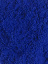 Prussian
blue, discovered in 1704 or 1705, is generally regarded as the
first of the modern colours. But in fact it is something of
an anomaly, appearing well before the blossoming of chemistry
as a science in the late 18th century. Like so many other innovations
in colour, it was the result of a serendipitous accident.
Prussian
blue, discovered in 1704 or 1705, is generally regarded as the
first of the modern colours. But in fact it is something of
an anomaly, appearing well before the blossoming of chemistry
as a science in the late 18th century. Like so many other innovations
in colour, it was the result of a serendipitous accident.
At
this time the manufacture of pigments for artists was barely
industrialized. In the Middle Ages and the Renaissance, painters
got their pigments from apothecaries and pharmacies, who made
them by the methods of alchemy. This kind of small-scale operation
was still being conducted in the 1700s, when indeed alchemy
itself was by no means extinct. A Berlin-based colour maker
named Heinrich Diesbach was working in the laboratory of the
alchemist Johann Konrad Dippel, and in the course of preparing
a red lake pigment Diesbach asked Dippel for some potash (a
potassium alkali).
Presumably
to economize, Diesbach requested a batch of potash contaminated
with oils prepared from animal blood. It was a false economy,
for his pigment turned out very pale. Attempting to concentrate
it, he succeeded instead in turning it deep blue. He had no
idea what had happened, but was astute enough to recognize the
blue material as a potential pigment in its own right, and was
soon manufacturing it according to a jealously guarded recipe.
Prussian
blue, which is iron ferricyanide, became popular throughout
Europe by the mid-18th century, after an Englishman named John
Woodward discovered and published an (unnecessarily elaborate)
account of its synthesis in 1724. It was particularly valued
for mixing light blues, and appears in skies by Watteau, Canaletto
and Gainsborough (where it has tended to fade).
It
was in the 1770s that the real era of pigment innovation began.
In 1775 the Swedish apothecarist Carl Wilhelm Scheele, one of
the finest experimental chemists of his age, discovered a bright
green compound of arsenic: copper arsenite. This reached artists’
palettes as Scheele’s green -- until it was largely superseded
by a new arsenic-based green devised in 1814 in Germany, which
the English called emerald green. Both these new greens were
relatively cheap and were used as household paints. Not until
the mid-19th century were the health risks of these arsenic-laced
colours recognized; it is speculatively claimed that Napoleon’s
death in exile on St Helena was hastened by dust or fumes from
his green wallpaper.
Industrial
manufacturing processes have long been a fertile hunting ground
for new materials and methods for artists’ pigments. Zinc
smelting grew in importance during the 19th century, and helped
to secure the rise of zinc white as a replacement for the centuries-old
lead white, the production of which led to illness and death
of factory workers because of lead poisoning. And in 1817 the
German chemist Friedrich Stromeyer identified a new element,
cadmium, as a by-product of zinc refining. He found that cadmium
combines with sulphur to make strong yellow and orange compounds,
which were marketed to artists from the 1820s as cadmium yellow
and cadmium orange. In the early twentieth century a deep red
version was manufactured too, in which some of the sulphur was
replaced with selenium. Cadmium red was a favourite pigment
of Henri Matisse -- who knew a thing or two about red, as his
Red Studio (1911) testifies.
But
perhaps the most versatile metals for expanding the artist’s
rainbow were cobalt and chromium. Cobalt minerals have been
used in blue pottery glazes for millennia, and cobalt is  also
the colouring agent of the pigment called smalt, used since
the Renaissance. But smalt is a rather crude blue, and difficult
to work with as a material. When the French government set Louis-Jacques
Thénard the task of devising a synthetic alternative
to expensive and rare ultramarine at the beginning of the 19th
century, he found inspiration in the cobalt blue glazes of the
potters at Sèvres.
also
the colouring agent of the pigment called smalt, used since
the Renaissance. But smalt is a rather crude blue, and difficult
to work with as a material. When the French government set Louis-Jacques
Thénard the task of devising a synthetic alternative
to expensive and rare ultramarine at the beginning of the 19th
century, he found inspiration in the cobalt blue glazes of the
potters at Sèvres.
This
trail led Thénard to the modern pigment known as cobalt
blue: cobalt aluminate. It is a fine, pure blue, and was widely
used by the Impressionists. The strong blue waters in Auguste
Renoir’s Boating on the Seine (1879-80), for
instance, are painted in this colour, used in some places straight
from the tube. Cobalt also furnished a sky-blue pigment -- cerulean
blue, which is cobalt stannate -- as well as a yellow, aureolin,
and the first pure purple pigment ever known, cobalt violet.
Previously, artists had always had to make purples by mixing
blue and red.
Chromium
was the chameleon-like fruit of a Siberian mineral, called crocoite
and discovered in the 18th century. The mineral is deep orange,
a natural form of lead chromate. It was analyzed in the late
1790s by the eminent French chemist Nicolas Louis Jacquelyn,
who identified the new element chromium as the source of the
colour. Jacquelyn studied the compounds of chromium, and found
that he could make bright yellow and rich orange versions of
lead chromate, both of which he proposed as potential pigments.
Chrome orange became the first pure orange pigment since the
medieval use of railcar, a highly toxic compound of arsenic.
The chromium colors did not become widespread, however, until
the discovery of chromium-containing mineral deposits in France,
USA and Britain.
By
replacing the lead in chrome yellow with other metals, such
as zinc and strontium, the colour  could
be tuned to paler or more acidic hues, such as lemon yellow.
And Jacquelyn also commented on un vert extremement beau
made by roasting crocoite to form chromium oxide. In 1838 this
was modified (by incorporating water in the crystals) to make
the vibrant green called viridian, a colour that became almost
emblematic for Paul Cézanne.
could
be tuned to paler or more acidic hues, such as lemon yellow.
And Jacquelyn also commented on un vert extremement beau
made by roasting crocoite to form chromium oxide. In 1838 this
was modified (by incorporating water in the crystals) to make
the vibrant green called viridian, a colour that became almost
emblematic for Paul Cézanne.
The
craft of dyeing has always been a rich source of artist’s
colours. The blue dye indigo, an extract of a pea plant native
to Asia, was used to colour the shields of the Roman army, and
was a cheap alternative to expensive mineral blues for Renaissance
painters. Red lake pigments are prepared by affixing the red
colourants of the dyers, such as lac (a resin exuded by tree-dwelling
insects), cochineal (squeezed from beetles native to Eastern
Europe and the New World) and madder root, to the surface of
a white mineral powder such as alumina. But in the mid-19th
century, synthetic chemistry began to generate artificial dyes
far more lurid than these natural ones.
The
first of the synthetic dyes to have a commercial impact was
aniline purple, or mauve, made from organic (carbon-based) compounds
extracted from coal tar, the black sticky residue of gas-lamp
burning. Mauve was made accidentally in 1856 by William Perkin,
a young student at the Royal College of Chemistry in London,
during experiments that were supposed instead to yield the anti-malarial
drug quinine.
Other
aniline colours soon followed: magenta, blues, reds. Chemists
figured out how to make synthetic alizarin, the red colourant
of madder, and artificial indigo; and they created new classes
of synthetic dyes, such as pinkish eosin and yellow azo dyes.
Some of these found their way onto the artists’ palettes.
But many of the new dyes faded rapidly in light, and in 1897
the French artist and academician Jean-Georges Vibert denounced
them as a “catastrophe for painting.” Vincent van
Gogh was amongst those who experimented, to his cost, with the
fugitive eosin-based pigments.
THE
BANISHMENT OF EARTH
Armed
with this new battery of brilliant colours, the Impressionists
set their canvases alight with fireworks, leading the conservative
Vibert to denounce them as “dazzlers” (éclatistes)
who painted “only with intense colours.” Camille
Pissarro claimed to have banished the old, dull earth colours
from his palette, and Claude Monet constructed his ochres and
khakis from complex mixtures of the new, bright pigments. Even
the gloom of Monet’s La Gare Saint-Lazare (1877)
is a concoction of rainbow hues: cobalt blue, cerulean blue,
synthetic ultramarine (made since 1828), emerald green, viridian.
The
Impressionists rejected both white and black: “White does
not exist in nature,” said Renoir, and ‘Shadows
are not black’. To him and especially to Monet, shadows
were instead typically violet, the complementary colour to yellow
sunshine. “I have finally discovered the true colour of
the atmosphere,” said Monet. “It’s violet.
Fresh air is violet. Three years from now everyone will work
in violet.” The Impressionist love of this shade led even
the favourably disposed critic Joris-Karl Huysmans to accuse
them of “indigomania,” as if it were some genuine
collective disease.
Thus
the typical Impressionist palette shines with strong colours,
most of them inventions of the 19th century. These were the
colours that inspired van Gogh to abandon his earlier, dull
hues when he came to Paris and to take up high-keyed colours
that became indispensible tools for constructing his passionate
visions. “Cobalt (blue) is a divine colour,” he
declared to his brother Theo, “and there is nothing so
beautiful for putting atmosphere around things . . . The same
with emerald green. It is bad economy not to use these colours,
the same with cadmium.” Matisse, a pupil of Pissarro,
took things further, bringing Post-Impressionist colour to a
new pitch in the Fauvist movement of 1904-07 before embarking
on a quest into the constructive possibilities of colour that
prefigured the whole of twentieth-century painting. According
to Pablo Picasso,
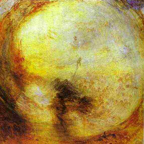 then
have anticipated. Many of his contemporaries were utterly at
sea with this almost abstract swirl of glowing primaries. Even
before Turner had so thoroughly shed the trappings of representational
landscape, his critics derided his sun-drenched veils of mist
as “pictures of nothing, and very like.” But in
his abandonment of line and his embracing of colour and light
as the key elements of art, Turner does not look old-fashioned
next to the luminous colour fields of Mark Rothko or the golden
veils of Morris Louis.
then
have anticipated. Many of his contemporaries were utterly at
sea with this almost abstract swirl of glowing primaries. Even
before Turner had so thoroughly shed the trappings of representational
landscape, his critics derided his sun-drenched veils of mist
as “pictures of nothing, and very like.” But in
his abandonment of line and his embracing of colour and light
as the key elements of art, Turner does not look old-fashioned
next to the luminous colour fields of Mark Rothko or the golden
veils of Morris Louis.


![Canadian Tire Repair Scam [2211 boul Roland-Therrien, Longueuil] = documents-proofs](../2010_v9_n5/images/mapleleaf.jpg)