|
Have you ever worked a color stripe
into ribbing and been dismayed at the funny little color
blips that appear in the ribs' purl columns? Turn over a striped
sweater and you will notice that on the wrong side, the
edges of the stripes are not smooth. Instead, the
two colors swap places
along the stripe's
border, making for an uneven transition on the purl side.
Traditionally, colorwork
designs have been placed
on a plain stockinette
background to avoid these types of issues, but a notable
exception comes from the Bohus knitting collective of Sweden. In
the late 1930s, spurred by a depression, the women of the
Bohuslan quarries of Sweden asked Emma Jacobsson, the wife
of the governor, to set them up with some sort of home-based
business to help them support their families during this
time of great hardship. While the initial designs
were simple, this homegrown knitting movement eventually
developed into a couture knitting collective where members
would produce incredibly complex colorwork designs on impossibly
tiny needles. One of the hallmarks of Bohus Stickning
(or Bohus Knitting)
is the use of purl
stitches alongside knit stitches in the colorwork bands
to add texture as well as color.
The original Bohus
designs have enjoyed
somewhat of a renaissance
with advanced knitters who are able to tolerate knitting
these complex designs at a very small gauge. Each sweater produced
in this manner is truly a work of art. However, there
is no reason why every
knitter can't glean
inspiration from these beautiful sweaters and use purl
stitches to liven up their own colorwork no matter what
the gauge.
I first learned of
the Bohus style while
taking a class from
Joan Shrouder on Ethnic Color Patterns. We also studied Fair Isle
and South American colorwork techniques, but I was entranced
by the unique color patterns formed by the addition of
purl stitches in the Bohus designs. I started playing
around with very simple
color charts, working
with crayons and graph paper, and realized that it's possible
to create extremely complex-looking color designs that
are actually very easy, simply by adding a few purl stitches
at the color transitions!
Here is an example
of a simple two-color pattern worked in plain stockinette: 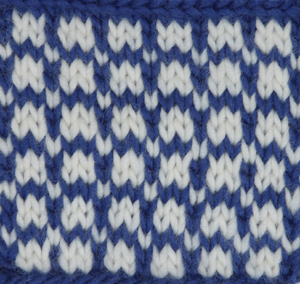 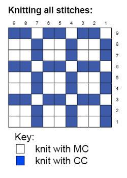
In the next example,
I've used the same
color placement but
added purl stitches
at the color transitions
from white to blue only:
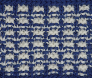
In the final example,
I've added purl stitches
at all color transitions
for a highly textured
piece that looks very different from the original:
 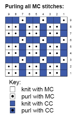
Amazing what a few
well-placed purl stitches
will accomplish, isn't
it? When
a purl stitch is worked
above a knit or purl
stitch of a different
color, the old color
is "pulled up" into
the new row, creating
a blip of old color
on new background.
Add one of these transitional
purl stitches anywhere that you want the previous row's
color to jump up and make itself
noticed!
There are a few things
to keep in mind before
tossing purl stitches
into your color patterns.
First, depending on
how many purl stitches
you add and how they are placed, your gauge can change
significantly. Swatch 3 above has a stitch and row gauge
that are approximately one stitch and one row less per
inch than Swatch 1. Swatch 2 has approximately 1 row per
inch less than Swatch 1 but the stitch gauge is nearly
the same. You will need to swatch to see how the purls
you're adding will affect your gauge in order
to determine if you
need to make any adjustments
to your knitting.
You will also want
to play around with
the placement and number
of purl stitches to
determine what looks
most pleasing to you.
You can definitely have too much of a good
thing with this technique,
particularly if you are trying to add texture to a complex
design such as a snowflake. A few things worth trying:
- add purls at the transition between color A and color
B only
- add purls at all transitions (both between color A
and color B, and between color B and color A)
- add purls at transitions where you'd like a little
extra highlight, such as at the points of a snowflake
or the teeth of a skull
- swatching is your friend! Don't
be afraid to experiment until you get it right!
Here is another example of one
of my swatch experiments. I
took a simple diagonal
color stripe and added purls in different spots in order
to see which effects were most pleasing to the eye.
You may find that using
your textured color
pattern is too overwhelming in an allover design, particularly
when using two or three colors that are in high contrast
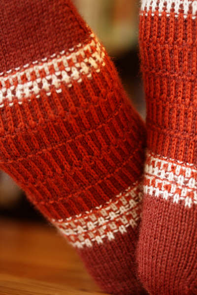
to each other. These designs
look fabulous on the yoke of a sweater and the garter-like
nature of the combined knits and purls make sturdy, non-rolling
collars, bands and borders. You will also find that
you can make a lovely pattern with a simple two-stitch
repeat, meaning that there are no long floats on the back
of your work. This is great for socks, gloves and
baby garments (no floats
to catch on fingers or toes) and gives the beginning stranded
knitter an opportunity to practice without worrying about
carrying their floats loosely enough to avoid puckering.
While
traditional Bohus designs
utilized very small needles
and fine wool, the technique
of adding well-placed
purl stitches translates
well to any weight of
yarn for those of us
who don't have months
(or years!) to work on
a single sweater, gorgeous
though it may be. I prefer
to work my color designs
in wool or alpaca, but
the smaller repeat patterns
in particular would
work well in a lightweight
plant fiber for those
who can't or prefer not
to work with animal fibers.
Again, swatching is your
friend. Swatch with the
yarn you'd like to use
and see how the color
pattern looks after you
block it. Is it too heavy
or thick? Does it drape
nicely? Did the blocking
help any imperfections
disappear or did it
make them more obvious?
Most importantly, do
you like the way it looks?
If you're interested
in learning more about
traditional Bohus-style
knitting, there are
a few resources available.
Wendy Keele's wonderful
book Poems of Color is
the most complete contemporary
English-language resource
for traditional Bohus
history and patterns.
She includes instructions
for several of the
traditional Bohus designs
in her book. You can
order kits from Sweden
for a number of Bohus designs
which include the original
patterns and traditional
yarns and colors from Solveig
Gustaffson
(click on Bohus Knitting
for an English-language
page listing available kits,
then click "Kontakta
mig" to
send an e-mail to
Solveig to get ordering
information). You will
also want to visit
Susanna
Hansson's website for
additional history
of Bohus and a list
of her Bohus Stickning workshops
which she teaches to
great acclaim across the
US and Canada.
Don't let the beautiful
color patterns intimidate
you - use them as inspiration
for your own Bohus-inspired
designs and embellishments.
Or, take your colors
in an entirely different
direction and texturize your
Fair Isle patterns or contemporary
color patterns. There's
no limit once you let your
creativity take over!
|


