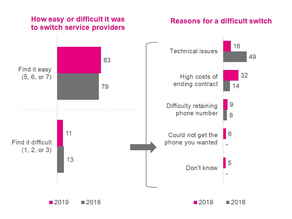
There are two graphs on this figure, the first titled “How easy or difficult it was to switch service providers” is a vertical bar graph showing the proportion of people who found it easy and those who found it difficult. The 231 respondents in the 2019 survey who changed service providers in the last two years answered as follows:
The 152 respondents in the 2018 survey who changed service providers in the last two years answered as follows:
The second graph, titled “Reasons for difficult switching” is also a vertical bar graph showing the extent to which each reason was applicable to the respondents. The 24 respondents in the 2019 survey who found it difficult to switch answered as follows:
The 19 respondents in the 2018 survey who found it difficult to switch answered as follows: