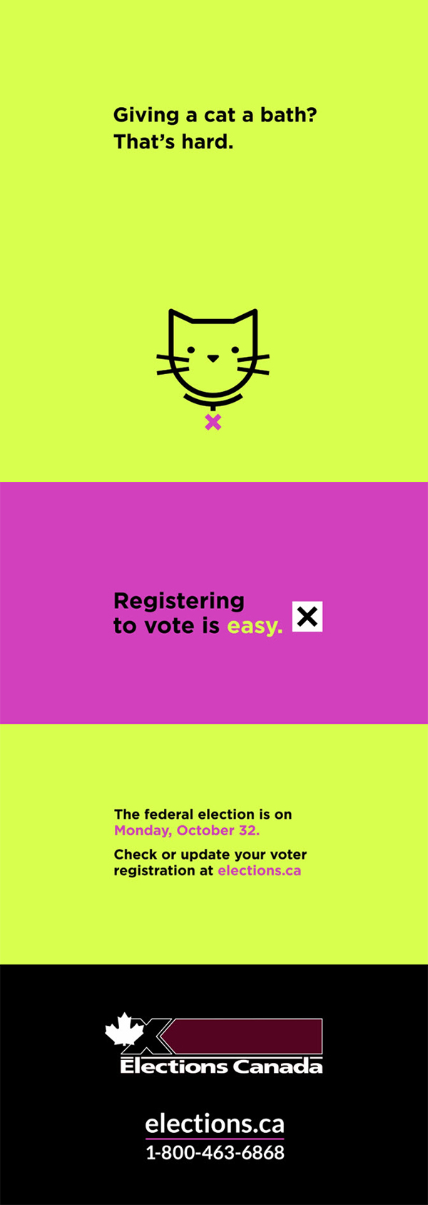
Video: Giving a cat a bath? That's hard.
On a coloured background, there's an image of a cat at the bottom of the screen. The text reads Giving a cat a bath? That's hard.
The screen changes colour, and the text is replaced by Registering to vote is easy.
Next to the text, there's a black X in a white box.
The screen changes colour, and the text is replaced by The federal election is on Monday, October 32. Check or update your voter registration at elections.ca.
The Elections Canada logo, the web address elections.ca and the telephone number 1-800-463-6868 appear on a black background.
The comparison between "bathing a cat is hard" vs. "voting is easy" resonated best among those who own or like cats. The idea of comparisons was generally seen as intriguing.
When asked about their initial feelings toward the video ad for Concept A, the participants often said it was funny and made them curious. The participants who had cats connected more with the comparison between bathing a cat and voting, and they were more likely to find the animation appealing than those who do not own or like cats.
Some participants suggested having several different comparisons between something perceived as hard vs. voting to appeal to different audiences, but the idea of comparisons was generally seen as intriguing and appealing. Furthermore, the idea that voting is easy confronted the participants with an idea that many felt to be a truth, urging them to feel like there is no excuse not to vote. Lastly, the bright colours and cute graphics were popular with some participants.
"I really like the humour of the opening line. I thought that was funny and a little witty. And then I like the cat graphic, which I thought was really cute."
"I think the video is very short and to the point. The video is also very eye catching, especially with the cat graphic and the colour. I think if I'm scrolling through YouTube [and see the ad], I would at least stop."
"For me, it's less about young people. I think it speaks really to anyone, not just to those who have a cat. I love the comparison to everyday tasks as opposed to just asking people to register to vote. If there were a bunch of comparisons for different everyday chores, I think that'd be kind of cute."
"I like the bright colours. I think they are eye-catching."
"I enjoyed the visuals. The [colour] is bright but I think it matches the music. I thought it was kind of fun and the visuals didn't bombard you with information. It's simple and doesn't overwhelm."
The comparison was sometimes unrelatable to those who were not cat owners or did not think voting is hard. These participants thought it was better to get straight to the point.
Often, non-cat owners did not find the comparison between bathing a cat and voting to be motivating or relatable. Others did not like the concept because they did not think that the difficulty of voting was a major barrier. Several participants found that the humour was not enough of a hook to keep them watching. In general, the participants felt it would be better to get straight to the point with details about voting instead of trying to be funny or persuasive.
"I think the problem is that voting is something you do have to carve out a more meaningful time of your day for as opposed to something where more effort is required, like cramming for your paper or giving your cat a bath."
"I don't feel it speaks to my demographic because I've never given a cat a bath. So, I don't know how easy that is."
"I can't relate because I don't have a cat. But I also can't relate because I haven't voted yet."
"I found it not relatable because I personally don't have a pet. Washing a cat being hard isn't that relatable to me."
Some participants found the video too text-heavy, while others felt the bright colours and light-hearted tone were not serious enough for the subject matter of voting.
When asked about the design, some participants found the last two frames too text-heavy, with not enough time to read through all the text in a single viewing. Some participants found the colours off-putting and not serious enough for the subject matter. The colours, combined with the light-hearted tone, made some participants feel the ad was made by people from an older generation, trying to appeal to a younger audience.
"I thought the text itself went by a little fast. I tried reading it the first time and I couldn't exactly get it all down, but the second time I got more of it."
"If they change the colour to correspond more with Elections Canada. Maybe incorporate more purple or stuff like that. It would be better."
"I don't like the colour and I think it tried a little too hard to reach to a younger population because it was just so bright."
Most participants praised the radio spot for being more straightforward compared to the video.
Most participants found the message in the radio spot more straightforward than the video ad. Some also praised the fact that key information such as the election date, website, and slogan are easier to notice than they are in the video ad.
"The second half of [the audio] is very informative."
"The message in the latter half is very clear. This is the voting date. This is the website, and you can go there to learn more information about [voting]."
"I would get what [the audio] means right away. And it's not like there's a bunch of filler stuff in it."
The participants often found the glitches at the beginning confusing and annoying. The idea of skipping audio ads being hard did not resonate well either because many participants pay for premium music services and thus do not experience ads.
The noises at the beginning of the ad were frequently brought up as a flaw, as many participants would assume it to be a technical issue with their phone or headphones the first time they listened to the ad. Although there were also participants who found the noises attention-grabbing, they widely felt they would get annoyed after hearing it repeatedly. Overall, the idea that it is difficult to wait for ads to finish did not resonate well with the participants as many of them have premium subscriptions to services like Spotify or simply do not find it all that difficult to put up with ads. Others did not appreciate the irony of an ad talking about waiting for ads and did not find it to be funny.
"I thought [my audio] glitched at first. That's why I don't really like it. The glitch was kind of disturbing."
"The first part caught me off guard. If I was only listening to that once, I might not have processed the whole ad because I was a bit confused."
"The glitchy thing in the beginning is not being very cool. But also, the slogan in the beginning about waiting for ads to finish being hard is weird to me because there's nothing hard about waiting for ads to finish. It's annoying and I don't like ads, but it's not very difficult to sit on my hands and do nothing. So, it just seemed weird to me as a phrase."
"I agree that it's not difficult to wait for an ad to finish and I was also a little confused in the beginning. The audio clip says that waiting for ads to finish is difficult, but the clip itself is an ad. So, it's kind of weird."
From an execution perspective, some participants said the pauses between sentences were too long. "It's our vote" also seemed out of context for some, and some suggested that a call to action, such as register to vote or visit the website, would make more sense at the end.
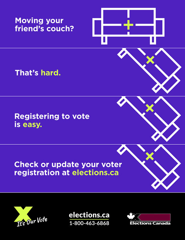
Image of a couch with a coloured X in the middle. The text reads Moving your friend's couch?
The couch is tipped to one side, and the text reads That's hard.
The image stays the same, and the text is replaced by Registering to vote is easy.
The text is replaced by Check or update your voter registration at elections.ca.
The tagline It's our vote,
the web address elections.ca, the telephone number 1-800-463-6868 and the Elections Canada logo appear on a black background.
The moving-a-couch comparison landed better than bathing a cat for many participants. Many found the couch comparison more relatable and attention-grabbing.
The participants generally found comparing voting to moving a couch more relatable than the video ad about bathing a cat. The humour of moving a couch was felt to be more universal. In addition, in the context of seeing this as a web ad, the couch animation was noted by some participants to be attention-grabbing rather than disruptive.
"I think the couch is a really clever way to catch my attention and then I get to see the message at the end. So overall I liked it."
"I think the couch reference represents at least in a more symbolic, solid way that you will carry the heavy burden of regret if you don't vote."
"I guess the purple would catch my eye and so does the animation."
"It reminds me of that episode of Friends where they move the couch."
For a few participants, the moving couch comparison was confusing and did not seem connected to voting.
While most participants viewed this ad positively, some had difficulty making the connection between moving a couch and voting. Additionally, some did not see the couch in the graphic right away.
"I couldn't tell what [the moving couch joke] meant until you actually said [the couch] just lifted."
Some participants thought the banner was visually unappealing and text-heavy.
When asked about the design, some found the banner to be visually boring or unremarkable, and said they would probably scroll past or ignore it when browsing a website. The sentences on the banner were seen by some to be too long and fast-moving to read all the way through. Similarly, several participants thought the final screen had too much going on and did not visually align with the rest of the banner.
"I found the banner too simple, which looks like a low budget ad. I guess it has to do with the way the couch is drawn. The couch is almost indistinguishable from the text because of the size, font, and colour. It's neither appealing nor eye-catching and it doesn't draw my attention to anything. It's also going by so quickly."
"I would notice the banner, but I wouldn't catch the message because the main message is after the whole couch skit. I would immediately ignore it and go on to whatever I'm looking at the website. I would never see the back part of the message."
"I wouldn't click on it. I think the text seems a little bit fast."
"I feel like there were too many words. It would be clearer to just [include] the election date."
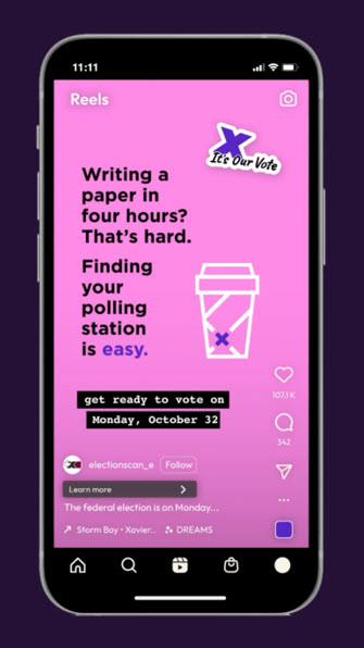
The tagline It's our vote
is on the top right.
The text reads Writing a paper in four hours? That's hard. Finding your polling station is easy.
Beside the text is an image of a coffee cup with an X on the bottom left.
The text reads get ready to vote on Monday, October 32.
Instagram icons (heart, comment bubble, share) are to the right.
Many found the comparison between writing a paper at the last minute and voting to be more relatable than the comparisons used in the other formats.
For some participants, the idea that it is difficult to write a paper at the last minute was more relatable than the other ads from Concept A. A few participants liked the pink and thought the ad resembled an organic social media post that they might encounter on a platform like Instagram.
"I find the little coffee cup and writing a paper in four hours relatable because who writes a paper in four hours? Students. Who drinks coffee? Students. Who's going to vote? Quite a large demographics is going to be students."
"[This ad] definitely [resembles] something you see on TikTok. I don't mind the colour. It's popping and might make you pause while scrolling for a second longer to read what it actually says. This is something different that you wouldn't normally see in a government or election post."
Some participants did not relate to the comparison and found that it did not apply to their own experiences. Moreover, many found the social ad to be amateurish and lacking in credibility.
Several participants struggled to make the connection between writing a paper last minute and voting. Some found the connection unrelatable, because they did not think it was actually difficult to write a paper in a short period of time, or, conversely, they did not think it was possible to write a paper so quickly. Others could not relate to the experience or felt that voting is a task that takes more effort and should be treated more seriously.
"What I do not particularly like about this ad is, I don't see a correlation between writing a paper and finding a polling booth. I would have preferred maybe something like finding parking at university is hard."
"I don't find it relatable because I could never write a paper in four hours."
"The comparison between rushing a paper in the last couple of hours and voting is demoralizing for me. Voting takes a long time and that's not the issue I have with it."
From a design aspect, many participants found that this social media post looked amateurish and that it lacked credibility because it does not feel like official EC material. The coffee animation and font choices were mentioned often as contributors to this feeling. Some participants did not feel the coffee cup was the best choice of icon to illustrate the idea of writing a paper, and they suggested that using other elements, such as a laptop, might create a clearer association. Critical information, such as the election date and call to action, i.e. get ready to vote, were hard to read because of the font choice. Lastly, "it's our vote" also seemed out of context for some participants, and some disliked the pink.
"The social media post just looks amateurish, especially with the stickers and the highlighted text. It gives off the vibe of student clubs making their own ads."
"The coffee cup doesn't really seem to fit with the whole ad. I would have preferred a computer or a little laptop animation, because that connects writing the paper and finding your polling station."
"I'm also not too sure what the relevance of the coffee cup is."
"I would associate [the cup] with a Starbucks barista spelling out your name, which is hard. I think that would be catchier and even more relatable."
"There's a lot of text. I don't like the lower case. I also don't like the 'get ready to vote' [call to action]."
The participants liked the concept of the comparisons more than the actual executions. The animations and bright colours are attention-grabbing for some but are also seen as lacking authenticity for trying too hard to be youthful for others.
In general, the participants liked the concept of comparing a hard task to voting. However, they felt that the execution of the ads was not relatable. The humoristic scenarios resonated with some youth, but often fell flat or need to be explained.
In general, urban youth tended to agree that voting is easy, but often felt that this point was self-evident and did not need to be explained to them in ads. Voting was seen as especially easy for Toronto participants due to the accessibility of polling stations, so this message was not as intriguing to them. The Prairies group did not see voting as something that is easy for everyone because of the longer travel distances often present for voters in rural ridings. Both finding and commuting to a polling station can be challenging and time-consuming, especially in more remote areas. In addition to accessing a polling station, those with more awareness of other voting barriers, i.e. students living away from home and voters who move constantly, did not always agree that voting is easy either.
"[The comment about] it's easy to find voting stations, I don't think it really had rural areas in mind."
"We do have lots of reserves where there usually isn't a voting station, and the residents do have to come to town, so it is not easy for everyone. But I guess it is easy for those who live in a more populated area."
"For me the ads are just very forgettable. I would see them in two seconds and skip and not think about them. I think maybe focusing on the fact that voting is easy is not very effective. But one thing that has stood out to me is that it's our vote thing. I think if that was more of the focus point, it would not be as forgettable."
In terms of the visual aspects of the ads, the "x" element tying images in different formats together was usually unnoticed by participants, which broke the overall cohesiveness of Concept A.
"Now that I'm seeing [Concept A ads] side by side, I [notice] and appreciate how the "x" is integrated into other things like the cat's collar or in the middle of the couch as opposed to just being a Twitter ad."
"I think all these ads are meant for people who don't vote. So, the "x" on the couch [for instance], I feel like most people wouldn't even notice if they never voted before. They might not make the connection that it's like checking the box."
Regarding colour and design, some participants found the animations and bright colours to be attention-grabbing and appealing; but others felt that these elements were trying too hard to be youthful and lacked authenticity. Several participants were a bit cynical about the appeal to youth and believed that a topic like voting deserved a more serious tone.
"The ad is taking voting very lightly, and it's very obviously geared towards the younger voters… I don't have a firm opinion, but I wonder if voting should be made to look really easy… I think that maybe voting should be taken more seriously."
"It feels like they're trying too hard [at grabbing my attention]. I don't need my attention pulled so just tell me what to do."
"[The social media post] would be extremely unmemorable because the only ads I ever bothered to give a second of attention are the ones that are more official looking… Anything that looks like it's trying to market something such as this ad, I would immediately assume it's for retail or something that I don't care about."