
Every small X
The slogan Every small X
in black font on a white background appears beside an X in a blue square.
The slogan continues with has a big impact,
and the background is now blue. Rays turn around the X like a windmill.
The screen changes, and the text reads How will you shape your future?
The text is replaced by The federal election is on Monday, October 32,
and the background remains blue.
The text is replaced by Visit elections.ca to register to vote or update your address.
The Elections Canada logo, the web address elections.ca and the telephone number 1-800-463-6868 appear on a black background.
The participants often found the video motivating and informative. Many also liked the colour and the turning windmill effect.
When asked about their initial reactions to the video ad, several participants said the main message was direct and motivating. They also praised the ad for conveying facts clearly, with text that was easy to read and understand. Overall, many participants thought the video was informative and effective.
"This ad makes me feel more interested in getting to know what I can do to register for my vote and how to change my address. I like the concept, which is telling me that my vote matters and it can change the society."
"I like [the message] in this one better because it tells me to just do it and I am important."
"I think it got straight to the point. It tells people where to vote and it highlights the importance of the urgency to vote. Hence why they used the upbeat music. They also used a really good colour."
"I think this one speaks more to me than [Concept A] because it talks about shaping the future as a young person. I think telling people their vote could make a difference is compelling or motivating."
From a design perspective, many said that the colour used in the video is appealing and still in keeping with the seriousness of the subject matter. Several participants even suggested using the video colour as a uniform colour scheme across all executions, to better tie Concept B together. Participants generally found the turning windmill effect in the video to be visually captivating.
The X
did not immediately connect with voting for some, especially those who had never voted in a federal election before.
The X
as a symbol of voting was not readily understood by all participants. Some, particularly those without voting experience, did not understand what it signified. Some of the confusion was due to differences in voting procedures at different levels (i.e. federal, provincial, municipal): for example, some elections use scannable ballots where voters fill in a circle to cast their vote.
"To someone who's not familiar with voting, the X
might be a foreign concept. I don't immediately relate that to voting."
"I didn't correlate initially the X
with voting because I've never voted before."
With these focus groups being held shortly after a major rebranding of the Twitter social media platform, now called "X," many participants noted that the video ad reminded them of this.
"If I hear the [slogan] 'every x matters' when I'm online, my first thought would be that every tweet matters."
Some participants thought the text was a bit wordy and moved too quickly, and some did not like the fonts.
The most common negative feedback about the video had to do with the text shown on screen. Some felt that the frame that says "… to register to vote or update your address" was just too wordy and quick for the message to sink in the first time they saw it. Some participants also criticized the font; with probing, this seemed to be a matter of personal preference from person to person.
"I feel like it's so quick. I didn't get the message at first."
"I think the last bit especially was pretty rushed with the amount of text. You can't read every word. You just have to infer."
"It took too long to communicate this. You could communicate the message much quicker, like within five seconds. Just say the election is on what day and go to the website for more information."
"I don't like the font they use. I think it is very basic like the fonts used in a PowerPoint."
Many found the radio spot to be clear, direct, and informative.
Like the video ad, most participants felt the audio messaging was clear, direct, and informative. Additionally, many found the tone to be appropriate for the subject matter because it treated the issue of voting seriously and in a direct way.
"I like the audio because I got the message and everything's at a good pace."
"I think it speaks to the fact that there's a responsibility I have coming up, and I should think about it. The ad guides me to where I can find more information. I think it's very informative in that sense."
"I definitely like the audio ad. They got to the point right away about the federal election, which is a lot more attention-grabbing to me. Immediately I know it's something I'm interested in rather than some cutesy slogan."
Many participants found the phrase "all the official information" ambiguous. For some, it also implied a complicated registration process.
The biggest issue that participants raised with the radio spot was in the way certain sentences were framed. The fourth sentence "Elections Canada has all the official information for voters" was noted by some to be long and a bit vague, leaving them with questions about what specific information was being referred to. Was it information about how to register to vote? How to find polling stations? Or about the political parties? These questions left some suggesting that the ad did not adequately prepare them to register or to vote. Likewise, "prepare to vote" felt daunting to some participants as they thought the phrase implied a complicated registration process.
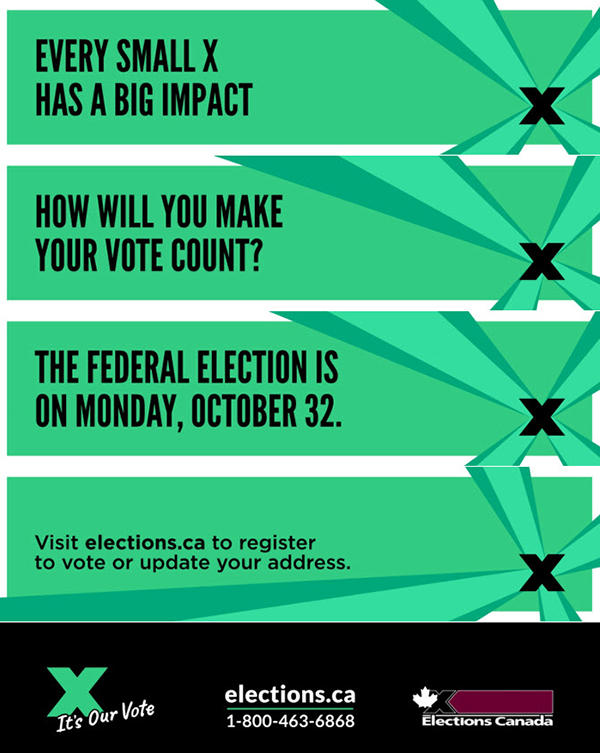
The slogan Every small X has a big impact
in black font on a green background appears beside a black X. Rays turn around the X like a windmill.
The text How will you make your vote count?
appears.
The text is replaced by The federal election is on Monday, October 32.
The text is replaced by Visit elections.ca to register to vote or update your address.
The tagline It's our vote,
the web address elections.ca, the telephone number 1-800-463-6868 and the Elections Canada logo appear on a black background.
The participants often found the design attention-grabbing and intriguing. The turning windmill and the bright green colour choice were captivating for some participants but disliked by others.
Many participants liked the design of the web banner ad for Concept B. Those who liked this execution found that the first frame quickly grabbed their attention and made them curious to find out what would come next. Participants often liked the transition effect of the turning windmill and said it was visually captivating, and somewhat unique as a design. The bright green was perceived by many participants to be a unique and eye-catching colour.
"I like the little transitions [of the windmill] because I feel like if I'm on my laptop and doing something else, and then I see something that is flipping through, even if it's slightly fast, it's going to draw my attention."
"If I was in need of information, I would easily just watch the entire banner to find it out, like the website, phone number, and the registration [process]."
"I like how everything ties back to the X
in the windmill effect because it kind of puts everything together, and it connects everything nicely. Although the windmill covered over some words and I didn't have time to fully read it before it came back again, that just encouraged me to watch it again."
"I like the green. I think it stands out."
While many liked the bright green colour, it was somewhat controversial as several others pointedly disliked it. Some participants found the last message to be a little too wordy.
In many groups, green was a controversial colour choice; some participants strongly disliked it, even as others found it to be quite appealing. Those who disliked the green in the banner ad generally felt it would be better to unify the colours across Concept B, preferring the same blue from the video ad.
From a messaging perspective, many participants found that some of the frames were wordy and hard to read through on a first pass, and making the ad move a bit more slowly might help them to absorb the information more readily.
Participants frequently noticed that the last message stayed on for two turns of the windmill and generally did not like this, because they expected a different text on the second turn, due to the pattern of the preceding text. Several suggested that it would be better to split the message up over two frames, solving both issues with one change.
"The [bright green] immediately made my eyes sore. It made me want to look away."
"It doesn't look like it's about elections. I want to take it more seriously but the [green and X
] reminds me of [a pop music album cover]."
"I found it bit weird that the very last text box reappeared after the X
swooped by. I was expecting a new text to appear, but it was the same as the previous one."
"I thought it was kind of fast, but I like that at the end it stops, and you can see all the contact information on one."
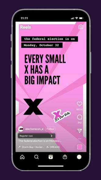
Text on a black background reads the federal election is on Monday, October 32.
The slogan Every small X has a big impact
follows.
On a pink background, rays turn around an X like a windmill.
The tagline It's our vote
is on the bottom right next to Instagram icons (heart, comment bubble, share).
Participants generally found that the social media post for Concept B worked well because the main message and election date were stated clearly, and the windmill theme connected it to the other formats.
Participants felt that the social media post for Concept B effectively drew attention to the right places in proportion to their perceived importance, i.e. the main message was centred and undistracted, and the election date was clearly stated at the top. The participants often liked the windmill animation in the social ad, and appreciated the unity of this theme across the different executions in Concept B. Though they were directed to wait until later to compare the ads across concepts, those who saw Concept B after Concept A were often tempted to point out that they thought it was better than the social media post for Concept A.
"I like the animation. It's attractive because it reminds me of Instagram stories or TikTok videos. That's the first thing I'm going to notice. It's going to attract me to want to read the prompt over there. It's straight to the point too."
"I think this is actually a pretty good ad that would make people stop and read. The lines would rotate around, and people would stop and then read whatever text is on there. In this case, the ad stresses the importance to a vote."
The use of pink was controversial because many participants found it to be inconsistent with the other Concept B ads and frequently associated it with breast cancer awareness campaigns.
The biggest change recommended by the participants was the colour. Participants frequently felt that pink was not consistent with the other formats under Concept B or that it did not look like official EC communication. The colour, in combination with the graphic elements, reminded many participants of breast cancer awareness campaigns.
"I don't like the pink and I would like to have some consistency in colour between the web banner and social ad… If I ran into the social ad and have also seen the web banner, I might not even connect them."
"The pink reminds me of breast cancer awareness posts."
"The pink might catch my attention, but it doesn't really tell me anything. I'm ok with most of the colour choices but I feel like they need to include the Elections Canada logo maybe on the top corner."
Some participants had issues with the font choices, the "It's our vote" icon, and the generally youthful tone of the post as a whole.
Although participants generally appreciated that the election date was right at the top of the post, as with Concept A, some found the white-on-black font to be unprofessional or unpolished. Others noted that the sentence was too wordy. Some felt that "it's our vote" was a better fit with Concept B, as it conveys a similar message to "your vote matters." However, a few did not like how the slogan was positioned on the Concept B post, when compared to the positioning of the slogan on the Concept A social media post. When asked about the overall tone, participants often said the post in did not look like official EC material, which means it could be mistaken as a post from a less legitimate source, and the information in it may not be taken seriously.
"Having one font for the election date and a bigger font for [the main message] feels very weird."
"If I'm just scrolling past the ad, I wouldn't be able to tell it's for Elections Canada because the 'x' and ['it's our vote'] are so small."
"Having that white border [on 'it's our vote'] and that little moving sticker is very unnecessary. Obviously, it's catering to the youth, but it really doesn't need to be there."
"I'll just ignore it. The sticker in the bottom corner, the text at the top, and the way that the 'x' is moving together makes the ad looks like a junior high project."
"There's a level of professionalism you expect from something supposed to be so important but it is just not being delivered in this [social media post]."
Overall, Concept B received positive feedback across all groups because of its directness, cohesiveness, and appealing visuals.
Considering Concept B as a whole, participants generally found it to be appealing because it was direct and cohesive, and conveyed a tone that was seen to be appropriate to the subject matter. The participants often felt that the directness of Concept B made it relevant for a broad audience, although they recognized that the ads were mainly aimed at young voters.
"I think when it comes to official stuff, it doesn't need to have a weird slogan. It can just say something like "your vote matters" and be straight and to the point. That's a lot more generic for the whole population."
"I pick Concept B because it's simple and straight to the point."
"I think Concept B is trying to reach the 100% of the population [by telling people] that you can vote, and something might change."
The X
element in Concept B ads drew positive feedback in general. Many participants felt the movement in the different executions was effective at drawing attention to the text. They also found that the windmill motif tied the different formats together cohesively. However, not all youth recognized the significance of the X
in the context of voting, and some related to other brands that use X prominently in their branding. For instance, one participant was concerned about people mistaking the X
as the rebranding of Twitter and didn't think they would recognize the ad as EC, even with voting experience.
"The 'x' confuses me a bit and I think it would have been clearer if they say every ballot or vote matters. That's more straightforward than trying to figure out what they're talking about when they say 'x.' "
"I feel like I'm going to see a concert or something like X Factor because it looks flashy and performative."
"My main issue right now is just with the 'x' because it's really ambiguous. Everyone gets reminded of different things when they see the 'x', like X Factor and Twitter. It doesn't stand out."
The colours and fonts were usually seen to be appealing, while still conveying a respectful tone toward the subject matter of voting. Nonetheless, some participants specifically did not like the green colour and a few criticized the heavy fonts. Additionally, there was a consensus across groups that unifying the colours in the three visual ads would make them more recognizable across executions.
"Change the colour. The bright green doesn't scream professional."
"The colours don't seem cohesive at all."
"I don't mind that they're different colours because they all have a cohesive theme. But I do think the colour could be worked on a bit. They don't connect very well."
While Concept B was the concept most preferred by participants, reactions to both were generally positive or neutral. Regardless of their preference, participants tended to see messages as more effective when they were direct with clear facts.
After reviewing both concepts in detail, groups were guided to consider the two concepts side by side. Concept B was the more preferred concept, with a majority of participants in each group choosing it as the most effective over Concept A.
The participants tended to see the messages as more effective when they were direct with clear facts, such as the election date, information on how to register, where to vote, etc. This was one of the key reasons why Concept B was preferred over Concept A across the groups. In particular, reiterating the website was something that stuck out among the participants as an important detail.
"Although I like the animations in Concept A more than Concept B, I think Concept B is better. It is direct. It tells me when the election is, what I need, my vote matters and I could do it."
"I chose Concept B because it has that consistency of [conveying] one message – your vote has a big impact – compared to Concept A where it's having all these different messages."
"I feel I'm more informed from Concept B. I see the website link more. I'm getting a little bit more of what I need to do next to find my polling station."
"I personally chose Concept B despite disliking it quite a bit. I recognize that Concept A resonated a lot with me as part of a larger demographic, but I can see Concept B being a lot more effective and to the point compared to Concept A. Even though Concept A has a good execution, it didn't make me feel it was relevant to the election itself a lot of the time until I see all formats collectively."
"Compared to Concept B, I feel [things] like where I can find information is better explained in Concept A, but Concept B is definitely more inspiring for me to go and do things."
"I just like the audio of both concepts for being super direct. You know what you are listening to right away."
"The only one that I liked how quickly it got to the point was the audio from Concept B. You can take that [aspect] and put it on all the formats. Put the date up front and just say that the election is coming up."
There was a consensus that both concepts could be improved by unifying elements across executions, like colour and imagery. The participants often understood without being told that EC needs to avoid colours associated with major parties, but many felt that some of the bright colours were too trendy and did not lend sufficient gravity for the subject matter of voting. A frequent suggestion in several groups was to bring back yellow or burgundy, which were familiar colours that participants often recalled from previous EC ads. Criticism of the colours was not unanimous, however; some participants were pleasantly surprised to see a more youthful look in these ads.
"Implementing the solid colours from Concept A instead of the gradient colours used in Concept B would be better."
"I would remember the colours and the change in style from [what we normally see in] a classic elections campaign to [what we are seeing today]. If I see something a bit more colourful in the future, I'll think it may be a government ad and not necessarily something else to just skip online."
"I wouldn't associate these colours, [bright green and pink] with the elections. I would say that's bad. If it was the burgundy that Elections Canada has maybe that would be more recognizable."
The issue of wordiness was mentioned repeatedly in response to the visual executions (i.e. video, Web, social media) for both concepts. Across groups, it was common for some individual participants to note that the text was hard to read when it moved by quickly and that some of the individual screens just had too many words on them. With the video and web banner ads from both concepts, participants often felt that they would need to see them multiple times to catch the information contained within, but this seemed at odds with the fleeting attention participants expected to give these sorts of ads in a real-life context.
In conclusion, though Concept B emerged as the preferred concept in the direct comparison, it is worth noting that reactions to both concepts were generally positive or neutral; negative reactions were largely limited to feedback about specific elements, with very few participants indicating deep negativity to either concept.