
Annual Bulletin 3, 1979-1980
Home
Français
Introduction
History
Annual Index
Author &
Subject
Credits
Contact

A
Selection of Books Illustrated by
Quebec Artists between 1916 and 1946
by Jean-René Ostiguy
Pages 1
| 2 | 3
| 4
| 5
In addition, many of the pictures for Le grand
silence blanc are reminiscent of some of the Nabis paintings. Paul
Gauguin 's influence is seen in a few letters and in all of the decorations,
including the tailpieces. On the whole the work recalls Les petites
fleurs de Saint François d'Assise (1913), illustrated by Maurice
Denis in collaboration with Jacques Beltrand (fig. 10). Raymond Escholier's
severe yet laudatory critique of the famous book is very much to the point:
"One could doubtless raise many objections to the polychromy in this book,
since the colour disrupts the unity of the page. But if an exception might
be made, should it not be made for this traditional work which has such
a natural affinity with the illuminated books of mediaeval times?" (20)
By their colour and by the stylization of the characters,
certain pictures in Maria Chapdelaine (1933), another book illustrated
by Gagnon, remind the art historian and critic of Maurice Denis. The garden
scene on page 150 (fig. 11) reinforces this impression. The tender blossoms
of the apple trees and the acid greens of springtime are unequalled except
in the work of Denis, as is the case with angelic, plump outlines of the
young mother and her child in the lower right corner of the composition.
The illustrations of Rodolphe Duguay in Du soleil sur
l'étang noir (1933) were conceived with a similar esthetic.
They show an equal if not closer kinship with the works of the post-Impressionist
painters, although they are executed in black and white, with woodblock.
Is this pure coincidence? Ulric Gingras, the author of this collection
of poems, salutes in his verse those who are skillful at "green sketches
and pink gouaches," seemingly referring to the manner of the symbolists
and of Denis. In woodblock work (fig. 12) worthy of Auguste Lepère
and Paul Baudier (fig. 13), Duguay symbolically decorates pages on which
the blank spaces generously match those of the compositions. The beautifully
inlaid black parts of his prints correspond harmoniously with those of
the printed letters.
The contribution made by Adrien Hébert to illustrated
works is still not very well known today. The Dictionnaire des oeuvres
littéraires du Québec (21) refers to a cover page for a
book by Yvonne Charette entitled Nuances (Le Devoir; 1919). Unfortunately,
the publishers were content to reproduce only a single image, on the cover;
this image rendered the symbolist manner abandoned by the artist the next
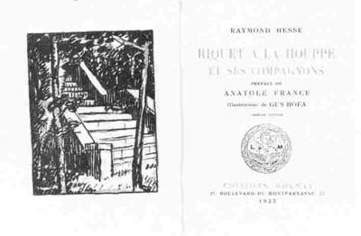
year. The India ink drawing for the frontispiece (fig. 14) of Hélène
Charbonneau's Chateau de cartes (c. 1931) is quite comparable to
the frontispiece (fig. 15) of Raymond Hesse's Riquet à la Houpe
et ses compagnons, illustrated by Gus Bofa (known 1914-1942). The
fact that a copy of the latter was found in the personal library of Adrien
Hébert tells us something about the unknown sources of the Montreal
draughtman's post-Cézanne esthetic. At that time he obtained four
very fine illustrations for the publisher of René Chopin's book Dominantes. The illustrations were conceived in the same style
as the previous work, but two of them introduced an element of variety
in the form of bands (fig.16).
The fine arts schools, in Montreal beginning in 1928 and
in Quebec City soon after Simone Hudon was appointed to the position
of Professor of engraving in 1931, furnished the book trade with several
skillful illustrators, who were inspired by a new esthetic: Fauvism and
the style of 1925. They all used woodblock printing or, failing this, the
linocut.
Shortly after being appointed professor at the École
des Beaux-Arts, Edwin Holgate began the illustration of Other Days Other
Ways (fig. 17), a translation of Vieilles choses vieilles gens by
Georges Bouchard, the original of which was to be republished in French
in 1931 using the same woodblock prints. Great care seems to have been
given to the page layout in these works (fig. 18). The bands and tail-pieces are seen to be every
bit as important as the four hors-texte plates and the two-colour frontispiece.
In
his work the artist exhibits a classical rigour: not a single knife
stroke is wasted. An unparalleled designer, Holgate would carefully study
his humblest compositions, mindful of the advantages of a severe economy
of execution. The result is stylization of the subject for maximum effect. In this sense,
and also in the type, placement, and rustic iconography
of the illustration, the overall effect evokes the work of the French engraver
Maurice Delavier for Les chardons du Baragan (fig. 19), a novel
by Romanian writer Panait Istrati, published by J. Ferenczi et Fils (Paris:
1921), in the Livre moderne illustré collection.
Holgate nevertheless showed himself to be a more versatile
creator than Delavier. In his illustrations for Metropolitan Museum,
a poem by Robert Choquette, his inventiveness attains
a modernism comparable to that of Hermann Paul, or the English engraver
Robert Gribbings, who headed the Golden Cockerel Press in England for some
years. The woodblock illustration on page 3 of Choquette's book (fig. 30)
can be taken as evidence of this modernism. How unfortunate that Edwin
Holgate's teaching did not produce any book illustrators!
In Quebec city, the instruction given by Simone
Hudon had a greater influence than Holgate's, even though the artist herself had
done very little work on illustrated books. Mention should nevertheless
be made of the linocuts which she produced for Jacqueline Francoeur's collection
Aux sources claires (fig. 21), published by Albert Lévesque
(Montreal, 1935). Her statement that she rarely found in her illustrations
the decorative inspiration that she admired in - Edy-Legrand (1892-1970),
one of the main figures in Art Deco, was a humble one indeed. The production
of her colleague Henri Beaulac, whom she was to marry in 1940, was much
more voluminous. His illustrations of as early as 1934 and 1935 for La
vie gracieuse de Catherine Tekakwitha and La vie inspirée
de Jeanne Mance (fig. 22) exhibit the decorative straightforwardness
of a Jean Lebedeff (1884-?) (fig. 23), despite his use of linoleum, a
material that does not lend itself to impeccably clean cutting. In an
even more fluid style he executed some very beautiful pages in 1940 for
Dans le bois (fig. 24), a book by Dr Antoine Panneton, who wrote
under the pen name Sylvain.
Maurice Gaudreau, who received his education at the same
school as the two previous artists, was extremely active as an illustrator
from the 1930s onward. He worked mainly for the newspapers, but he illustrated
three books in 1935. He too used linocut, but more than any other he knew
how to take advantage of the properties of this friable material. In his close-up figures or eloquent landscapes (fig. 25) for
Sébastien
Pierre, or the interior scenes (fig. 26) for Un homme et son péché,
for the cover (fig. 27), or for the bands and the tail-pieces in Les
Rapaillages, the artist proceeds by way of broad, luminous slashes.
He uses very little shading and completely ignores cross-hatching. His
personal style, confined to broad blacks and whites, is not disagreeable
in spite of its pronounced reliefs and its tendency toward heaviness.
Next Page | Omer
Parent
1
| 2 | 3
| 4
| 5
Annual Index | Author & Subject | Credits | Contact
This digital collection
was produced under contract to Canada's Digital Collections program,
Industry Canada.
"Digital
Collections Program, Copyright
© National Gallery of
Canada 2001"