 |
||
|
||
 |
| Graphic Design Unit Lesson 2: Layout
Techniques Lesson Background There are 5 layout techniques in graphic design that we are going to look at. Layout techniques are concepts that are incorporated into graphic design to increase the effectiveness of the design.
1. Rhythm
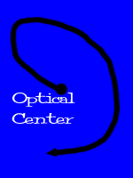
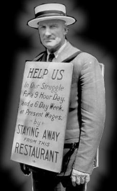
There are several different ways to achieve rhythm in a layout. a) One technique to create rhythm in a layout is to use pointing devices. A pointing device is an image that directs the eye where to look. An example of a pointing device is found in the following images from a SchoolNet Digital Collection. Can you identify the pointing device?
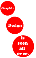
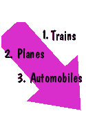
c) Numbering items in a graphic design layout explicitly tells the eyes where to focus and when. An example of this numbering is found in this graphic design.
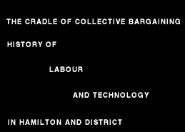
d) The Z pattern creates rhythm on a page by making the zig-zag pattern of the letter Z something very easy for the eye to follow. Mark the Z pattern in the following example from SchoolNet's Digital Collections.
Cradle of Collective Bargaining e) Eyes will tend to follow the direction in which eyes in the picture or design are looking. This is a creative way of adding rhythm to a design. The following Digital Collection example contains eyes that guide the eyes of those viewing it.
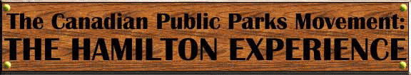
Canadian Public Parks Movement: The Hamilton Experience These methods for creating rhythm in a graphic design layout can be used powerfully to enhance the quality of the design. 2. Emphasis Most design layouts contain some amount of text. This text can be emphasized by using capital letters, bold font, underlined text, large size, and by leaving plenty of "white space" around the words. "White space" refers to space in a layout that contains no designs, images, or text.
Write a five-sentence paragraph on the importance of oxygen. In each sentence emphasis one or more words using one of the five methods for giving emphasis. After you are finished writing the paragraph, pass the paper to a colleague and ask her or him which words stand out the most. Remember these techniques used to create emphasis and use them. 3. Balance There are two different types of balance that we are going to look into: a) Symmetrical layout. This type of balance is the traditional one and comes across as very formal. Here is a good example of symmetrical layout from one of the Digital Collections. In a symmetrical layout, the text and graphics are arranged so that one side balances out the other and top balances out the bottom.
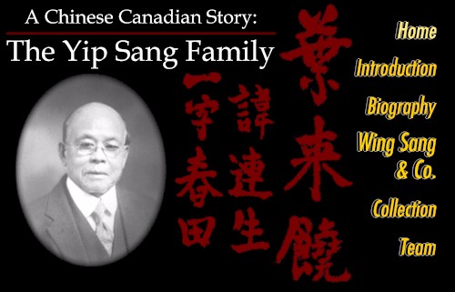
b) Asymmetrical layouts come across as less traditional and more informal than the symmetrical layout. In an asymmetrical layout, the text and images are not necessarily balanced to the eye from side to side and from top to bottom. In this Digital Collection example, we have an asymmetrical layout.
A Chinese Canadian Story: The Yip Sang Family The remaining two layout techniques are introduced in Lesson 3. |
Homepage --- Teaching Units --- Graphic Design--- Authors