| Graphic Design Unit Lesson 3: Layout Techniques (Continued) 
4. Readability
Readability is how easy it is for the reader to read through the text in a
layout without being bored or fatigued. If the layout has high readability, then the
material in it is easy to read and even motivates the reader to read.
a) Text justification affects the readability of a layout. Text can be justified in a
variety of forms.
i) Centered text has each phrase in the middle of the page.
This makes it difficult for the eye to find the beginning of each line. |
ii) Left Justified text has each line starting the same
distance
from the left margin of the page. This is the most common
form of setting up text.
ii) Left Justified text is not uncommon
and it occurs when all the lines on
a page begin at the same distance
from the left margin and all lines
end at the same distance from the
right margin. This justification can
be very pleasing to the eye. The on-
ly problem is that many hyphens are
made at the end of the lines when
words need to be broken up. This can
be distracting. Full justification
is rarely used in Web publishing and
is simulated here using "preform-
atted" text and a non-proportional
font.
|
ii) Justified text is not uncommon and it occurs when all
the lines on a page begin at the same distance from the
left margin and all lines end at the same distance from the
right margin. This justification can be very pleasing to the
eye. The only problem is that many hyphens are made at
the end of the lines when words need to be broken up.
This can be distracting. Full justification is rarely used in
Web publishing and is simulated here using "preforma-
tted" text and a non-proportional font. |
iv) Right justified text has each line ending the
same distance
from the right margin. This style is good for variety, but can
lead to many distracting hyphens along the right side of the
page.
b) Choice of font is another factor that affects readability.
i) Choose a font that suits what the design is about.

For example, if the design is advertising the latest computer hardware, which of the
following fonts would be best suited?

ii) Be sure that the font is legible.
iii) Kerning is the space between the letters in a word. If the kerning is too l
a r g e or too small, the readability comes into jeopardy.
5. Presentation
The final layout technique relates to how the items on a page are arranged. Each method of
presentation gives a different effect to the design.
a) Adding tilt to a page can add a great amount of punch. In this Digital Collection
example we find an example of tilt layout.
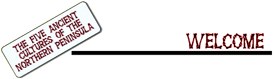
Five Ancient
Cultures of the Northern Peninsula
b) Vertical layouts can make the page look narrow and slim. This
SchoolNet Collection example makes good use of vertical layout.
Glenn Gould Archive
c) Borders add to the clarity and focus of a layout design. The
Collège Joliette Digital Collection title page contains borders.

Collège
Joliette: 150 ans d'éducation
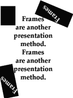
d) Frames add focus to layouts.
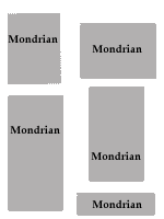
e) Mondrian layout happens when the page is divided using
rectangles of different sizes.
f) Knockout causes the item in the layout to stand out greatly.
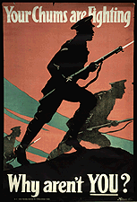
Attestation Papers: Canadian
Expeditionary Force

Make a design layout for each of the following items. For each layout,
incorporate at least five concepts from each of the five different layout techniques
(Rhythm, Emphasis, Balance, Readability, Presentation).
A summer camp
Yahiyo Chocolate bars
Take 25 minutes to complete this task. When you are finished, divide into
groups of four and exchange papers. Try to identify the concepts used in the layouts
passed out to you. Write the concepts that you identified on the back of the sheet and
pass it back to the creator. |